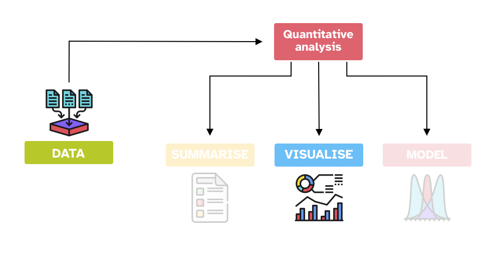
As you learned in Chapter 2, quantitative data analysis can be conceived as three activities: summarising, visualising and modelling data. This chapter introduces you to basic principles of good data visualisation, while in Chapter 15 you will learn the basics of plotting data in R.
14.1 Good data visualisation
Alberto Cairo has identified four common features of good data visualisation (Spiegelhalter 2019: 64-66):
TipGood data visualisation
It contains reliable information.
The design has been chosen so that relevant patterns become noticeable.
It is presented in an attractive manner, but appearance should not get in the way of honesty, clarity and depth.
When appropriate, it is organized in a way that enables some exploration.
Let’s see a few examples that illustrate each point. Since you will learn about the plotting code in the next chapter, the code is not shown by default here, but you can see it by clicking on the expandable Code button above each plot.
14.2 Information is (not) reliable
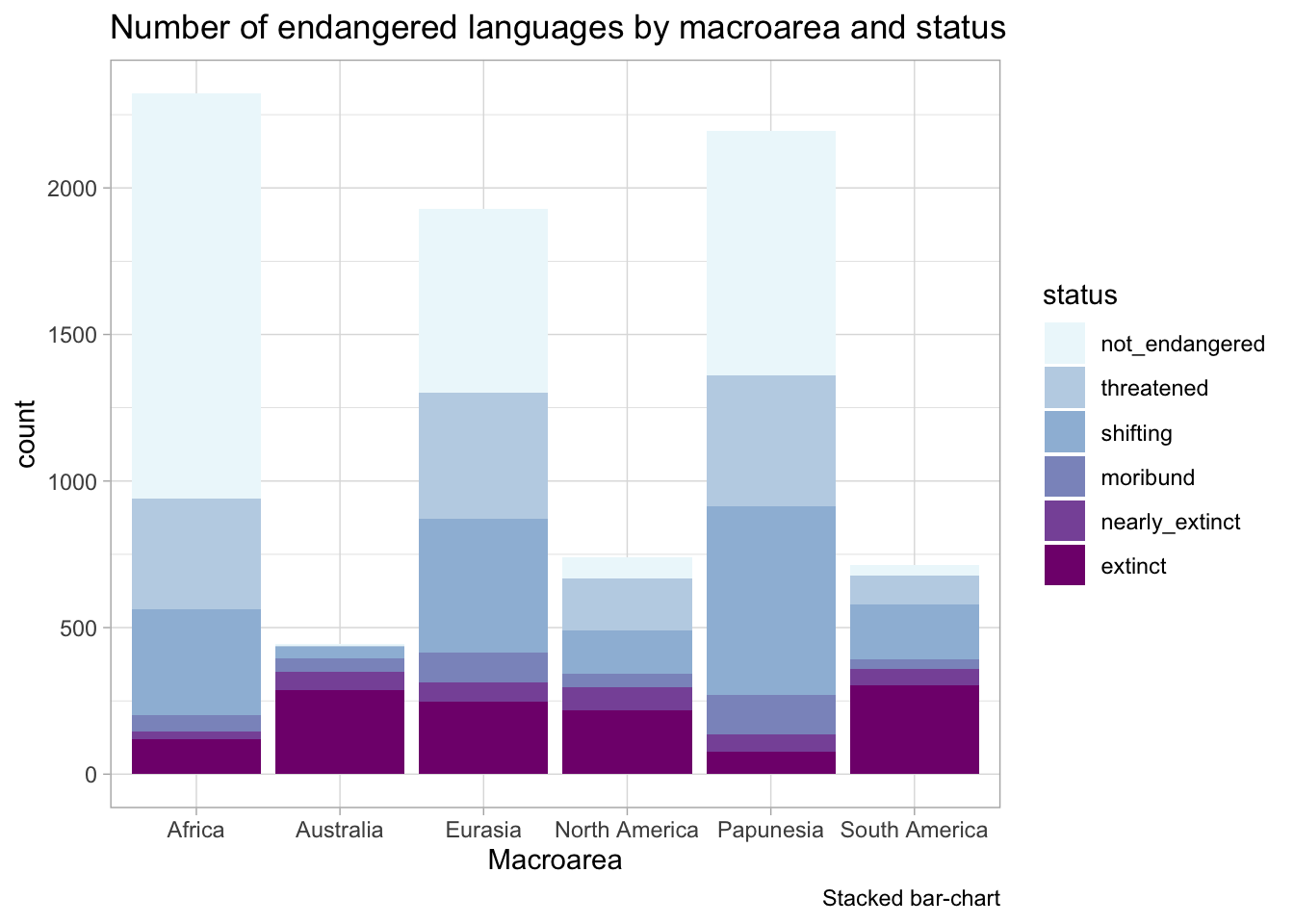
Let’s use the coretta2022/glot_status data. to create the plots because you will learn about it later. The following plot is titled Number of endangered languages by macroarea and status, but the plot contains both endangered and non-endangered languages.
Code
glot_status %>%# filter(status != "extinct") %>%ggplot(aes(Macroarea, fill = status)) +geom_bar() +scale_fill_brewer(type ="seq", palette ="BuPu") +labs(title ="Number of endangered languages by macroarea and status",caption ="Stacked bar-chart" )
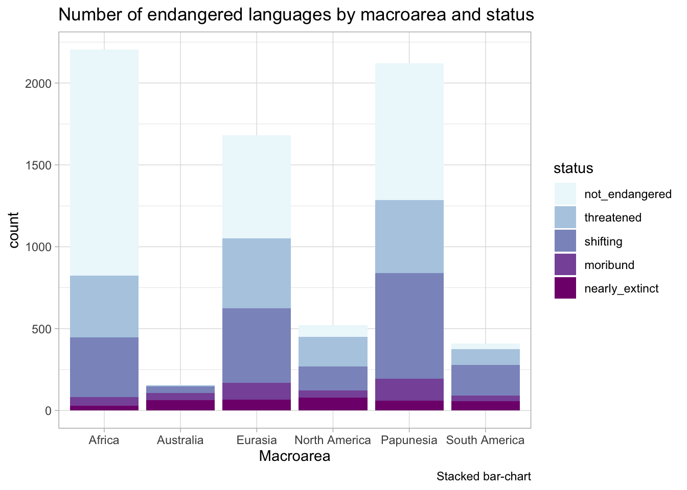
We can fix that by filtering the data so that it contains only endangered languages.
Code
glot_status %>%filter(status !="extinct") %>%ggplot(aes(Macroarea, fill = status)) +geom_bar() +scale_fill_brewer(type ="seq", palette ="BuPu") +labs(title ="Number of endangered languages by macroarea and status",caption ="Stacked bar-chart" )
14.3 Patterns are (not) noticeable
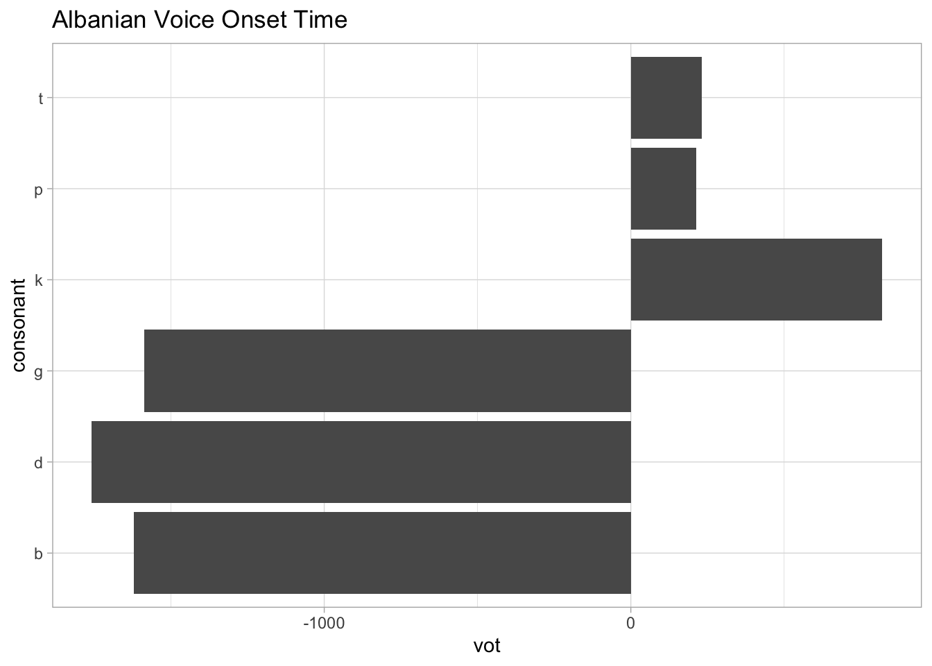
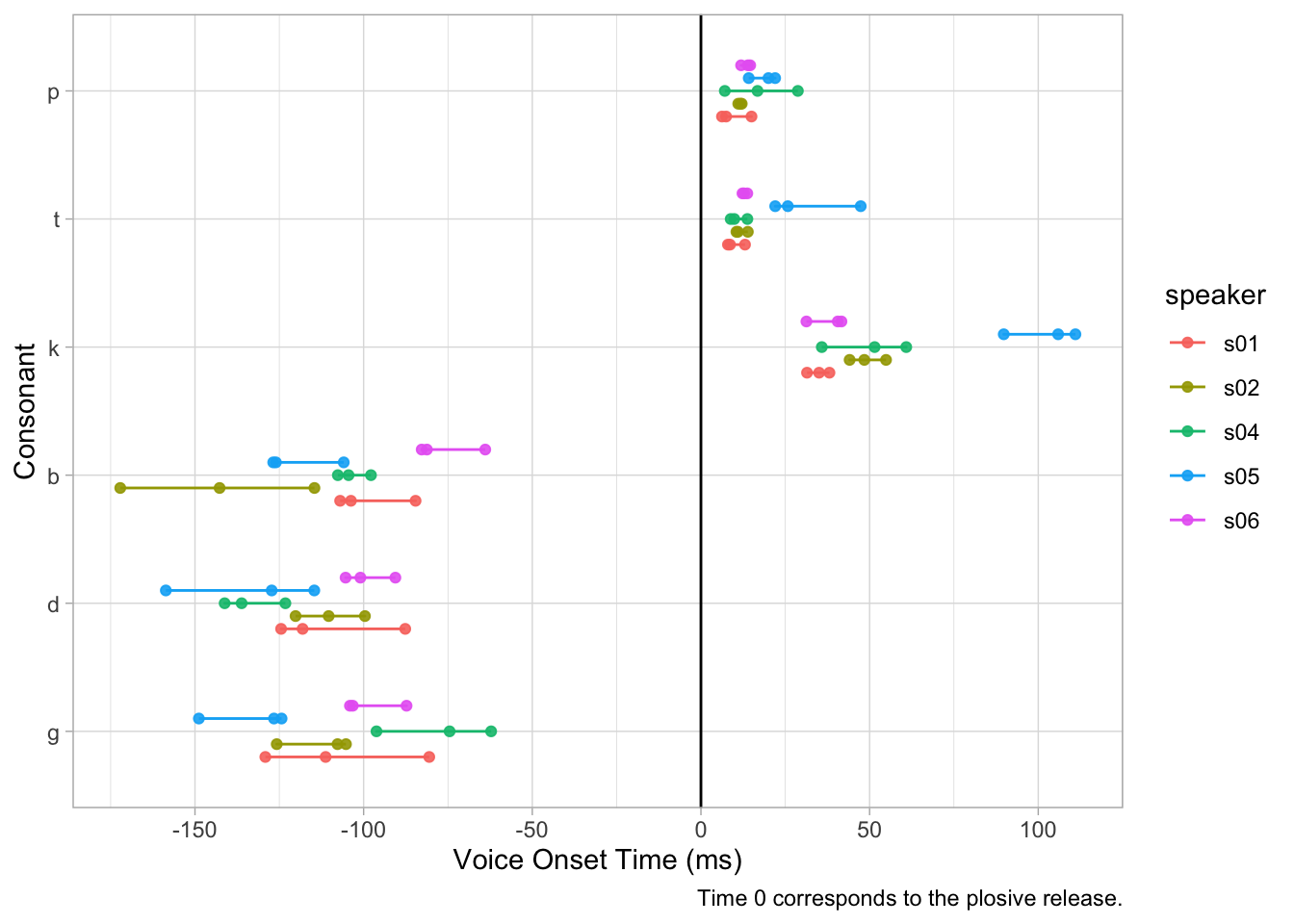
The coretta2021/albvot data contains data on VOT in Albanian. It has data from 6 speakers (Coretta et al. 2022). The following plot uses a bar chart to show the VOT of different stops, but what you can’t really see is that there is a lot of variability within and among stops and within and among speakers.
We can do better. The following plot shows individual measurements of VOT for different stops and speakers. Now an interesting pattern emerges: speaker 5 (s05) has particularly long VOT for /t/ and /k/ relative to the other speakers.
Code
albvot %>%filter(consonant %in%c("p", "t", "k", "b", "d", "\u261")) %>%mutate(consonant =factor(consonant, levels =rev(c("p", "t", "k", "b", "d", "\u261")))) %>%ggplot(aes(consonant, vot, colour = speaker)) +geom_line(aes(group =interaction(speaker, consonant)), position =position_dodge(width =0.5)) +geom_point(size =1.5, alpha =0.9, position =position_dodge(width =0.5), aes(group = speaker)) +geom_hline(aes(yintercept =0)) +scale_y_continuous(breaks =seq(-200, 200, by =50)) +coord_flip() +labs(ttile ="Albanian Voice Onset Time",y ="Voice Onset Time (ms)", x ="Consonant",caption ="Time 0 corresponds to the plosive release." )
Bar charts are unfortunately overused in research, even in those cases when they are not appropriate.
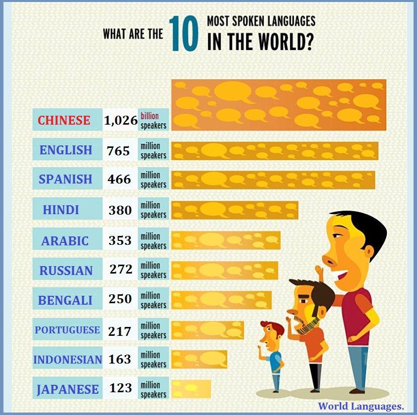
14.4 Aesthetics (should not) get in the way
The graph above has a lot of issues:
The bar length and thickness are not proportional. Compare Japanese with 123 million speakers vs English with 765 million speakers.
The graph mixes two scales: million speakers and billion speakers. This makes it look as if Chinese does not have that many more speakers.
The shade of orange of the bars does not seem to become proportionally darker with more speakers. Look at Arabic and Hindi: they have a very similar number of speakers but one bar is darker than the other.
The three dudes speaking are just fillers. Are they really necessary? Also, they are all white men…
Can you find other issues? See more examples on Ugly Charts.
14.5 Does (not) enable exploration
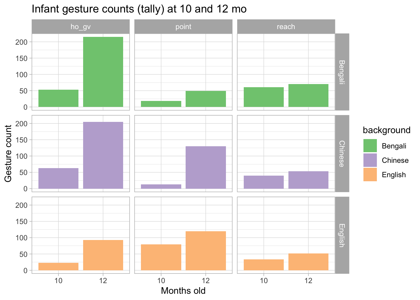
The plot below shows the number of gestures enacted by infants of English, Bengali and Chinese background as recorded during a controlled session (Cameron-Faulkner et al. 2020). Three different types of gestures are shown: hold out and give gestures (ho_gv), index-finger pointing (point) and reach out gestures (reach). Moreover the plot shows the number of gestures at 10 and 12 months.
A bar chart is appropriate with count data, like in this case, but it does not allow for much exploration. Each infant was recorded at 10 and 12 months of age, but in the plot you don’t see whether individual infants changed their number of gestures. We can only notice that overall the number of gestures increases from 10 to 12 months old.
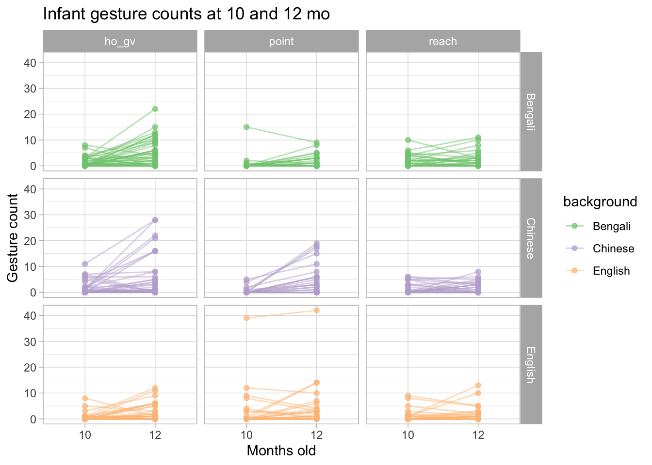
We can use a “connected point” plot: each infant is represented by a dot at 10 and 12 months and the dots of the same infant are connected by a line. This allows us to see whether an individual infant uses more gestures at 12 months.
You will notice that some infants don’t really use more gestures and others even use slightly less gestures. You would not be able to see any of this if you used a bar chart, like we used above.
14.6 Practical tips
Here is a list of practical visualisation tips for you to think about.
Tip
Show raw data (e.g. individual observations, participants, items…).
Separate data in different panels as needed.
Use simple but informative labels for axes, panels, etc…
Use colour as a visual aid, not just for aesthetics.
Reuse labels, colours, shapes throughout different plots to indicate the same thing.
Cameron-Faulkner, Thea, Nivedita Malik, Circle Steele, Stefano Coretta, Ludovica Serratrice, and Elena Lieven. 2020. “A Cross-Cultural Analysis of Early Prelinguistic Gesture Development and Its Relationship to Language Development.”Child Development 92 (1): 273290. https://doi.org/10.1111/cdev.13406.
Coretta, Stefano, Josiane Riverin-Coutlée, Enkeleida Kapia, and Stephen Nichols. 2022. “Northern Tosk Albanian.”Journal of the International Phonetic Association, 123. https://doi.org/10.1017/s0025100322000044.