mald <- readRDS("data/tucker2019/mald_1_1.rds")31 Log-normal regression


In Chapter 18, we talked about skewness of distributions in relation to the density plots of reaction times. In Chapter 21, we further explained that it is the onus of the researcher to decide on a distribution family when fitting regression models and we said that, in the absence of more specific knowledge, the Gaussian distribution is a safe assumption to make. Note that the choice of distribution family should be based as much as possible on theoretical (as opposed to empirical) grounds. In other words, you shouldn’t just plot the variable to check which distribution it might follow (more on this below).
There are heuristics one can follow to pick a theoretically grounded distribution. The major ones are listed in Section A.2, so you can refer to that section in the appendix, but in this chapter we will focus on one type of variables and the default distribution choice: i.e. variables that can only take on values that are positive numbers. These variables, in the absence of more specific knowledge, can be assumed to be from a log-normal distribution.
31.1 Log-normal distribution
The log-normal distribution is a continuous probability distribution of variables that can only be positive and not zero. It has two parameters: the mean \(\mu\)$\mu$ and the standard deviation \(\sigma\). These are the same parameters of the Gaussian distribution, but the parameters of the log-normal distribution are in logged units. The name log-normal comes from the fact that variables that are log-normal approximate a Gaussian (aka normal) distribution when we take the logarithm (log) of the values. In other words, the variable is assumed to be Gaussian on the log scale, rather than on the natural scale. Mathematically, we represent the log-normal distribution with \(LogNormal(\mu, \sigma)\).
Typical examples of continuous variables that can only be positive and not zero are:
Phonetic durations (segments, words, sentences, pauses, …).
Frequencies like f0 and formants. Speech rate.
Reaction times.
I will illustrate the nature of log-normal variables using reaction times (RT) from Tucker et al. (2019). First, attach the packages.
library(tidyverse)
theme_set(theme_light())
library(brms)
library(posterior)
library(bayesplot)
library(ggdist)
Let’s read the data and plot the density of RTs. Recall we ran a Gaussian regression model of the data in Chapter 28.
Code
mald |>
  ggplot(aes(RT)) +
  geom_density(fill = "antiquewhite") +
  geom_rug(alpha = 0.1)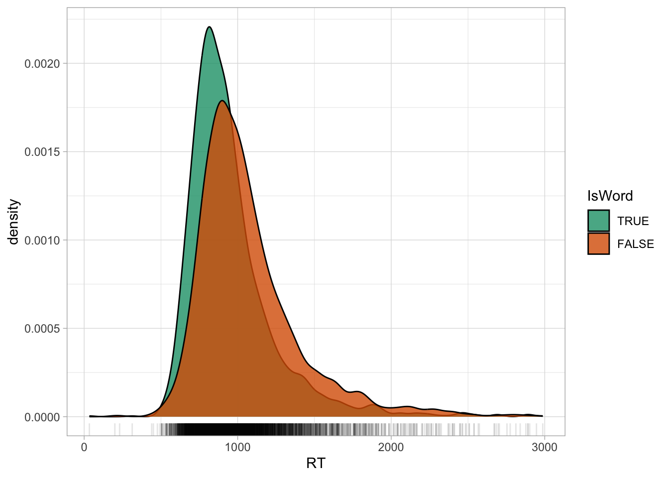
We have already observed in Chapter 28 that the distribution of RTs is right-skewed: which is, there are more extreme values to the right of the distribution than what would be expected if this were a Gaussian variable. This is because RTs are naturally bounded to positive numbers only, while Gaussian variables are unbounded. A common procedure, which you will likely encounter in the literature, is to take the logarithm of RTs (and other log-normal variables), or in other words to log them: the logarithm of a log-normal variable transforms the variable so that it approximates a Gaussian distribution. In R, the logarithm function is simply applied with log() (this uses the natural logarithm, which is the logarithm with base \(e\); if you need a refresher, see Introduction to logarithms).
Code
mald |>
  ggplot(aes(log(RT))) +
  geom_density(fill = "antiquewhite") +
  geom_rug(alpha = 0.1)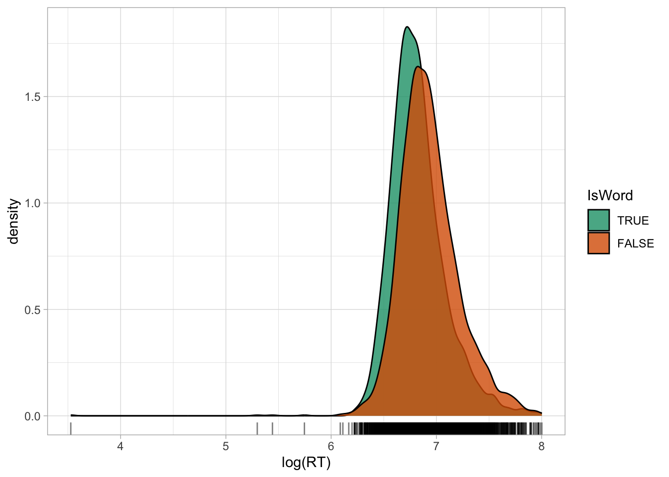
Figure 31.2 shows the density of logged RTs. Note how the density curve is less skewed now compared to Figure 31.1. You will also note that the some lower RTs values now look more extreme than in the first figure: logging a variable compresses the scale more at higher values and spreads the scale more at lower values, which results in the reduction of right-skew, but also in making very low values look more extreme. Before moving onto discussing what to do with outliers, an important clarification is due.
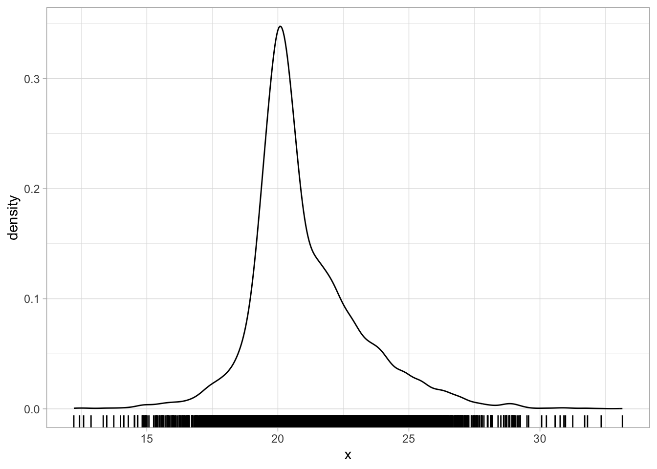
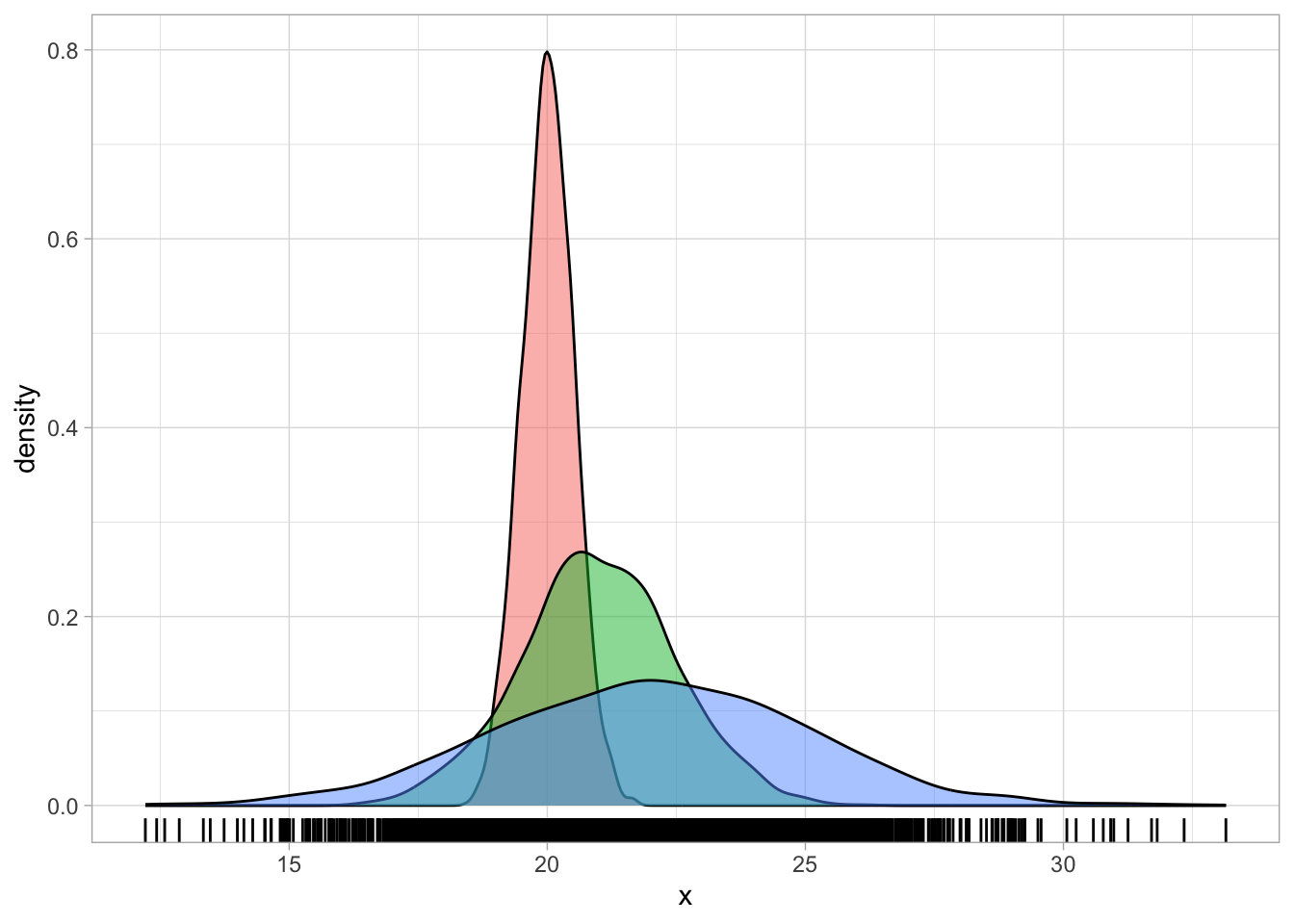
There are cases where the density plot is a combination of multiple underlying distributions with different means and SDs that makes it look as if it is skewed. For example, the following code creates a mixture of three Gaussian distributions of the same variable, but coming from three different groups, each with a slightly higher mean and SD than the first group. Figure 31.3 shows a single density curve for the data (Figure 31.3 (a)), and the density plots for the individual groups (Figure 31.3 (b)). In the single density plot, we might be given the impression that this is a log-normal variable because of the right skew, but in fact, when plotting the density curves of the individual groups we can see that the distribution in each group is quite symmetric (not skewed) and quite Gaussian-like.
set.seed(123)

# Sample sizes
n <- 2000

# Three different normal distributions
x1 <- rnorm(n, mean = 20, sd = 0.5)
x2 <- rnorm(n, mean = 21, sd = 1.5)
x3 <- rnorm(n, mean = 22, sd = 3)

dat <- tibble(
  x = c(x1, x2, x3),
  gr = rep(c("a", "b", "c"), each = n)
)
Deciding if a variable is log-normal should be based on theoretical considerations rather than on the empirical distribution. Ask yourself, before seeing the data: is this variable continuous and can it only take on positive values? If the answer is yes, then assuming a log-normal distribution is safe.
31.2 Dealing with outliers
Very extreme values are generally called outliers: an outlier is a value that is more extreme than what the distribution would indicate. The definition of outlier is quite vague and there are different ways of operationalising “outlierness” (i.e. to determine if a value is an outlier). There are also different camps as to what to do with outliers, particularly in regard to inclusion/exclusion criteria. I side with the camp that suggests not to exclude outliers, if they are real outliers. In most cases, thinking about errors is a much more useful way of deciding which values to include or exclude. For example, in our RT data there is one observation of 34 ms. The second lowest RT is 200 ms. Given the task participants had to complete, a lexical decision task, it is unlikely that they could thoughtfully answer after only 34 ms (that is a very short time). So we could argue that that was an error: the participant mistakenly pressed the button before thinking about the answer.
We have a good theoretical reason to exclude that observation. We would not call this an outlier, because it is an error. You should reserve the word outlier only for extreme observations that are not the result of an error, misunderstanding or the like. It also very often depends on the specific task at hand: for certain tasks, an RT of 5 seconds might still be acceptable, but for others it probably means the participant was distracted. This type of observations do not represent the process one is interested in, so they are best left out. But if there are observations that are extreme, but not so extreme to believe that they come from errors or other causes, then it is theoretically more sound to keep them.
Since we have established that this very low RT observation of 34 ms must be an error, let’s drop it from the data before moving on onto modelling.
mald_filt <- mald |>
  filter(RT > 34)
31.3 Modelling RTs with a log-normal family
The problems arising from assuming a Gaussian distribution for RTs is visually obvious when comparing the empirical distribution of the observed RTs with the predicted distribution from a Gaussian model. Let’s reload the Gaussian model from Chapter 22.
rt_bm <- brm(
  RT ~ 1,
  family = gaussian,
  data = mald,
  seed = 6725,
  file = "cache/ch-fit-model-rt_bm"
)
We can plot the empirical and predicted distribution using the pp_check() function from the brms package. The function name stands for posterior predictive check: in other words, we are checking how the predicted joint posterior distribution of the data looks when compared with the empirical distribution. The joint posterior probability distribution is simply the probability of the outcome variable as predicted by the posterior probability distributions of the parameters of the model. The Gaussian regression above correspond to the following mathematical equations:
\[\begin{aligned} RT_i & \sim Gaussian(\mu_i, \sigma)\\ \end{aligned}\]
The joint posterior distribution of the outcome \(RT\) is the \(Gaussian(\mu, \sigma)\) distribution in the model. This is based on the posterior probability of the mean \(\mu\) and the overall standard deviation \(\sigma\). Remember that inference in the context of Bayesian regression models using MCMC is based on the MCMC draws. Each draw has sampled a value for the model parameters. So for each draw we can reconstruct one joint posterior distribution based on the specific parameter values of that draw. It is useful to plot the joint posterior based on several draws, but since this computation is expensive, it is usually best to use just some and not all the draws. There isn’t a specific number and by default pp_check() uses 10 draws. In most cases these suffice. In the following code I set the number of draws to 50 just to illustrate how to use the ndraws argument.
Figure 31.4 shows the output of the pp_check() function. The first argument of the function is simply the model object, rt_bm_1. We set ndraws = 50 to use 50 random draws from the MCMC draws to reconstruct joint posteriors. These are in light blue in the figure. The dark blue, thicker line is the empirical density of the data, the same density you would get with geom_density(). It is quite obvious that the reconstructed posterior densities do not match the empirical density. Values below 500 ms are over-estimated by the model (in other words, the model over-predicts the presence of lower RT values) and similarly values between 1000 and 1500 ms are over-estimated. The empirical density of the data is much more compact around the peak of the distribution, compare to the posteriors from the model.
pp_check(rt_bm, ndraws = 50)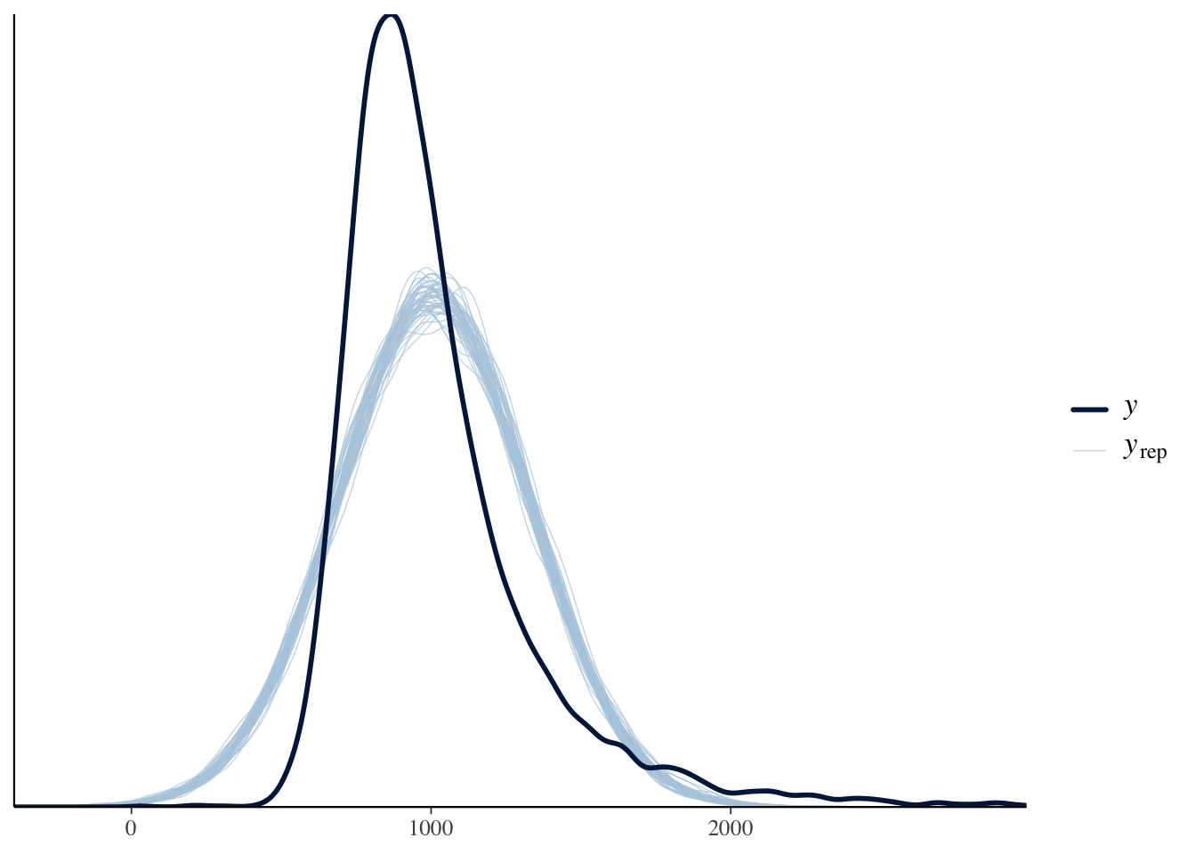
A common reason for the failure of the posterior probability to correctly reconstruct the empirical distribution is the incorrect choice of the distribution family (another notable reason is not including important predictors in the model, like in the three Gaussian groups from the example above: a Gaussian model of that data without group as a predictor will incorrectly estimate values). We have learned above that RT values can be assumed to be log-normal, rather than Gaussian, because they are continuous and can only be positive.
Let’s fit a log-normal model instead and check the posterior predictive distribution with pp_check(). The model mathematical formula is the following:
\[\begin{aligned} RT_i & \sim LogNormal(\mu_i, \sigma)\\ \end{aligned}\]
rt_bm_log <- brm(
  RT ~ 1,
  family = lognormal,
  data = mald,
  seed = 6725,
  cores = 4,
  file = "cache/ch-fit-model-rt_bm_log"
)pp_check(rt_bm_log, ndraws = 50)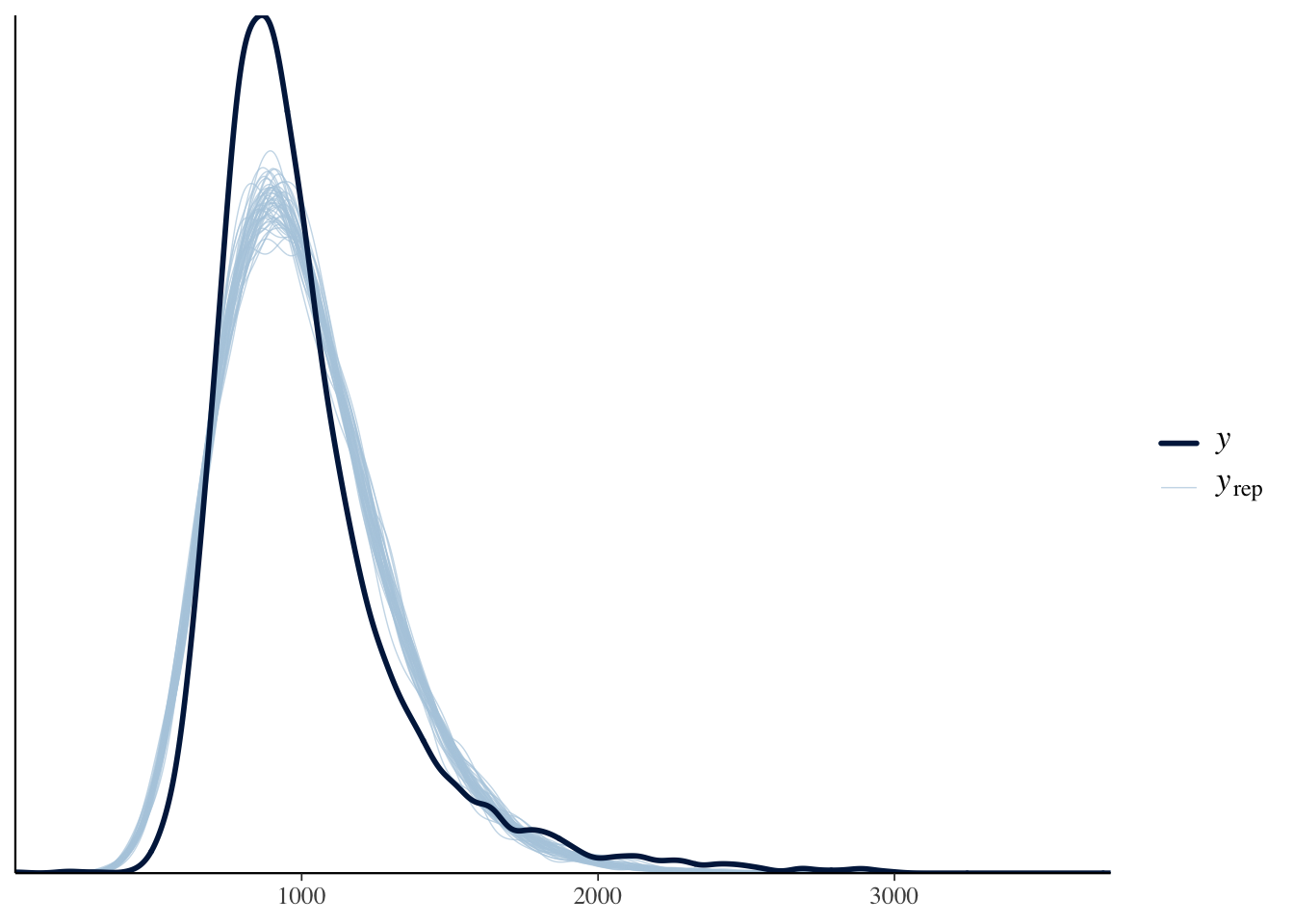
The posterior predictive distributions in Figure 31.5 (light blue) now are much more similar to the empirical distribution (dark blue). This is because a log-normal distribution better captures the distribution of RTs, which are bounded to positive numbers and cannot be 0.
In the following sections we will fit a log-normal regression model to RTs and a measure called mean phoneme-level Levenshtein distance.
31.4 Levenshtein distance and RTs
The Levenshtein distance is a measure of how different two strings are. It is defined as the minimum number of single-character edits needed to transform one string into the other, where the allowed edits are inserting a character, deleting a character, or substituting one character for another. For example, the Levenshtein distance between kitten and sitting is 3 because three edits are required to convert one word into the other. Tucker et al. (2019) apply this measure to the phonemic representation of words, rather than their written string. For example, the words through and though have a string-based Levenshtein distance of 1 (deleting r), but their phonemic transcriptions are /θruː/ and /ðoʊ/, respectively. At the phoneme level, transforming /θ r uː/ into /ð oʊ/ requires substituting /θ/ with /ð/, deleting /r/, and substituting /uː/ with /oʊ/, giving a phoneme-level Levenshtein distance of 3.
For each word in the data, Tucker et al. (2019) measured the pairwise phoneme-level Levenshtein distance of that word and all the other words, and then calculated the mean distance for that word. Words that are more phonemically unique have a higher mean phoneme-level Levenshtein distance, while more similar words have lower mean phoneme-level Levenshtein distance. We can thus ask the following research question:
Does mean phoneme-level Levenshtein distance of the target word have an effect on the response reaction times in an English lexical decision task?
Let’s plot the data. Figure 31.6 shows a scatter plot of RTs and mean phoneme-level Levenshtein distance. We also added a regression line. Note that this regression line is based on a Gaussian regression model, RT ~ PhonLev, but RTs are not Gaussian, so the regression line is somewhat deceiving.
Code
mald_filt |>
  ggplot(aes(PhonLev, RT)) +
  geom_point(alpha = 0.3, colour = "seagreen") +
  geom_smooth(method = "lm", colour = "tomato4") +
  labs(x = "Levenshtein distance", y = "RT (ms)")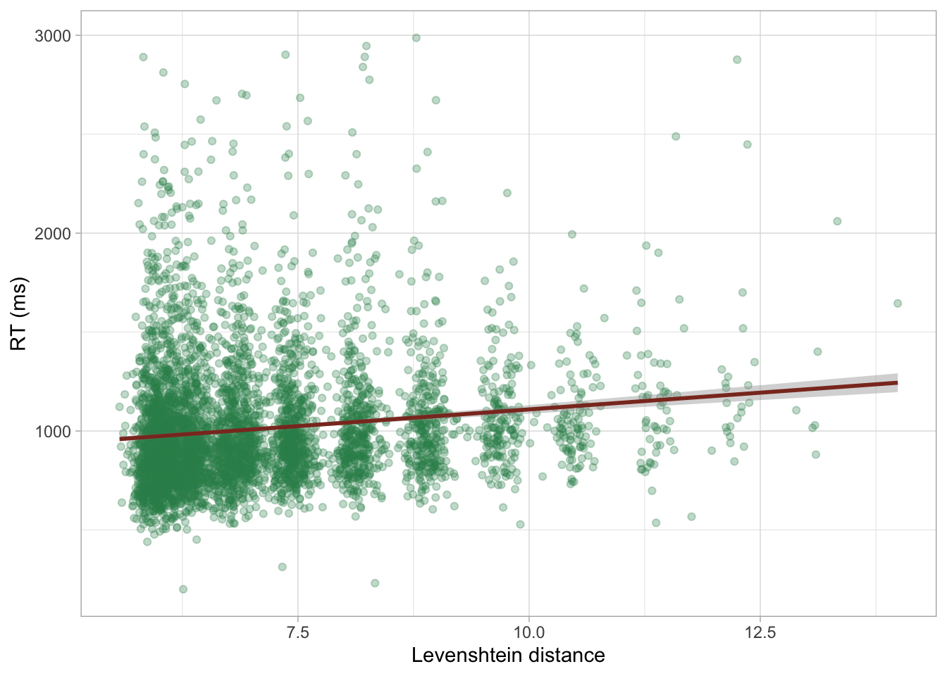
As we have discussed above, taking the logarithm of a log-normal variable makes it a Gaussian variable. So we can log RTs for plotting.
mald_filt <- mald_filt |>
  mutate(
    RT_log = log(RT)
  )
Let’s plot the data again, this time by logging both RTs and distance. Figure 31.7 shows a scatter plot with logged RTs and distance. Now the regression line is based on a Gaussian regression of logged RTs: this is equivalent to a log-normal regression model of (untransformed) RTs.
Code
mald_filt |>
  ggplot(aes(PhonLev, RT_log)) +
  geom_point(alpha = 0.3, colour = "seagreen") +
  geom_smooth(method = "lm", colour = "tomato4") +
  labs(x = "Levenshtein distance (log)", y = "RT (log ms)")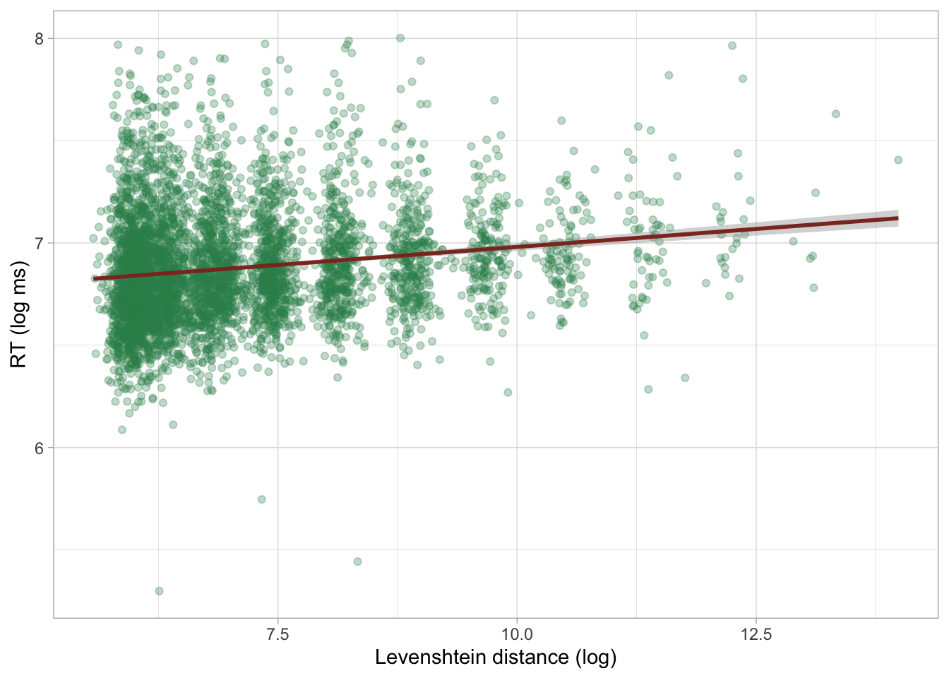
31.5 A log-normal regression model
We can proceed with modelling RTs using a log-normal regression model. This is just a regression model with a log-normal family as the distribution family for the outcome variable, here RTs. Here are the model formulae:
\[\begin{aligned} RT_i & \sim LogNormal(\mu_i, \sigma)\\ \mu_i & = \beta_0 + \beta_1 \cdot l_i\\ \end{aligned}\]
Reaction times \(RT\) are distributed according to a log-normal distribution with mean \(\mu\) and SD \(\sigma\).
The mean \(\mu\) depends on Levenshtein distance (\(l\)).
Since we are using a log-normal distribution, \(\mu\) and \(\sigma\) are on the log scale. In other words, the log-transformation of the outcome variable is handled by the model, so you don’t have to log RTs yourself.
The estimates of the regression coefficients \(\beta_0, \beta_1\) and the \(\sigma\) parameter will be in logged milliseconds, because the RTs in the data are measured in milliseconds and we are using a log-normal family. The following code fits a log-normal regression to the RT values from the filtered MALD data and we are also modelling the effect of phoneme-level distance (PhonLev) on RTs.
rt_bm_2 <- brm(
  RT ~ PhonLev,
  family = lognormal,
  data = mald_filt,
  cores = 4,
  seed = 6725,
  file = "cache/ch-regression-lognormal-rt_bm_2"
)
Before we learn how to interpret the model summary of a log-normal regression, let’s check the posterior predictive plot, shown in Figure 31.8. Look at how the posterior predictive distributions match the empirical distribution much better, compared to Figure 31.4. They are not perfect, but there is indeed much improvement with a log-normal model, as we have also seen in Figure 31.5. The remaining differences are probably because RTs are not specifically log-normal, and other distributions have been proposed, like the exponential-Gaussian, or ex-Gaussian distribution. We will not treat these alternatives here: just remember that a log-normal distribution is a good initial assumption for continuous variables that are bounded to positive numbers and cannot be 0.
pp_check(rt_bm_2, ndraws = 50)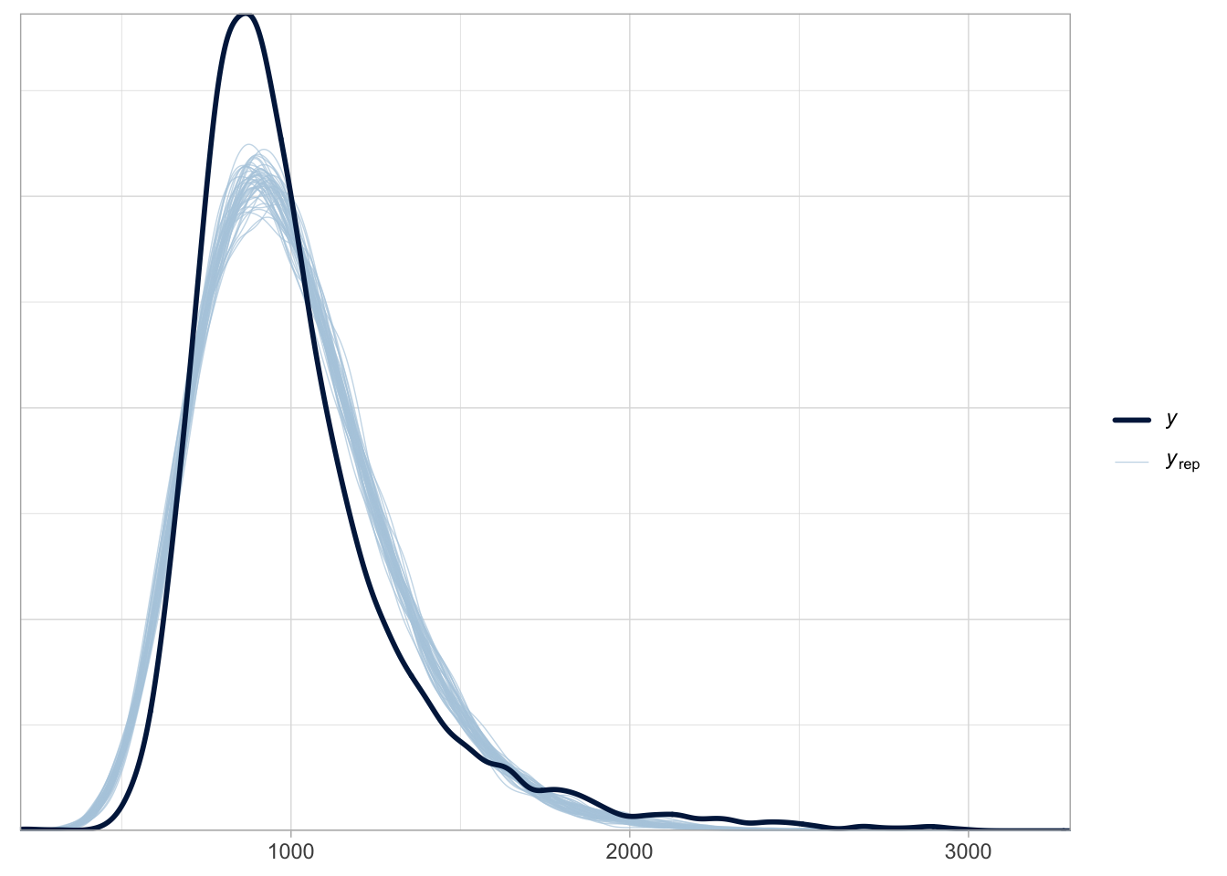
31.6 Interpreting log-normal regressions
Interpretation of log-normal regression models is not that different from interpreting Gaussian models, with the difference that estimates are in the log-scale. Let’s print the model summary.
summary(rt_bm_2, prob = 0.8) Family: lognormal
Links: mu = identity
Formula: RT ~ PhonLev
Data: mald_filt (Number of observations: 4999)
Draws: 4 chains, each with iter = 2000; warmup = 1000; thin = 1;
total post-warmup draws = 4000
Regression Coefficients:
Estimate Est.Error l-80% CI u-80% CI Rhat Bulk_ESS Tail_ESS
Intercept 6.63 0.02 6.60 6.66 1.00 5098 2658
PhonLev 0.04 0.00 0.03 0.04 1.00 5089 2649
Further Distributional Parameters:
Estimate Est.Error l-80% CI u-80% CI Rhat Bulk_ESS Tail_ESS
sigma 0.27 0.00 0.27 0.27 1.00 2395 2084
Draws were sampled using sampling(NUTS). For each parameter, Bulk_ESS
and Tail_ESS are effective sample size measures, and Rhat is the potential
scale reduction factor on split chains (at convergence, Rhat = 1).As usual, the first lines give us information about the model. The family is lognormal. The link functions are identity for both the mean mu and the standard deviation sigma (these are \(\mu\) and \(\sigma\) from the model formula above). You have encountered link functions in the previous chapter, when you learned about Bernoulli models. A Gaussian model uses the identity link, while a Bernoulli model uses the logit link to model probabilities, which are bounded between 0 and 1. The log-normal model we just fitted uses the identity function instead: with the identity function, the input values are simply returned untransformed, in other words, no transformation is applied to the values. This might look surprising because we know that the estimates are on the log scale, not on the natural scale, so we would assume a log link.
However, link functions are applied to model parameters, rather than on the outcome variable. The log-transformation we discussed in log-normal models is applied to the outcome variable directly. Because of this, the model parameters are already on the log-scale and don’t have to be further transformed. That’s why the link for the mean and SD is the identity function. Similarly, in Gaussian models the model parameters are on the original scale and are not transformed (the estimates for the models of RTs were in milliseconds because RTs were measured in milliseconds).
The Formula, Data and Draws rows of the summary have no surprises. Let’s focus on the Regression Coefficients table (repeated here with fixef()).
fixef(rt_bm_2, probs = c(0.1, 0.9)) |> round(2) Estimate Est.Error Q10 Q90
Intercept 6.63 0.02 6.60 6.66
PhonLev 0.04 0.00 0.03 0.04Inteceptis \(\beta_0\): the mean log-RTs when mean phoneme-level distance (PhonLev) is 0.IsWordFALSEis \(\beta_1\): the difference in log-RTs for each unit increase of distance (PhonLev).
You see that, apart from the fact that the estimates are about log-RTs rather than RTs in milliseconds, the interpretation of the estimates is the same as in the Gaussian regression model you fitted in Chapter 28. The model suggests that the log-RTs increase by 0.03 to 0.04 for each unit increase of distance, at 80% confidence.
31.7 Logs and ratios
Differences of logged variables, aka log differences for short, can also be interpreted by converting them to the ratio of the difference. Converting log differences to ratios is done by applying the inverse of the logarithm function, which is the exponential function: in R, this is simply exp(). Figure 31.9 illustrates the relationship between logs on the x-axis and ratios on the y-axes (logs are converted to ratios with exp()).
Code
log_exp <- tibble(
  log = seq(-2, 2, by = 0.1),
  ratio = exp(log),
) %>%
  ggplot(aes(log, ratio)) +
  geom_hline(yintercept = 1, colour = "#8856a7") +
  geom_line(linewidth = 2) +
  geom_point(x = 0, y = 1, colour = "#8856a7", size = 4) +
  scale_x_continuous(breaks = seq(-2, 2, by = 1), limits = c(-2, 2)) +
  scale_y_continuous(breaks = seq(0, 7)) +
  annotate("text", x = 0, y = 3, label = "ratio = exp(log)") +
  labs(
    x = "Logs",
    y = "Ratios"
  )
log_exp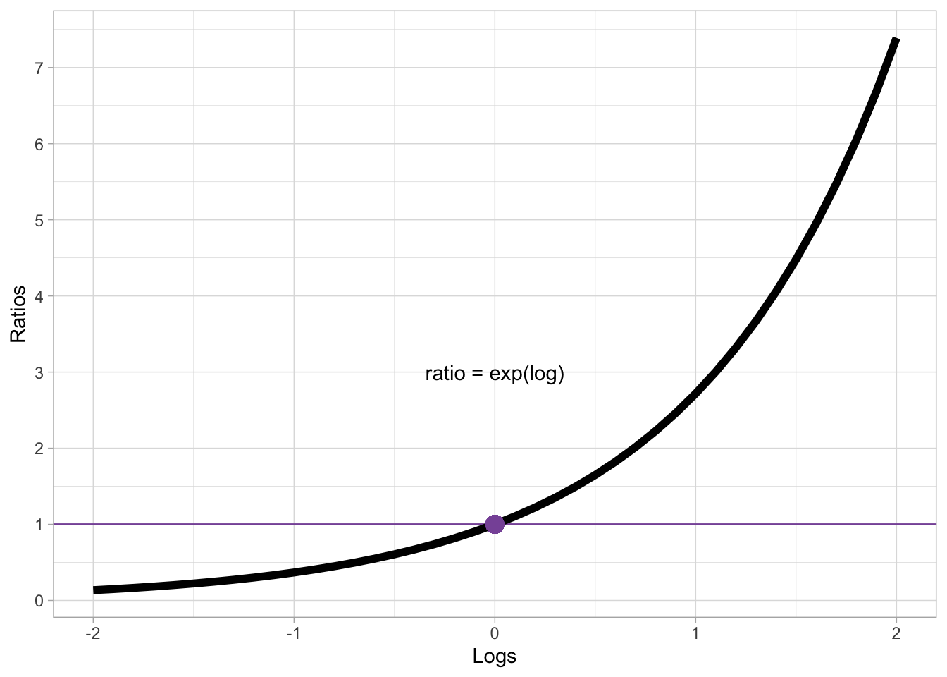
Log 0 corresponds to ratio 1. Positive logs correspond to increasingly larger ratios, while negative logs correspond to increasingly smaller ratios. Note however that a ratio can only be positive! There are no negative ratios. Ratios can be thought of as a the number to multiply the reference number by: if the log difference is 0, the ratio is 1 which means you multiply the reference value by 1. If you multiply by 1, you simply get the same value: for example, if the reference (like the model intercept) is 6 then the value resulting from the difference is also 6. In other words, there is no difference.
Logs that are greater than 0 correspond to ratios that are greater than 1. Since we multiply the reference value by the ratio value, positive logs correspond to greater values relative to the reference. For example, with a baseline value of 6 and a ratio of 1.5 (approximately log = 0.405), the value resulting from the ratio is \(6 \times 1.5 = 9\). Ratios can also be interpreted as percentages: a ratio of 1.5 corresponds to a 50% increase (50% of 6 is 3 and \(9 = 6 + 3\)). Conversely, logs that are smaller than zero corresponds to ratios that are smaller than 1, which in turn correspond to percentage decreases: For example, with a baseline 6 and a ratio of 0.8, there is a 20% decrease (\(1 - 0.8 = 0.2\)): \(6 \times 0.8 = 4.8\), or \(6 - (6 \times 0.2)\).
Ratios are useful with log-normal variables because the magnitude of the difference depends on the baseline. This is similar to log-odds: if a Bernoulli model suggests an increase of 0.3 log-odds, the difference in percentage points depends on the baseline value, as illustrated by the following code:
round(plogis(1 + 0.3) - plogis(1), 2)[1] 0.05round(plogis(2 + 0.3) - plogis(2), 2)[1] 0.03When the baseline log-odds is 1 (corresponding to about 73%), a 0.3 log-odd increase corresponds to a 5 percentage point increase (from 73 to 78%). When the baseline is 2 (about 88%) the same increase corresponds to a 3 percentage point increase. With log estimates, the same principle applies: for the same log difference, the difference in the original scale (like milliseconds for RT) is greater with larger baselines.
We can extract the posterior draws of the coefficients of PhonLev from the model and transform the values (log differences) to ratios. As usual, we can plot the posterior draws and calculate summary measures.
rt_bm_2_draws <- as_draws_df(rt_bm_2) |>
  mutate(
    b_PhonLev_ratio = exp(b_PhonLev)
  )

quantile2(rt_bm_2_draws$b_PhonLev_ratio, probs = c(0.1, 0.9)) |> round(2)
q10 q90
1.03 1.04 At 80% probability, for each unit increase of mean distance, RTs increase by 3 to 4%. The absolute increase in milliseconds depends on the baseline value, as explained above. Let’s calculate the increase based on the RTs when mean distance is 1 vs when it is 2. Why not comparing 0 and 1? Because mean distance cannot be 0 (that would imply a lexicon made only of identical words, or in other words a lexicon with a single word in it). Remember that the intercept is the log-RT when mean distance is 0, which is not what we want. So let’s calculate the posterior draws of the expected value of RTs when mean distance is 1 and 2. The expected values of an outcome in a log-normal model are on the same scale as the untransformed outcome, in our case milliseconds. As a reminder, here is the model formula:
\[\begin{aligned} RT_i & \sim LogNormal(\mu_i, \sigma)\\ \mu_i & = \beta_0 + \beta_1 \cdot l_i\\ \end{aligned}\]
To calculate the expected value (\(\mu\)), we can substitute \(l\) with 1 and 2 and we need to exponentiate the result:
\[\begin{aligned} \mu_{PhonLev=1} & = exp(\beta_0 + \beta_1 \cdot 1)\\ \mu_{PhonLev=2} & = exp(\beta_0 + \beta_1 \cdot 2)\\ \end{aligned}\]
The two coefficients \(\beta_0\) and \(\beta_1\) are the posterior draws of b_Intercept and b_PhonLev respectively. The following code should now make sense.
rt_bm_2_draws <- rt_bm_2_draws |>
  mutate(
    rt_1 = exp(b_Intercept + b_PhonLev),
    rt_2 = exp(b_Intercept + b_PhonLev * 2),
    # Difference in RT
    rt_2_1 = rt_2 - rt_1
  )

quantile2(rt_bm_2_draws$rt_2_1, probs = c(0.1, 0.9)) |> round()
q10 q90
26 30 When we go from mean distance 1 to mean distance 2, the RTs increase by 26 to 30 ms (at 80% confidence). Now, calculate the difference in milliseconds when comparing mean distance 13 and 14. You will see that it is larger (if you did things right, 37-49 ms). This is because of the log-normal family: at larger baseline values, the difference on the original scale is larger.
31.8 Using epred_draws() and linpred_draws() from tidybayes
We can plot the expected values easily as per usual, using the conditional_effects() function. Figure 31.10 shows the output of the function. Note how RTs are plotted on the original millisecond scale, rather than in logged milliseconds. This is because we fitted a log-normal model (rather than fitting a Gaussian model to logged RTs, in which case the function would plot logged RTs).
conditional_effects(rt_bm_2)Ignoring unknown labels:
• fill : "NA"
• colour : "NA"
Ignoring unknown labels:
• fill : "NA"
• colour : "NA"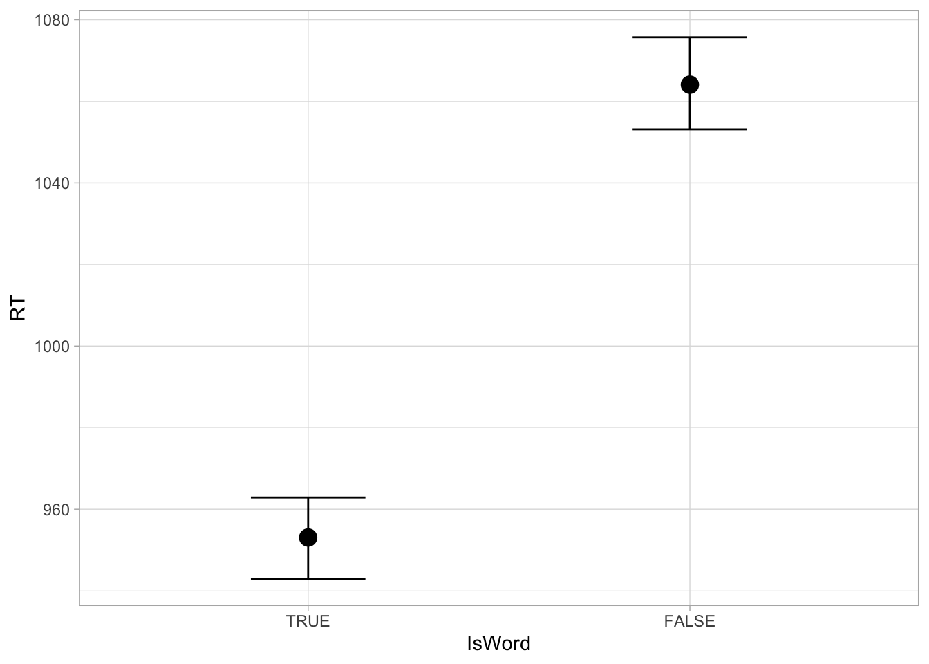
But what if we want to calculate the expected draws from the model draws ourselves? Since mean distance is numeric, it would be tedious to manually calculate the expected values for several values of mean distance. Instead, we can use the function epred_draws() from the tidybayes package. Add the code to attach the package at the top of your Quarto document, below the other packages.
library(tidybayes)The epred_draws() function needs two main arguments: the model object and a new data frame to use for calculating the expected values. This data frame should have columns for each predictor in the model. Since in this model we only have PhonLev, the data frame should have a single PhonLev column. The column should list values of the predictor to evaluate expected values from. With categorical predictors, you simply list the levels of the predictor. With a numeric predictor things are a bit more involved because there are many possible values the predictor can take. Normally, you would pick representative values along the range of the predictor for which you have data (but you could also include values outside the empirical range). Let’s set up the data frame first, using the tibble() function. We can use the seq() function to generate a sequence of values along a range. The seq() functions takes three arguments: the minimum value from, the maximum value to and the increment of the sequence by. For example, the following code returns a sequence of numbers from 1 to 5 by 0.5
seq(1, 5, 0.5)[1] 1.0 1.5 2.0 2.5 3.0 3.5 4.0 4.5 5.0Let’s use seq() to generate the sequence of values of PhonLev. We can extract the minimum and maximum value of PhonLev with min() and max().
min_pl <- min(mald_filt$PhonLev)
max_pl <- max(mald_filt$PhonLev)
Now we can use these for the from and to arguments of seq(). As the by argument, we set 0.1, so that we get a good number of values along the range.
epred_grid <- tibble(
  PhonLev = seq(min_pl, max_pl, by = 0.1)
)
Now we can let epreds_draws calculate the posterior draws of the expected values of RTs (in milliseconds).
rt_bm_2_epred <- epred_draws(
  rt_bm_2,
  epred_grid
)

rt_bm_2_epred
rt_bm_2_epred is a tibble itself, with the expected values listed in the .epred column. These values are the posterior draws of the expected values: since there are 4000 draws in the model, for each value of PhonLev we get 4000 values of .epred. The .row column is an index of each PhonLev value (there are 85 values, so it goes from 1 to 85), while .draw indexes the number of the draw (from 1 to 4000). The tibble is grouped by PhonLev (and .row) automatically. All operations on this tibble will be applied within each value of PhonLev which is what we need. To plot the regression line with the CrIs as in conditional_effects(), we need to first calculate the mean, lower and upper CrI from the draws, like so:
rt_bm_2_epred_cri <- rt_bm_2_epred |>
  summarise(
    mean = mean(.epred),
    lower = quantile2(.epred, probs = 0.025),
    upper = quantile2(.epred, probs = 0.975)
  )
`summarise()` has regrouped the output.
ℹ Summaries were computed grouped by PhonLev and .row.
ℹ Output is grouped by PhonLev.
ℹ Use `summarise(.groups = "drop_last")` to silence this message.
ℹ Use `summarise(.by = c(PhonLev, .row))` for per-operation grouping
(`?dplyr::dplyr_by`) instead.Since the tibble is grouped by value of PhonLev, we get one mean, lower and upper interval value for each PhonLev value. We can finally plot the expected values with the following code.
rt_bm_2_epred_cri |>
  ggplot(aes(PhonLev, mean)) +
  geom_ribbon(aes(ymin = lower, ymax = upper), alpha = 0.2) +
  geom_line(linewidth = 1, colour = "tomato4")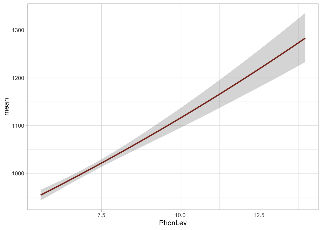
Since we used a log-normal family, the regression line of the effect of mean distance on RTs is not a perfect straight line (it is subtle, but it is true). This is because the effect of mean distance depends on the baseline RTs, as we said above: with higher baseline RTs the effect is larger, so the regression line is in fact a curve. It becomes steeper with higher mean distances. If you plotted the regression line of the linear predictor of the model (i.e. logged RTs) then it would be a nice straight line: the effect of the predictor is log-linear, i.e. it is linear on the log scale of the outcome variable. Let’s try that: we can use another function from tidybayes, linpred_draws(). This is like epred_draws(), but it returns the outcome on the linear predictor scale (here logged ms) rather than on the original scale.
rt_bm_2_linpred <- linpred_draws(
  rt_bm_2,
  epred_grid
)

rt_bm_2_linpred
The .linpred column has linear predictor values in logged milliseconds. We can reuse the code above to get the mean and CrIs and plot the linear predictor values in Figure 31.12.
Code
rt_bm_2_linpred_cri <- rt_bm_2_linpred |>
  summarise(
    mean = mean(.linpred),
    lower = quantile2(.linpred, probs = 0.025),
    upper = quantile2(.linpred, probs = 0.975)
  )

rt_bm_2_linpred_cri |>
  ggplot(aes(PhonLev, mean)) +
  geom_ribbon(aes(ymin = lower, ymax = upper), alpha = 0.2) +
  geom_line(linewidth = 1, colour = "tomato4")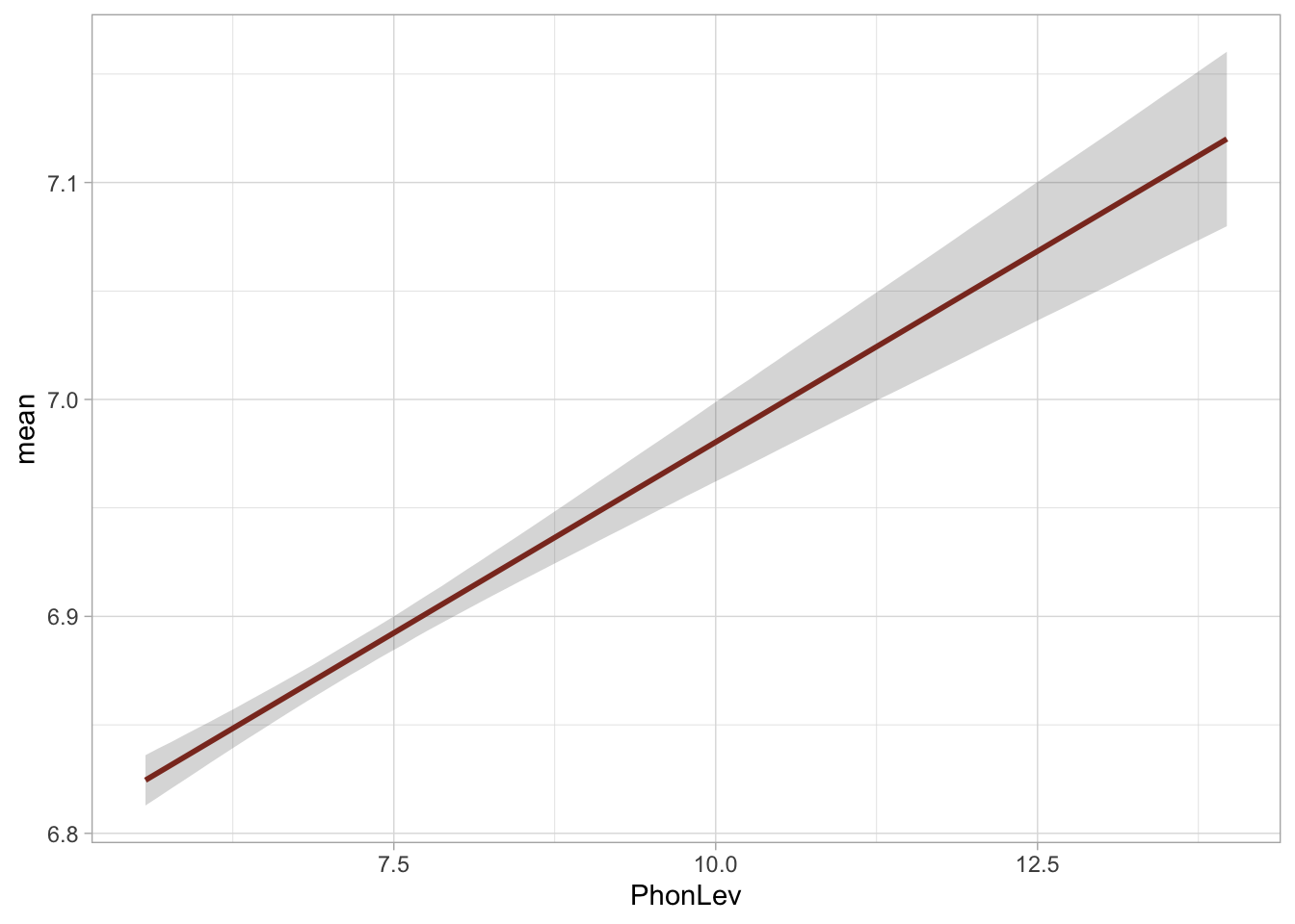
The regression line in Figure 31.12 is a straight line, as we expected. The functions epred_draws() and linpred_draws() can also be used with categorical predictors, and with models using any family distribution (including Gaussian and Bernoulli families).
31.9 Reporting
Like with Bernoulli models, while the estimates in log-normal regressions are in log-odds, it is more straightforward to understand differences and effects in the original scale. However, when reporting, you should report effects on the logged scale and as ratios/percentages). In complex models, it might be worth reporting ratios/percentages and put log differences in tables. There isn’t a rule for this.
You could report the model we fitted in this chapter like so:
We fitted a Bayesian regression model with a log-normal family for the outcome variable (reaction times, RT) using brms (Bürkner 2017) in R (R Core Team 2025). As a predictor, we entered the mean phoneme-level Levenshtein distance of the word. The model was fitted with four MCMC chains, each with 2000 iterations, of which 1000 for warm-up. The default brms priors were used.
The model indicates that the average RT when mean distance is 0 is between 736 and 777 ms, at 80% confidence (\(\beta\) = 6.63, SD = 0.02). For each unit increase of mean distance, the RTs increase by a factor of 1.03-1.04 (or 3-4%), (\(\beta\) = 0.04, SD = 0.003). As an example, the expected RTs at mean distance 5 are 894-910 ms, while at mean distance 14 are 1205-1271ms, at 80% probability.
Code
fixef(rt_bm_2) |> knitr::kable(digits = 2)| Estimate | Est.Error | Q2.5 | Q97.5 | |
|---|---|---|---|---|
| Intercept | 6.63 | 0.02 | 6.59 | 6.67 |
| PhonLev | 0.04 | 0.00 | 0.03 | 0.04 |
This answers our research question above (“Does mean phoneme-level Levenshtein distance of the target word have an effect on the response reaction times?”): we know now that for each unit increase of mean distance, the RTs increase by 3-4% at 80% probability.