# N:M is a shortcut for all integer numbers between N and M
q <- 1:10
# w is the cube of q
w <- q^3

# Plot a scatter plot with x as the x-axis and y as the y-axis
plot(x = q, y = w)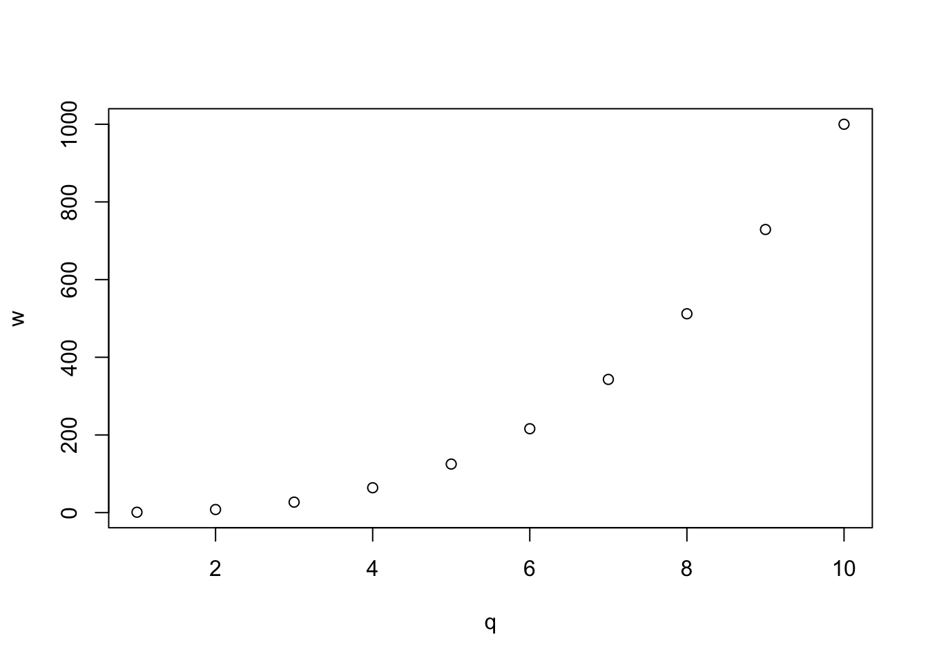
![]()
In the previous chapter, Chapter 14, you have learned about basic visualisation principles.
With these principles in mind, this chapter will teach you the basics of data visualisation (aka plotting) in R. In R, you can create plots using different systems: base R, ggplot2, plotly, lattice and others. This book focusses on the ggplot2 system, which is part of the tidyverse, but before we dive in, it is useful to have a look at the base R plotting system.
Let’s create two numeric vectors, q and w and plot them. The function plot() takes two arguments: the first argument x takes a vector with the horizontal coordinates (x-axis), here q, and the argument y takes a vector of the same length as the vector of the first argument, with the vertical coordinates (y-axis).
# N:M is a shortcut for all integer numbers between N and M
q <- 1:10
# w is the cube of q
w <- q^3
# Plot a scatter plot with x as the x-axis and y as the y-axis
plot(x = q, y = w)
The function takes care of adding tick-marks with numbers on the x and y axis, name the axes with the names of the vectors and add the points based on the coordinates in the vectors. It could not be easier! Now let’s add a few more things to this basic plot. Let’s specify we want a line plot (type = "l") instead of points, that the line should be coloured purple (col = "purple"), with a width of 3 (lwd = 3) and dashed (lty = "dashed"). The function connects the points from the coordinates given in the vectors with a line.
plot(q, w, type = "l", col = "purple", lwd = 3, lty = "dashed")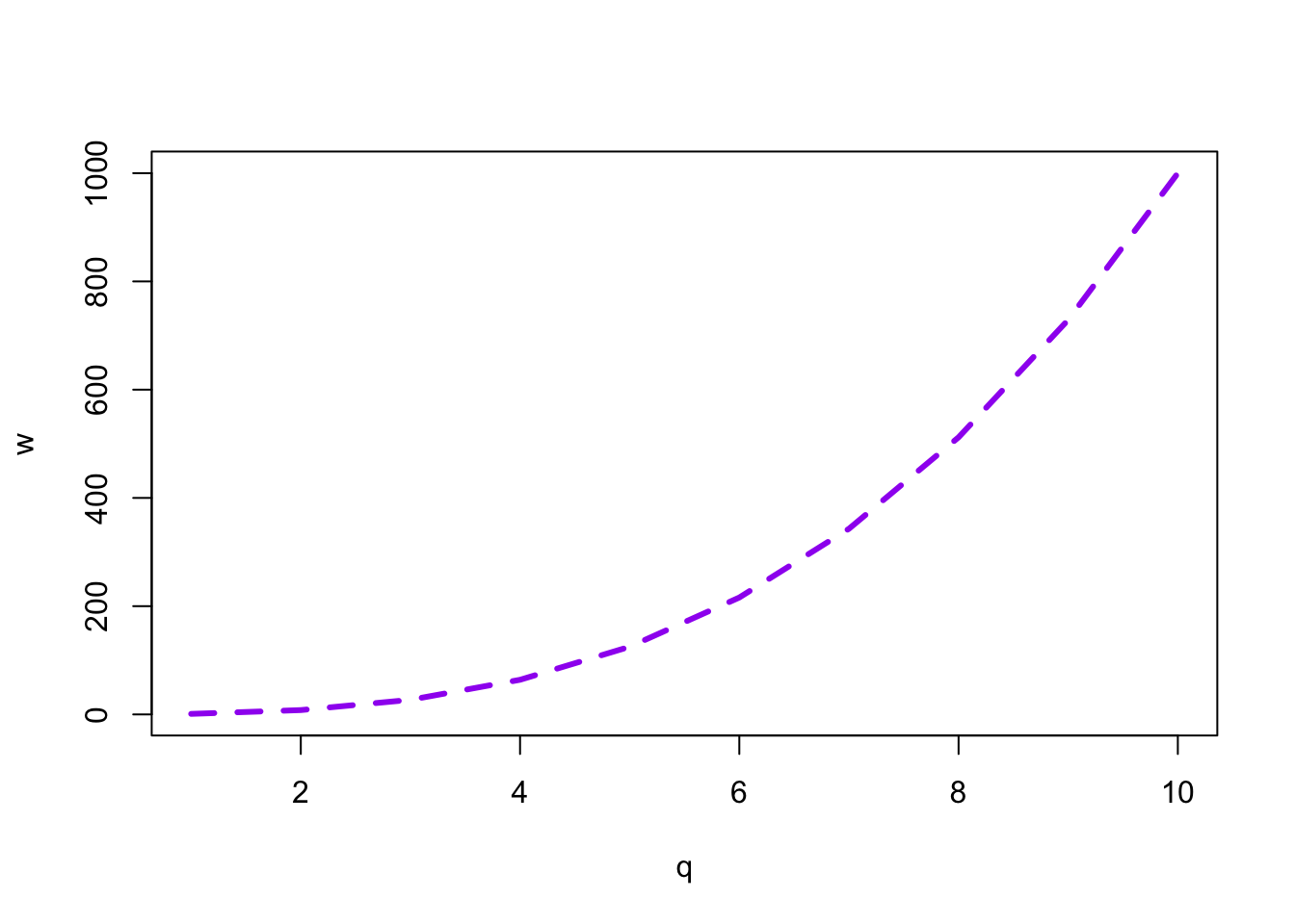
With plots as simple as this one, the base R plotting system is sufficient, but to create more complex plots (which is virtually always the case), base R gets incredibly complicated. Instead, we can use the tidyverse package ggplot2. ggplot2 works well with the other tidyverse packages and it follows the same principles, so it is convenient to use it for data visualisation instead of base R. The following sections will go through the basics of plotting with ggplot2.
The tidyverse package ggplot2 provides users with a consistent set of functions to create captivating graphics, and the package works well in combination with the other tidyverse packages. We will plot data from winter2012/polite.csv (Winter and Grawunder 2012) to learn the basics. We can read the data with read_csv() from readr and plot it with ggplot() from ggplot2. Since both readr and the ggplot2 package are part of the tidyverse, it is sufficient to attach the tidyverse with library(tidyverse).
library(tidyverse)

polite <- read_csv("data/winter2012/polite.csv")
polite
The polite data contains several acoustic measurements from utterances spoken by Korean students in Germany. Each row is a single utterance and each participant has spoken many utterances. These are the columns we will focus on.
f0mn: the mean f0 (fundamental frequency). This is the mean f0 of each utterance (i.e. the f0 is calculated along the entire utterance and the mean is taken).
H1H2: the difference between H2 and H1 (second and first harmonic; the paper reports that this “was based on the central vowel portion of each vowel” although it is not clear if the H1-H2 value of each vowel in the utterance was averaged to produce a mean H1-H2 difference per utterance). A higher H1-H2 difference indicates that the voice is more breathy (as opposed to modal).
gender: the gender of the speaker (F = female, M = male).
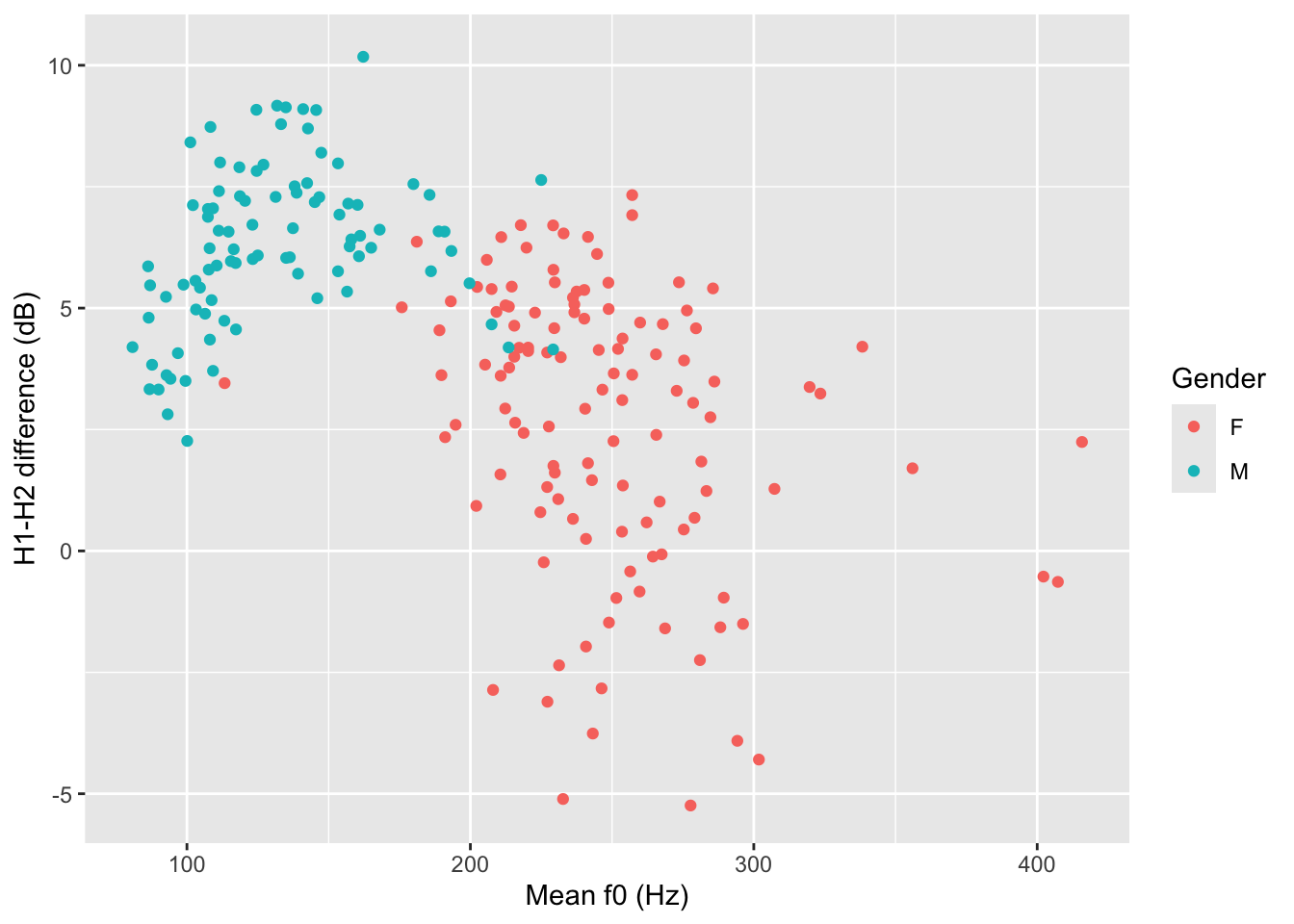
Figure 15.1 shows the plot we will end up with and you will learn how to create it bit by bit below. This plot is a scatter plot, with mean f0 on the x-axis and the H1-H2 difference on the y-axis. Each point represents an observation in the data, i.e. a row. The points are coloured based on the gender of the participant. You might notice that when mean f0 is high, the H1-H2 difference is lower. In other words, higher mean f0 corresponds to breathier voice.
Each ggplot2 plot has a minimum of two constituents (which correspond to two arguments of the ggplot() function): the data and aesthetics mapping.
You can specify the data and mapping with the data and mapping arguments of the ggplot() function. Note that the mapping argument is always specified with aes(): mapping = aes(…). In the following bare plot, we are just mapping f0mn to the x-axis and H1H2 to the y-axis, from the polite data frame. From this point on I will assume you’ll be creating a new code chunk, copy-paste the code and run it, without explicit instructions.
ggplot(
  data = polite,
  mapping = aes(x = f0mn, y = H1H2)
)
Not much to see here: just two axes! So where’s the data? Don’t worry, we didn’t do anything wrong. Showing the data itself requires a further step, adding geometries, which we’ll turn to next.
Our code so far makes nice axes, but we are missing the most important part: showing the data! Data is represented with geometries, or geoms for short. geoms are added to the base ggplot with functions whose names all start with geom_.
For this plot, you want to use geom_point(). This geom simply adds point to the plot based on the data in the polite data frame. To add geoms to a plot, you write a plus sign + at the end of the ggplot() command and include the geom on the next line.1 The geom_point() geometry creates a scatter plot, which is a plot with two continuous axes where data is represented with points. Figure 15.2 is a scatter plot of mean f0 (mnf0) and H1-H2 difference (H1H2).
ggplot(
  data = polite,
  mapping = aes(x = f0mn, y = H1H2)
) +
  geom_point()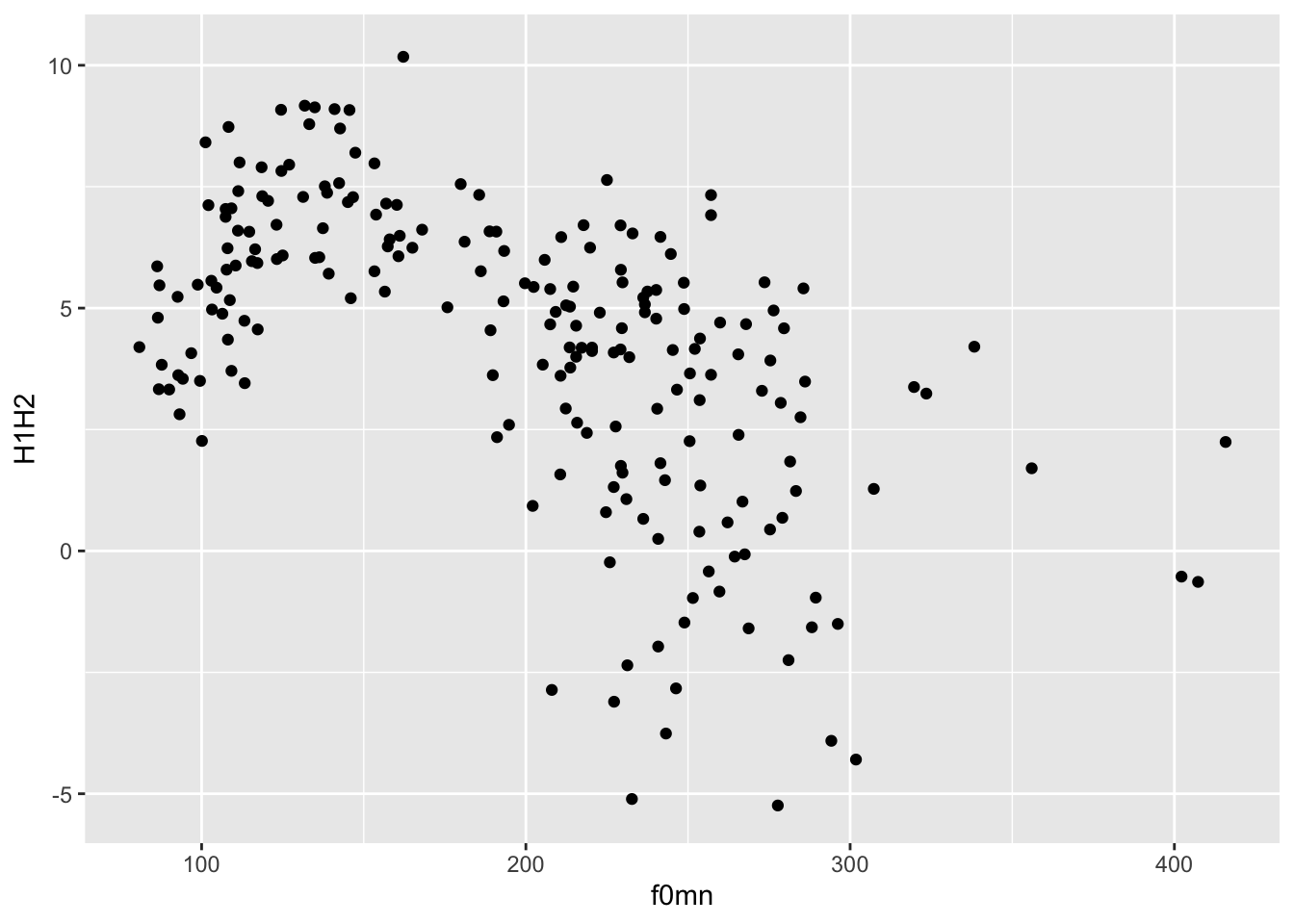
Look at Figure 15.2: is there a relationship between mean f0 and H1-H2? A pattern can be observed: when mean f0 is low, H1-H2 is high (meaning more breathiness) and when f0 is high, H1-H2 is low (meaning less breathiness). Statistically, this is called a negative relationship. The opposite is a positive relationship, when an increase in \(x\) corresponds to an increase in \(y\). Spoiler: the negative relationship in the plot is a mirage: if you look more closely, you might spot two subgroups in the data: one up to about 175 hz and one from 175 hz up. We will see below that these two groups correspond to the speakers’ genders.
For the time being, let’s pretend we don’t know that and we want to write a description of the plot and the pattern. You could describe the plot this way:
Figure 15.2 shows a scatter plot of mean f0 on the x-axis and H1-H2 difference on the y-axis. The plot suggest an overall negative relationship between mean f0 and H1-H2 difference. In other words, increasing mean f0 corresponds to decreasing breathiness.
Note that the data and mapping arguments don’t have to be named explicitly (with data = and mapping =) in the ggplot() function, since they are obligatory and they are specified in that order. So you can write:
ggplot(
  polite,
  aes(x = f0mn, y = H1H2)
) +
  geom_point()
In fact, you can also leave out x = and y =.
ggplot(
  polite,
  aes(f0mn, H1H2)
) +
  geom_point()
But we can go further. You can use the pipe |>, which you have encountered in Chapter 11.
polite |>
  ggplot(aes(f0mn, H1H2)) +
    geom_point()
You can of course stack multiple functions in the pipeline, like for example filtering the data before plotting it, like so:
polite |>
  # include only rows where f0mn < 300
  filter(f0mn < 300) |>
  ggplot(aes(f0mn, H1H2)) +
    geom_point()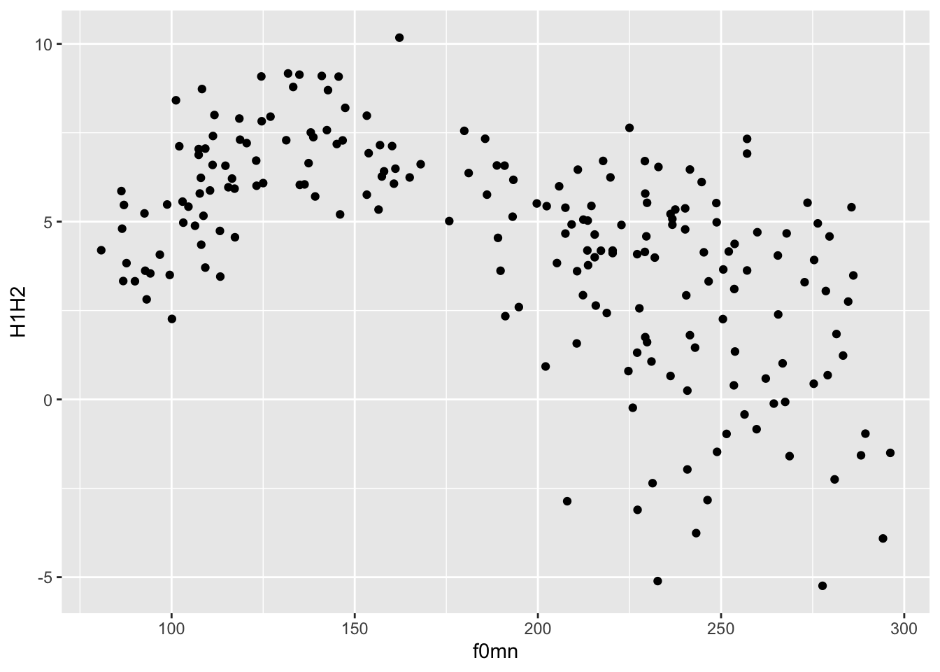
So far, the only aesthetics you have been using were the x and y aesthetics, which correspond to the x and y axes. ggplot2 has many other aesthetics that can be employed to represent other variables in the plot: in this section you will learn about colour (which is used to colour geometries, like points) and alpha (which is used to set the transparency of geometries).
colour aestheticAs mentioned above, there seems to be two subgroups within the data: one below about 175 Hz and one above it. These subgroups are in fact related to the gender of the participants. We can colour the points by gender, using the colour aesthetic.2 Figure 15.4 shows a scatter plot of mean f0 and the H1-H2 difference, with points coloured depending on the gender of the speaker. Now the two subgroups are quite visible, although we can also appreciate some overlap between the two gender subgroups (some blue points overlap with the red points and there is one red point that has a very low mean f0).
polite |>
  ggplot(aes(f0mn, H1H2, colour = gender)) +
  geom_point()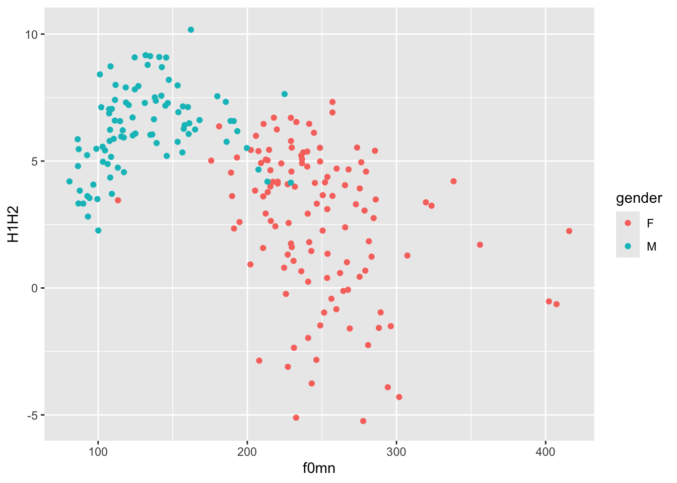
Notice how colour = gender must be inside the aes() function, because we are trying to map colour to the values of the column gender (when you map values to aesthetics, the aesthetics have to be inside aes()). Colours are automatically assigned to each level in gender (here, F for female which gets red and M for male which gets blue).
The default colour palette is used, but you can customise it. One way to quickly change the palette it to use one of the scale_colour_*() functions. A good option for our plot is scale_colour_brewer(). This function creates palettes based on ColorBrewer 2.0. There are three types of palettes (see the linked website for examples):
Sequential (seq): a gradient sequence of hues from lighter to darker.
Diverging (div): useful when you need a neutral middle colour and sequential colours on either side of the neutral colour.
Qualitative (qual): useful for categorical variables.
Let’s use the default qualitative palette, since gender is a categorical variable in the data. Figure 15.5 is the same as Figure 15.4, but we are now using a qualitative ColorBrewer palette.
polite |>
  ggplot(aes(f0mn, H1H2, colour = gender)) +
  geom_point() +
  scale_color_brewer(type = "qual")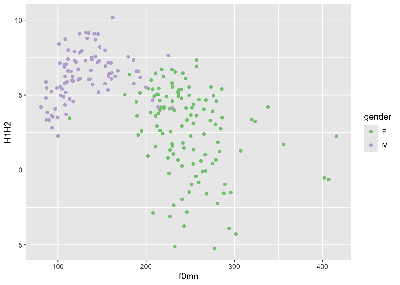
Another set of palettes is provided by scale_colour_viridis_d() (the d stands for “discrete” palette, to be used for categorical variables like gender). Figure 15.6 uses the “B” palette from the viridis palettes.
polite |>
  ggplot(aes(f0mn, H1H2, colour = gender)) +
  geom_point() +
  scale_color_viridis_d(option = "B")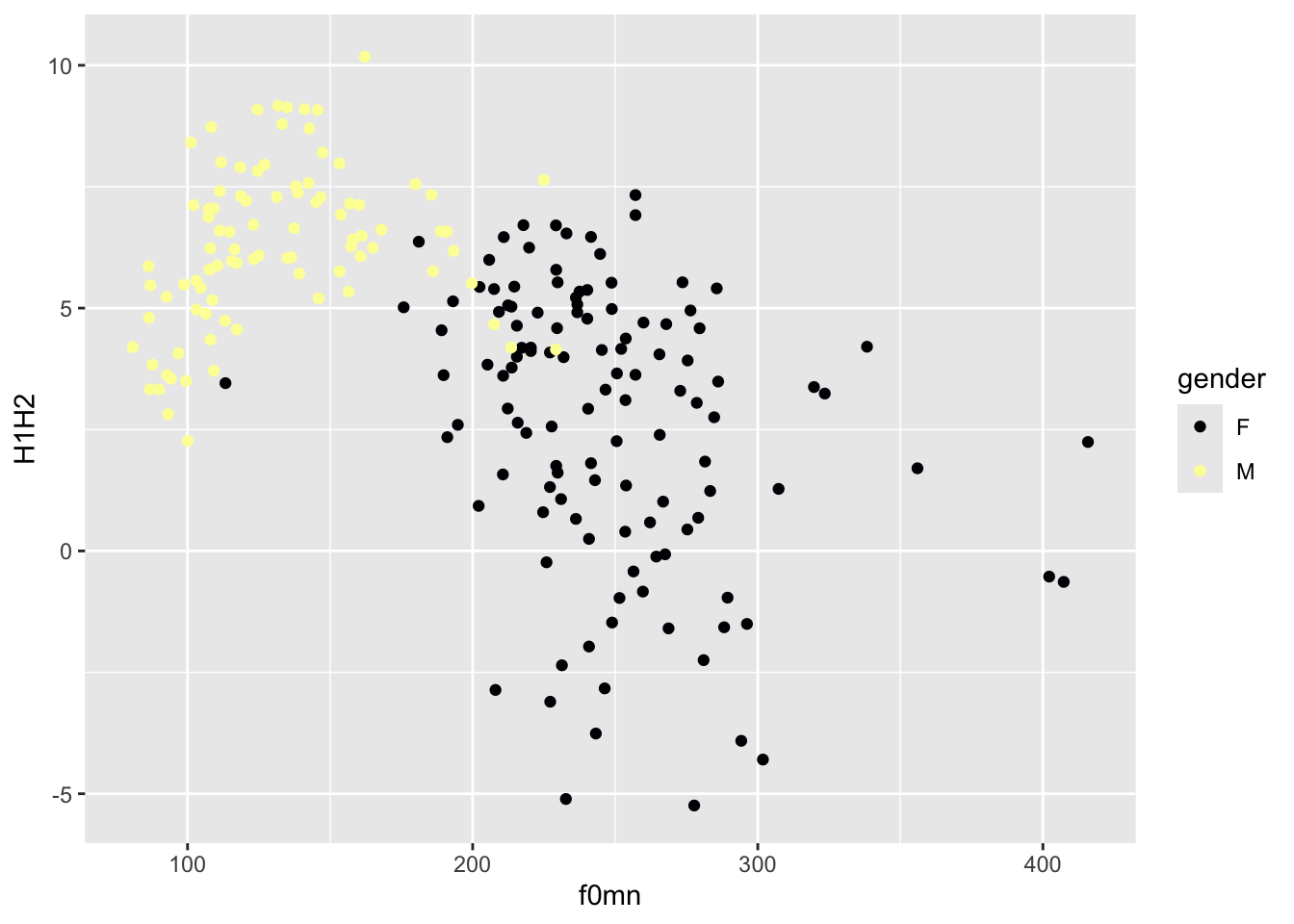
alpha aestheticAnother useful ggplot2 aesthetic is alpha. This aesthetic sets the transparency of the geometry: 0 means completely transparent and 1 means completely opaque. When you are setting the value of an aesthetic yourself that should apply to all instances of some geometry, rather than mapping an aesthetic to values in a specific column (like we did above with colour), you should add the aesthetic outside of aes() and usually in the geom function you want to set the aesthetic for. Set alpha for the point geometry to 0.5.
Setting a lower alpha is useful when there are a lot of points or other geometries that overlap with each other and it just looks like a blob of colour (so that, for example, you can’t really see the individual points). It is not the case here, and in fact reducing the alpha makes the plot quite illegible!
The labels of the plot, like the axes labels and the legend, are automatically included by ggplot2 based on the names of the variables/columns. If you want to change the labels to something you set yourself, you can use the labs() function, like in Figure 15.7 below.
polite |>
  ggplot(aes(f0mn, H1H2, colour = gender)) +
  geom_point() +
  labs(
    x = "Mean f0 (Hz)",
    y = "H1-H2 difference (dB)",
    colour = "Gender"
  )
Let’s rewrite out description of the plot from above to reflect the updates.
Figure 15.7 shows a scatter plot of mean f0 on the x-axis and H1-H2 difference on the y-axis, with points coloured by gender. The plot suggest an overall negative relationship between mean f0 and H1-H2 difference. However, the negative relationship appears to be an artefact of the presence of the two gender subgroups: male participants have lower mean f0 and higher H1-H2 difference (less breathiness), while female participants have higher f0 and lower H1-H2 difference (more breathiness).