Code
mald <- readRDS("data/tucker2019/mald_1_1.rds")

mald |>
  filter(RT_log > 6) |>
  ggplot(aes(RT_log)) +
  geom_density(fill = "purple", alpha = 0.5) +
  geom_rug(alpha = 0.1) +
  labs(x = "Reaction Times (logged ms)")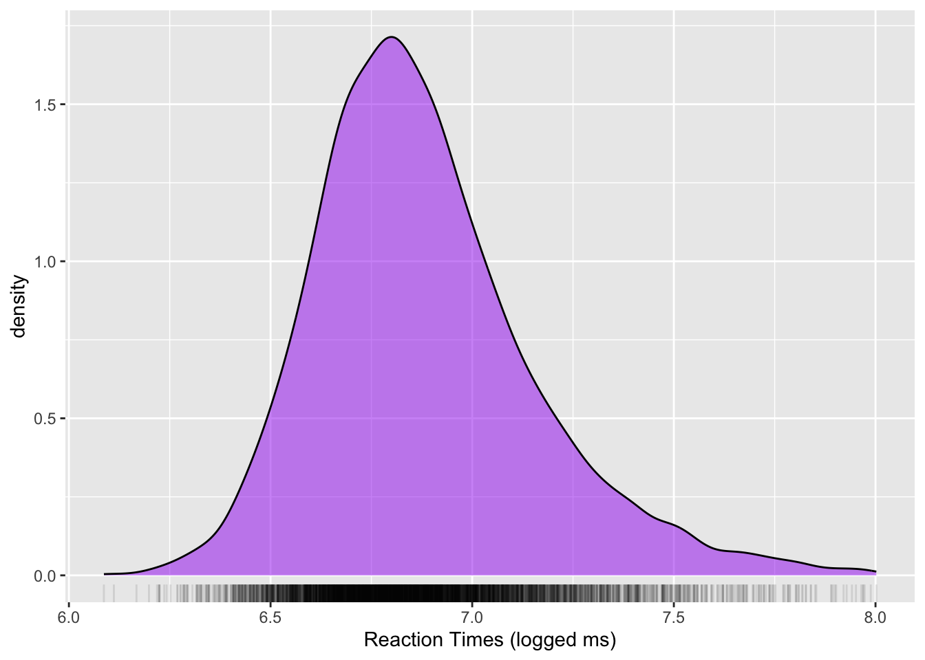
![]()

Imbuing numbers with meaning is a good characterisation of the inference process. Here is how it works. We have a question about something. Let’s imagine that this something is the population of British Sign Language signers. We want to know whether the cultural background of the BSL signers is linked to different pragmatic uses of the sign for BROTHER. But we can’t survey the entire population of BSL signers. So instead of surveying all BSL users, we take a sample from the BSL population. The sample is our data (the product of our study or observation). Now, how do we go from data/observation to answering our question about the use of BROTHER? We can use the inference process!
The figure below is a schematic representation of the inference process.
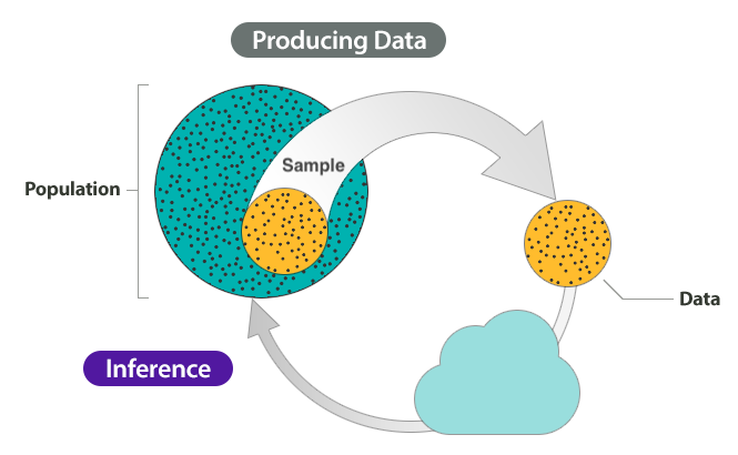
The inference process has two main stages: producing data and inference. For the first step, producing data, we start off with a population. Note that population can be a set of anything, not just a specific group of people. For example, the words in a dictionary can be a “population”; or the antipassive constructions of Austronesian languages, and so on. From that population, we select a sample and that sample produces our data. We analyse the data to get results. Finally, we use inference to understand something about the population based on the results from the sampled data. Inference can take many forms and the type of inference we are interested in here is statistical inference: i.e. using statistics to do inference.
However, despite inference being based on data, it does not guarantee that the answers to our questions are right or even that they are true. In fact, any observation we make comes with a certain degree of uncertainty and variability.
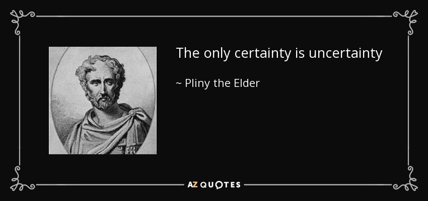
Pliny the Elder was a Roman philosopher who died in the Vesuvius eruption in 79 CE. He certainly did not expect to die then. Leaving dark irony aside, as researchers we have to deal with uncertainty and variability.
So uncertainty is a feature of each measurement, while variability occurs between different measurements. Together, uncertainty and variability render the inference process more complex and can interfere with its outcomes.
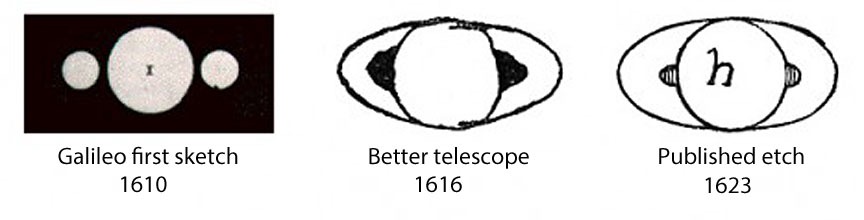
The following picture is a reconstruction of what Galileo Galilei saw when he pointed one of his first telescopes towards Saturn, based on his 1610 sketch: a blurry circle flanked by two smaller blurry circles.

Only six years later, telescopes were much better and Galileo could correctly identify that the flanking circles were not spheres orbiting around Saturn, but rings. The figures below show how the sketches evolved over time between first observation and publication.
The moral of the story is that at any point in history we are like Galileo in at least some of our research: we might be close to understanding something but not quite yet.
To give a more concrete example of how each sample is but an imperfect represetation of the population it is taken from, let’s look at reaction times (RTs) data from the MALD dataset (Tucker et al. 2019). The study the data comes from used an auditory lexical decision task to elicit RTs and accuracy data. In each trial, participants listened to a word and pressed a button to say if the word is a real English word or not. The RT is the time lag between the offset of the auditory stimulus (the target word) and the button press. Note that to keep things more manageable, the data we will read is just a subset of the full data. Figure 6.1 shows a density plot of the data: the x-axis is the range of RTs (in logged milliseconds), while the y-axis shows the “density” of the data. Higher density means that the data contains a lot of observations in that region. Conversely, low density means that the data does not contain a lot of observations in that range. You will learn more about density plots in Chapter 18.
mald <- readRDS("data/tucker2019/mald_1_1.rds")
mald |>
filter(RT_log > 6) |>
ggplot(aes(RT_log)) +
geom_density(fill = "purple", alpha = 0.5) +
geom_rug(alpha = 0.1) +
labs(x = "Reaction Times (logged ms)")The mean logged RT is 6.88 and the standard deviation (a measure of dispersion around the mean, you will learn about them in Chapter 10) is 0.28. We might take these values as the mean and standard deviation of the population of logged RTs. But this would not be correct: these are the sample mean and standard deviation. To show why we cannot take these to be the mean and standard deviation of the population, we can simulate RT data based on those values (you will understand the details of this later on, when you learn about probability distributions in Chapter 18, so for now just stay for the ride).
set.seed(9899)
rt_l <- list()
for (i in 1:10) {
  rt_l[i] <- list(rlnorm(n = 20, mean(mald$RT_log), sd(mald$RT_log)))
}
We sample 20 randomly generated values from a distribution with mean 6.88 and standard deviation 0.28. We then can take the mean and SD of these generated values and compare them to the original distribution’s mean and SD. But we can go further and sample 20 values 10 times. This procedure gives us 10 means and standard deviations, one for each sample of 20 values. The means and standard deviations of these 10 random samples are shown in Table 27.3.
| sample | mean | sd |
|---|---|---|
| 1 | 6.84 | 0.24 |
| 2 | 7.02 | 0.30 |
| 3 | 6.92 | 0.19 |
| 4 | 6.88 | 0.31 |
| 5 | 6.84 | 0.27 |
| 6 | 6.80 | 0.22 |
| 7 | 6.84 | 0.25 |
| 8 | 6.95 | 0.34 |
| 9 | 6.99 | 0.31 |
| 10 | 6.97 | 0.32 |
You will notice that, while all the means and SD are very close to the mean and SD we sampled from, they are not exactly the same: every sample’s mean and SD are slightly different from each other and from the mean and SD we sample from. In other words, it’s very very unlikely that the sample mean and standard deviation are exactly the population mean and standard deviation. Inference is affected by uncertainty and variability. So what do we do with such uncertainty and variability? We can use statistics to quantify them!
But what is statistics exactly?
Statistics is a tool. But what does it do? There are at least four ways of looking at statistics as a tool.
Statistics is the science concerned with developing and studying methods for collecting, analyzing, interpreting and presenting empirical data. (From UCI Department of Statistics)
Statistics is the technology of extracting information, illumination and understanding from data, often in the face of uncertainty. (From the British Academy)
Statistics is a mathematical and conceptual discipline that focuses on the relation between data and hypotheses. (From the Standford Encyclopedia of Philosophy)
Statistics is the art of applying the science of scientific methods. (From ORI Results, Nature)
To quote a historically important statistician:
Statistics is a many things, but it is also not a lot of things.
Statistics is not maths, but it is informed by maths.
Statistics is not about hard truths, but about how to seek the truth.
Statistics is not a purely objective endeavour. In fact there are a lot of subjective aspects to statistics (see below).
Statistics is not a substitute of common sense and expert knowledge.
Statistics is not just about \(p\)-values and significance testing.
As Gollum would put it, all that glisters is not gold.

In Silberzahn et al. (2018), a group of researchers asked 29 independent analysis teams to answer the following question based on provided data: Is there a link between player skin tone and number of red cards in soccer? Crucially, 69% of the teams reported an effect of player skin tone, and 31% did not. In total, the 29 teams came up with 21 unique types of statistical analysis. These results clearly show how subjective statistics is and how even a straightforward question can lead to a multitude of answers. To put it in Silberzahn et al’s words: “The observed results from analyzing a complex data set can be highly contingent on justifiable, but subjective, analytic decisions. This is why you should always be somewhat sceptical of the results of any single study: you never know what results might have been found if another research team did the study. This is one of the reasons why replicating research is very important. You will learn about replication and related concepts in Chapter 17.
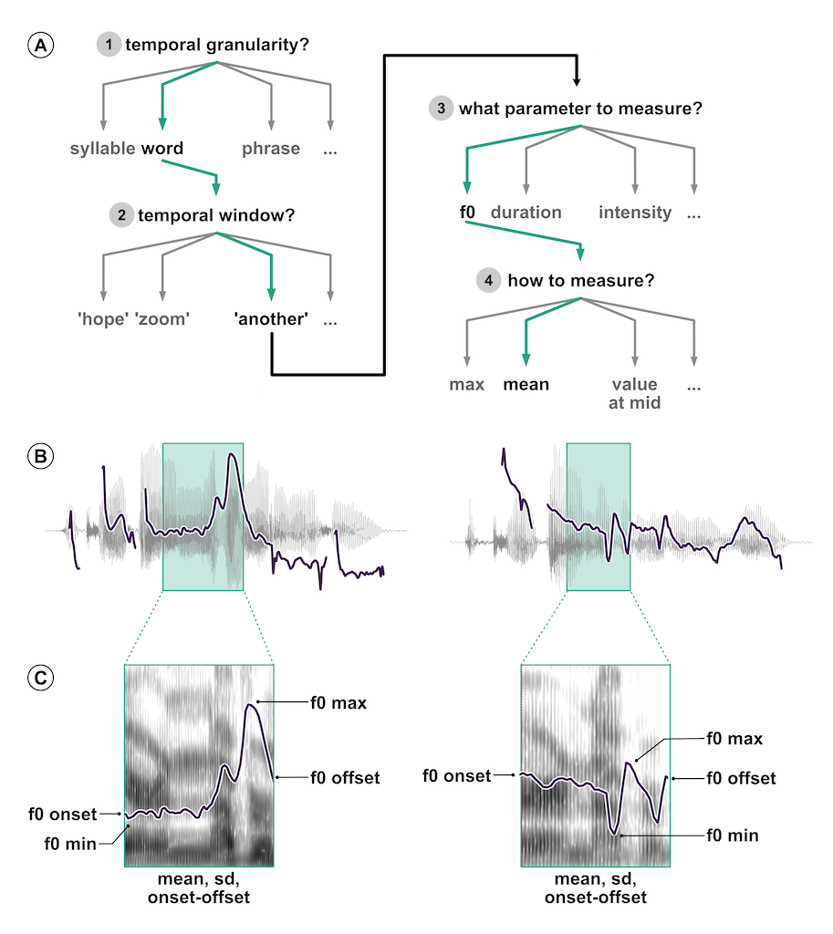
Coretta et al. (2023) tried something similar, but in the context of the speech sciences: they asked 30 independent analysis teams (84 signed up, 46 submitted an analysis, 30 submitted usable analyses) to answer the question: Do speakers acoustically modify utterances to signal atypical word combinations? Outstandingly, the 30 teams submitted 109 individual analyses—a bit more than 3 analyses per team!—and 52 unique measurement specifications in 47 unique model specifications. Coretta et al. (2023) say: “Nine teams out of the thirty (30%) reported to have found at least one statistically reliable effect (based on the inferential criteria they specified). Of the 170 critical model coefficients, 37 were claimed to show a statistically reliable effect (21.8%).” Figure 6.2 illustrates the analytic flexibility typical of acoustic analyses. (A) shows the pipeline of decision a researcher would have to do: which linguistic unit, which temporal window, which acoustic parameters and how to measure those. You can appreciate that there are potentially many combinations. (B) illustrates the fundamental frequency (f0) contour of the sentences “I can’t bear ANOTHER meeting on Zoom” and “I can’t bear another meeting on ZOOM”. In both sentences, the green shaded area marks the word “another”. Finally, in (C) you see the different parameters that can be extracted from the f0 contour of the word “another”. In sum, there are many choices a researcher is faced with and, while most of these choices might be justifiable, they are still subjective, as shown by the large variability of actual analyses carried out by the analysis teams in Coretta et al. (2023).
The Silberzahn et al. (2018) and Coretta et al. (2023) studies are just the tip of the iceberg. We are currently facing a “research crisis”. As mentioned above, we will dig deeper into this subject in Chapter 17. In brief, the research crisis is a mix of problems related to how research is conducted and published. In response to the research crisis, Cumming (2013) introduced a new approach to statistics, which he calls the “New Statistics”. The New Statistics mainly addresses three problems: (1) published research is a biased selection of all (existing and possible) research; (2) data analysis and reporting are often selective and biased, (3) in many research fields, studies are rarely replicated, so false conclusions persist. To help solve those problems, the New Statistics proposes these solutions (among others): (1) promoting research integrity, by which researchers explicitly discuss the subjectivity and shortcomings of quantitative research, (2) shifting away from statistical significance of differences between groups to quantitative estimation of those differences, (3) building a cumulative quantitative discipline, in which phenomena are studied again and again in the same contexts and with the same conditions to ensure they are robust enough.
Kruschke and Liddell (2018) revisit the New Statistics and make a further proposal: to adopt the historically older but only recently popularised approach of Bayesian statistics. They call this the Bayesian New Statistics. The classical approach to statistics is the frequentist method, based on work by Fisher, Neyman and Pearson. Put simply, frequentist statistics is based on rejecting the “null hypothesis” (i.e. the hypothesis that there is no difference between groups) using p-values. Bayesian statistics provides researchers with more appropriate and more robust ways to answer research questions, by reallocating belief or credibility across possibilities. You will learn more about the frequentist and the Bayesian approaches in Chapter 20.
This textbook adopts the Bayesian New Statistics approach. Note that we will not really touch upon Bayesian statistics in the strict sense until Chapter 20, just before statistical modelling will be introduced. So you should not worry too much about it for now: just try to appreciate that not only is statistics not intended to objectively separate truths from falsities, but also there are several ways to practise statistics. After all, statistics is a human activity, and like all other human activities it is embedded in the world constructed by humans and their idiosyncrasies.