# Set the seed for reproducibility
set.seed(9182)

rbinom(1, 10, 0.5)
[1] 6![]()
![]()
Binary outcome variables are very common in linguistics. These are categorical variable that have two levels, e.g.:
So far you have been fitting regression models in which the outcome variable was numeric and continuous. However, a lot of studies use binary outcome variables and it thus important to learn how to deal with those. This is what this chapter is about.
When modelling binary outcomes, what the researcher is usually interested in is the probability of obtaining one of the two levels. For example, in a lexical decision task one might want to know the probability that real words were recognised as such (in other words, we are interested in accuracy: incorrect or correct response). Let’s say there is an 80% probability of responding correctly. So (\(p()\) stands for “probability of”):
\[ \begin{aligned} p(\text{correct}) & = 0.8\\ p(\text{incorrect}) & = 1 - p(\text{correct}) = 0.2 \end{aligned} \]
You see that if you know the probability of one level (correct) you automatically know the probability of the other level, since there are only two levels and the total probability has to sum to 1. The distribution family for binary probabilities is the Bernoulli family. The Bernoulli family has only one parameter, \(p\), which is the probability of obtaining one of the two levels (one can pick which level). With our lexical decision task example, we can write:
\[ \begin{aligned} resp_{\text{correct}} & \sim Bernoulli(p) \\ p & = 0.8 \end{aligned} \]
You can read it as:
The probability of getting a correct response follows a Bernoulli distribution with \(p\) = 0.8.
If you randomly sampled from \(Bernoulli(0.8)\) you would get “correct” 80% of the times and “incorrect” 20% of the times. We can test this in R. In previous chapters we used the rnorm() function to generate random numbers from Gaussian distributions. R doesn’t have an rbern() function, so we have to use the rbinom() function instead. The function generates random observations from a binomial distribution: the binomial distribution is a more general form of the Bernoulli distribution. It has two parameters, \(n\) the number of trials and \(p\) the “success” probability of each trial. If we code each level in the binary variable as 0 and 1, \(p\) is the probability of getting 1 (that’s why it is called the “success” probability).
\[ Binomial(n, p) \]
Think of a coin: you flip it 10 times so \(n = 10\) (ten trials). If this is a fair coin, then \(p\) should be 0.5: 50% of the times you get head (1) and 50% of the times you get tail (0). The rbinom() function takes three arguments: n number of observations (maybe confusingly, not the number of trials), size the number of trials, and p the probability of success. The following code simulates 10 flips of a fair coin with rbinom().
# Set the seed for reproducibility
set.seed(9182)
rbinom(1, 10, 0.5)[1] 6The output is 6, meaning 6 out of 10 flips had head (1). Note that the probability of success \(p\) is the mean probability of success. In any one observation, you won’t necessarily get 5 of 10 with \(p = 0.5\), but if you take many 10-trial observations, then on average you should get pretty close to 0.5. Let’s try this:
# Set the seed for reproducibility
set.seed(9182)

mean(rbinom(100, 10, 0.5))
[1] 5.08Here we took 100 observations of 10 flips. On average, about 5 of 10 flips got head (it is not precisely 5, but very close).
A Bernoulli distribution is simply a binomial distribution with a single trial. Imagine again a lexical decision task: each word presented to the participant is one trial and in each trial there is a probability \(p\) of getting it right (correctly identifying the type of the word). We can thus use rbinom() with size set to 1. Let’s get 25 observations of 1 trial each.
# Set the seed for reproducibility
set.seed(9182)

rbinom(25, 1, 0.8)
[1] 1 0 1 1 1 1 0 1 1 0 1 1 0 1 1 1 1 1 1 1 1 1 1 1 1For each trial, we get a 1 for correct or a 0 for incorrect. If you take the mean of the trials it should be very close to 0.8 (with those random observations, it is 0.84). Again, \(p\) is the mean probability of success across trials.
Now, what we are trying to do when modelling binary outcome variables is to estimate the probability \(p\) from the data. But there is a catch: probabilities are bounded between 0 and 1 and regression models don’t work with bounded variables out of the box! Bounded probabilities are transformed into an unbounded numeric variable. The following section explains how.
As we have just learned, probabilities are bounded between 0 and 1 but we need something that is not bounded because regression models don’t work with bounded numeric variables. This is where the logit function comes in: the logit function (from “logistic unit”) is a mathematical function that transforms probabilities into log-odds. The logit function is the quantile function (the function that returns quantiles, the value below which a given proportion of a probability distribution lies) of the logistic distribution. The logit function is the quantile of a logistic function with mean 0 and standard deviation 1 (a standard logistic distribution). In R, the logit function is qlogis(). The default mean and SD in qlogis() are 0 and 1 respectively, so you can just input the first argument, p which is the probability you want to transform into log-odds.
qlogis(0.2)[1] -1.386294qlogis(0.5)[1] 0qlogis(0.8)[1] 1.386294Figure 30.1 shows the logit function (the quantile function of the standard logistic distribution). The probabilities on the x-axis are transformed into log-odds on the y axis. When you fit a regression model with a binary outcome and a Bernoulli family, the estimates of the regression coefficients are in log-odds.
dots <- tibble(
  p = seq(0.1, 0.9, by = 0.1),
  log_odds = qlogis(p)
)

log_odds_p <- tibble(
  p = seq(0, 1, by = 0.001),
  log_odds = qlogis(p)
) %>%
  ggplot(aes(p, log_odds)) +
  geom_vline(xintercept = 0.5, linetype = "dashed") +
  geom_vline(xintercept = 0, colour = "#8856a7", linewidth = 1) +
  geom_vline(xintercept = 1, colour = "#8856a7", linewidth = 1) +
  geom_hline(yintercept = 0, alpha = 0.5) +
  geom_line(linewidth = 2) +
  geom_point(data = dots, size = 4) +
  geom_point(x = 0.5, y = 0, colour = "#8856a7", size = 4) +
  annotate("text", x = 0.2, y = 3, label = "logit(p) = log-odds") +
  scale_x_continuous(breaks = seq(0, 1, by = 0.1), minor_breaks = NULL, limits = c(0, 1)) +
  scale_y_continuous(breaks = seq(-6, 6, by = 1), minor_breaks = NULL) +
  labs(
    x = "Probability",
    y = "Log-odds"
  )
log_odds_p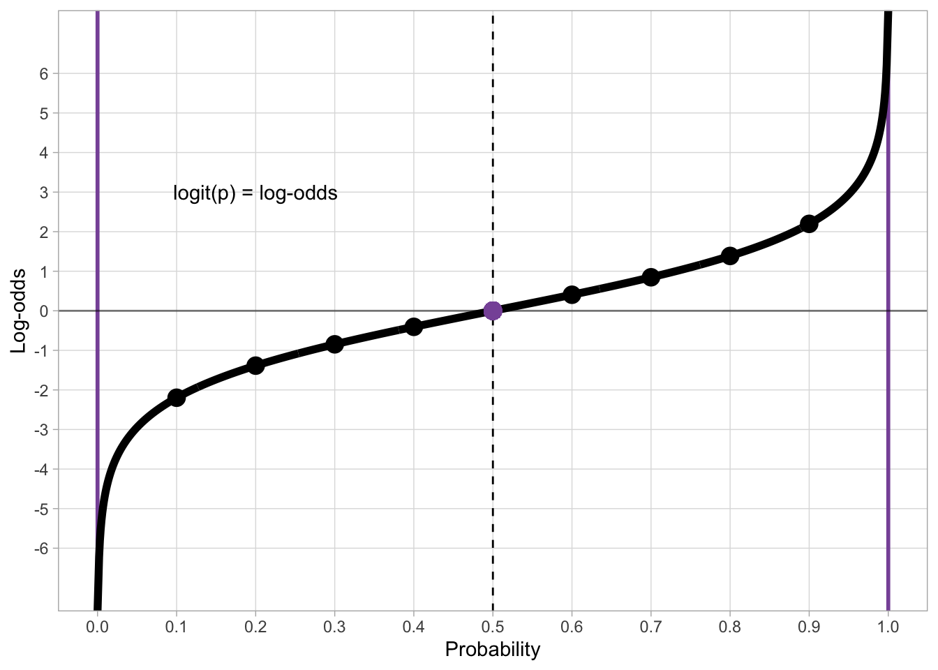
To go back from log-odds to probabilities, we use the inverse logit function. This is the CDF of the standard logistic distribution. In R, you apply the inverse logit function (also called the logistic function, because it is the CDF of the standard logistic distribution) with plogis(). As with qnorm(), the default mean and SD are 0 and 1 respectively so you can just input the log-odds you want to transform into probabilities as the first argument q.
plogis(-3)[1] 0.04742587plogis(0)[1] 0.5plogis(2)[1] 0.8807971plogis(6)[1] 0.9975274# To show that plogis is the inverse of qlogis
plogis(qlogis(0.2))[1] 0.2Figure 30.1 shows the inverse logit transformation of log-odds (on the x-axis) into probabilities (on the y-axis). The inverse logit constructs the typical S-shaped curve (black thick line) of the CDF of the standard logistic distribution. Since probabilities can’t be smaller than 0 and greater than 1, the black line slopes in either direction and it approaches 0 and 1 on the y-axis without ever reaching them (in mathematical terms, it’s an asymptotic line). It is helpful to just memorise that log-odds 0 corresponds to probability 0.5 (and vice versa of course).
dots <- tibble(
  p = seq(0.1, 0.9, by = 0.1),
  log_odds = qlogis(p)
)

p_log_odds <- tibble(
  p = seq(0, 1, by = 0.001),
  log_odds = qlogis(p)
) %>%
  ggplot(aes(log_odds, p)) +
  geom_hline(yintercept = 0.5, linetype = "dashed") +
  geom_hline(yintercept = 0, colour = "#8856a7", linewidth = 1) +
  geom_hline(yintercept = 1, colour = "#8856a7", linewidth = 1) +
  geom_vline(xintercept = 0, alpha = 0.5) +
  geom_line(linewidth = 2) +
  # geom_point(data = dots, size = 4) +
  geom_point(x = 0, y = 0.5, colour = "#8856a7", size = 4) +
  annotate("text", x = -4, y = 0.8, label = "inv_logit(log-odds) = p") +
  scale_x_continuous(breaks = seq(-6, 6, by = 1), minor_breaks = NULL, limits = c(-6, 6)) +
  scale_y_continuous(breaks = seq(0, 1, by = 0.1), minor_breaks = NULL) +
  labs(
    x = "Log-odds",
    y = "Probability"
  )
p_log_odds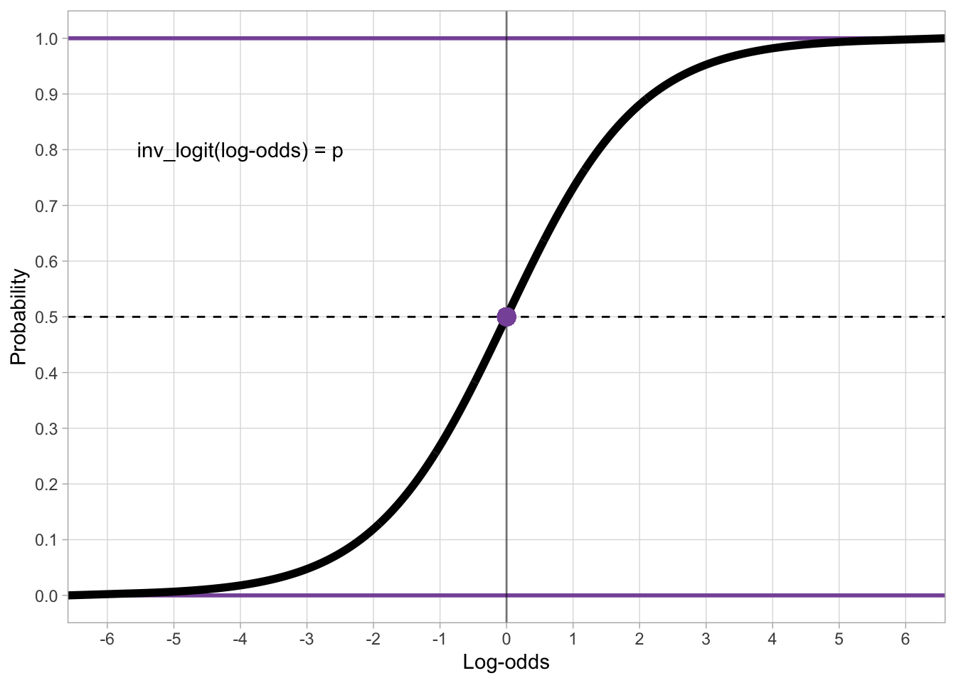
To illustrate how to fit a Bernoulli model, we will use data from Brentari et al. (2024) on the emergent Nicaraguan Sign Language (Lengua de Señas Nicaragüense, NSL).
verb_org <- read_csv("data/brentari2024/verb_org.csv")
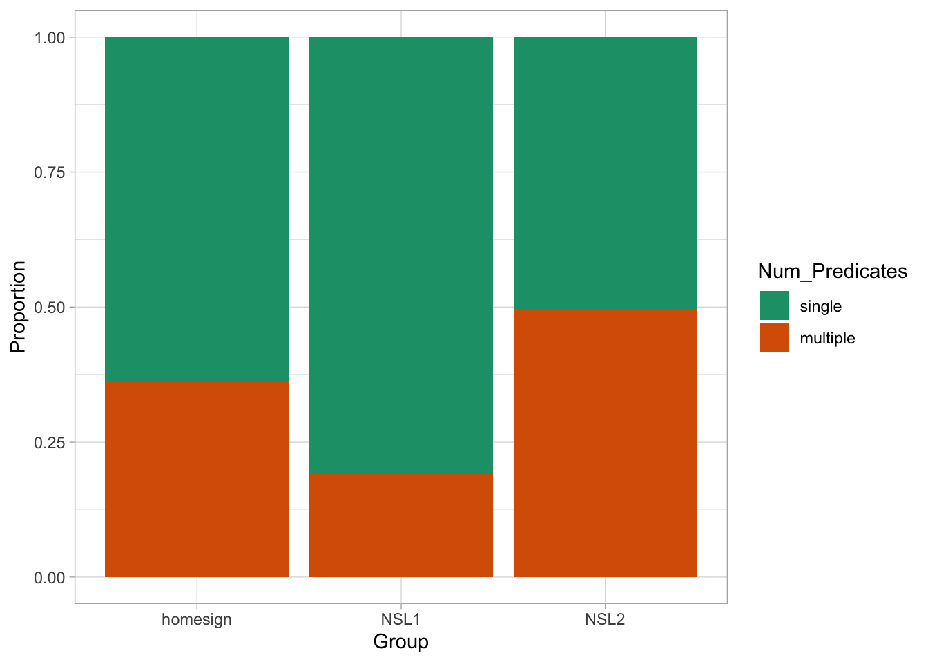
verb_orgverb_org contains information on predicates as signed by three groups (Group): home-signers (homesign), first generation NSL signers (NSL1) and second generation NSL signers (NSL2). Specifically, the data coded in Num_Predicates whether the predicates uttered by the signer were single-verb predicates (single) or a multi-verb predicates (multiple). The hypothesis of the study is that use of multi-verb predicates would increase with each generation, i.e. that NSL1 signers would use more multi-verb predicates than home-signers and that NSL2 signers would use more multi-verb predicates than home-signers and NSL1 signers. (For the linguistic reasons behind this hypothesis, check the paper linked above). Figure 30.3 shows the proportion of single vs multiple predicates in the three groups.
verb_org |>
  ggplot(aes(Group, fill = Num_Predicates)) +
  geom_bar(position = "fill") +
  scale_fill_brewer(palette = "Dark2") +
  labs(
    y = "Proportion"
  )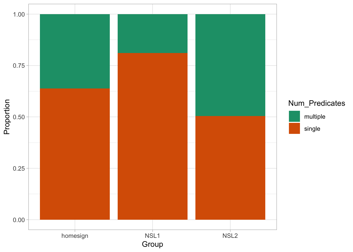
What do you notice about the type of predicates in the three groups? Does it match the hypothesis put forward by the paper? We can calculate the proportion of multi-verb predicates by creating a column which codes Num_Predicates with 0 for single and 1 for multi-verbs predicates. This is the same dummy coding we encountered in Chapter 27 for categorical predictors, but now we apply that to a binary outcome variable. Then you just take the mean of the dummy column by group, to obtain the proportion of multi-verb predicates for each group. Note that since we code multi-verb predicates with 1, taking the mean gives you the proportion of multi-verb predicates and the proportion of single predicates is just \(1 - p\) where \(p\) is the proportion of multi-verb predicates.
verb_org <- verb_org |>
  mutate(
    Num_Pred_dum = ifelse(Num_Predicates == "multiple", 1, 0)
  )

verb_org |>
  group_by(Group) |>
  summarise(
    prop_multi = round(mean(Num_Pred_dum), 2)
  )
On average, home-signers produce 36% of multi-verb predicates, first generation signers (NSL1) 19% and second generation signers (NSL2) 50%. In other words, there is a decrease in production of multi-verb predicates from home-signers to NSL1 signers, while NSL2 signers basically just use either single or multi-verb predicates. Most times, it is also useful to plot the proportion for each participant separately. Unfortunately, this is an area where bad practices have become standard so it is worth spending some time on this, in a new section.
A common (but incorrect) way of plotting proportion/percentage data (like accuracy, or the single vs multi-verb predicates of the verb_org dataset) is to calculate the proportion of each participant and then produce a bar chart with error bars that indicate the mean proportion (i.e. the mean of the proportions of each participant) and the dispersion around the mean accuracy. You might have seen something like Figure 30.4 in many papers. This type of plot is called “bars and whiskers” because the error bars look like cat whiskers.
verb_org |>
  group_by(Participant, Group) |>
  summarise(prop = sum(Num_Pred_dum) / n(), .groups = "drop") |>
  group_by(Group) |>
  add_tally() |>
  summarise(mean_prop = mean(prop), sd_prop = sd(prop)) |>
  ggplot(aes(Group, mean_prop)) +
  geom_bar(stat = "identity") +
  geom_errorbar(
    aes(
      ymin = mean_prop - sd_prop / sqrt(46),
      ymax = mean_prop + sd_prop / sqrt(46)
    ),
    width = 0.2
  )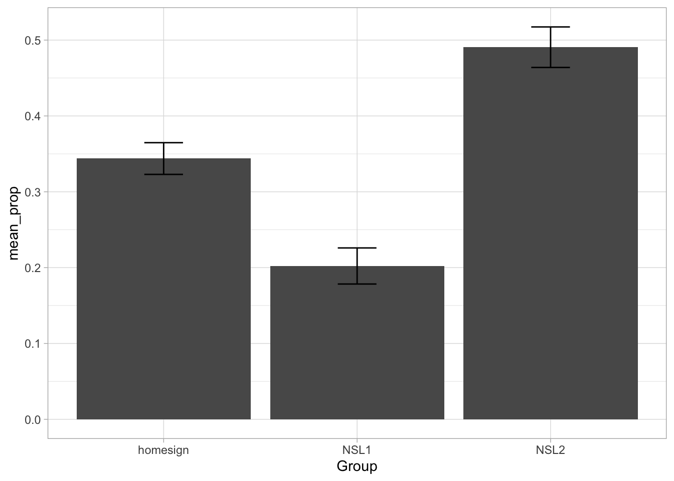
THE HORROR. Alas, this is a very bad way of processing proportion data. You can learn why in Holtz (2019).1 The alternative (robust) way to plot proportion data is to show the proportion for individual participants. To do so we can use a combination of summarise(), geom_jitter() and stat_summary(). First, we need to compute the proportion of multi-verb predicates by participant. The procedure is the same as calculating the proportion for the three signer groups, but now we do it for each participant. Note that participants only have a unique ID within group, so we need to group by participant and group (we need the group information any way to be able to plot participants by group below). We save the output to a new tibble verb_part.
verb_part <- verb_org |>
  group_by(Participant, Group) |>
  summarise(
    prop_multi = round(mean(Num_Pred_dum), 2),
    .groups = "drop"
  )
Now we can plot the proportions and add mean and confidence intervals using geom_jitter() and stat_summary(). Before proceeding, you need to install the Hmisc package. There is no need to attach it (it is used by stat_summary() under the hood). Remember not to include the code for installation in your document; you need to install the package only once. After several years of teaching, I still see a lot of students having install.packages() in their scripts.
ggplot() +
  # Proportion of each participant
  geom_jitter(
    data = verb_part,
    aes(x = Group, y = prop_multi),
    width = 0.1, alpha = 0.5
  ) +
  # Mean proportion by stimulus with confidence interval
  stat_summary(
    data = verb_org,
    aes(x = Group, y = Num_Pred_dum, colour = Group),
    fun.data = "mean_cl_boot", size = 0.5
  ) +
  labs(
    title = "Proportion of multi-verb responses by participant and stimulus",
    caption = "Mean proportion is represented by coloured points with 95% bootstrapped Confidence Intervals.",
    x = "Stimulus",
    y = "Proportion"
  ) +
  ylim(0, 1) +
  theme(legend.position = "none")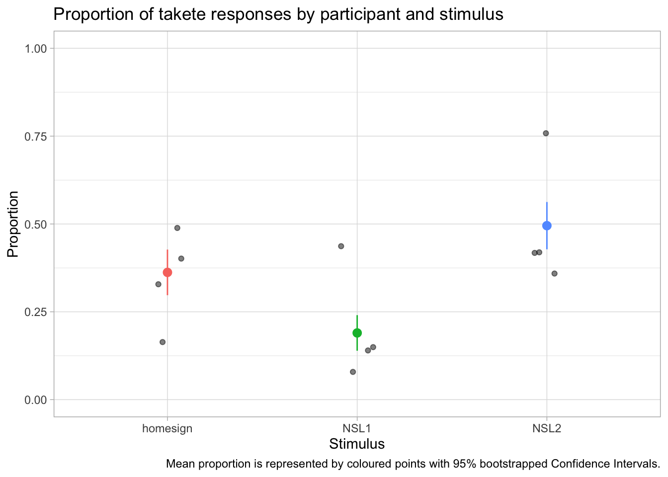
In this data we don’t have many participants for group, but you can immediately appreciate the variability between participants. You will notice something new in the code: we have specified the data inside geom_jitter() and stat_summary() instead of inside ggplot(). This is because the two functions need different data: geom_jitter() needs the data with the proportion we calculated for each participant and group; stat_summary() needs to calculate the mean and CIs from the overall data, rather than from the proportion data we created. This is the aspect that a lot of researchers get wrong: you should not take the mean of the participant proportions, unless all participants have exactly the same number of observations. In the verb_org data specifically, the number of observations do indeed differ for each participant. You can check this yourself by getting the number of observations per participant per group with the count() function. We are also specifying the aesthetics within each geom/stat function, because while x is the same, the y differs! In stat_summary(), the fun.data argument lets you specify the function you want to use for the summary statistics to be added. Here we are using the mean_cl_boot function, which returns the mean proportion of Response_num and the 95% Confidence Intervals (CIs) of that mean. The CIs are calculated using a bootstrapping procedure (if you are interested in learning what that is, check the documentation of smean.sd from the Hmisc package).
This also creates a nice opportunity to mention one shortcoming of the models we are fitting, thinking a bit ahead of ourselves: the regression models we cover in Week 4 to 10 do not account for the fact that the data comes from multiple participants and instead they just assume that each observation in the data set is from a different participant. When you have multiple observations from each participant, we call this a repeated measure design. This is a problem because it breaks one assumption of regression models: that all the observations are independent from each other. Of course, if they come from the same participant, they are not independent. We won’t have time in this course to learn about the solution (i.e. hierarchical regression models, also known as multi-level, mixed-effects, nested-effects, or random-effects models; these are just regression models that are set up so they can account for hierarchical grouping in the data, like multiple observations from multiple participants, or multiple pupils from multiple classes from multiple schools), but I point you to further resources in Chapter 37 (TBA).
The hypothesis of the study is that use of multi-verb predicates would increase with each generation. To statistically assess this hypothesis and obtain estimates of the proportion of multiple predicates, we can fit a Bernoulli model with Num_Predicates as the outcome variable and Group as a categorical predictor. Before we move on onto fitting the model, it is useful to transform Num_Predicates into a factor and specify the order of the levels so that single is the first level and multiple is the second level. We need this because Bernoulli models estimate the probability (the parameter \(p\) in \(Bernoulli(p)\)) of obtaining the second level in the outcome variable (remember, \(p\) is the probability of success, i.e. of obtaining \(1\) in a 0/1 coded binary variable). The first level in the factor corresponds to 0 and the second level to 1. We want to set this order because the hypothesis states that multi-verb predicates should increase, and by modelling the probability of multi-verb predicates we can more straightforwardly address the hypothesis (of course, if the probability of multi-verb predicates increases, the probability of single-verb predicates decreases, because \(q = 1 - p\)). Complete the following code to make Num_Predicates into a factor.
verb_org <- verb_org |>
  mutate(
    ...
  )
If you reproduce Figure 30.3 now, you will see that the order of Num_Predicates in the legend is “single” then “multiple” and that the order of the proportions in the bar chart have flipped.
verb_org |>
  ggplot(aes(Group, fill = Num_Predicates)) +
  geom_bar(position = "fill") +
  scale_fill_brewer(palette = "Dark2") +
  labs(
    y = "Proportion"
  )
Now we can move on onto modelling. Here is the mathematical formula of the model we will fit.
\[ \begin{aligned} MVP_i & \sim Bernoulli(p_i) \\ logit(p_i) & = \beta_0 + \beta_1 \cdot NSL1_i + \beta_2 \cdot NSL2_i \\ \end{aligned} \]
The probability of using an multi-verb predicate follows a Bernoulli distribution with probability \(p\), which is the only parameter. The logit function is applied to the parameter \(p\) as discussed in Section 30.1. Functions applied to model parameters are known as link functions. Bernoulli models use the logit link (i.e. the logit function). Because the logit link returns log-odds from probabilities, the log-odds of \(p\), rather than just the probability \(p\), are equal to the regression equation \(\beta_0 + \beta_1 \cdot NSL1_i + \beta_2 \cdot NSL2_i\). This model has three regression coefficients: \(\beta_0, \beta_1, \beta_2\). With one categorical predictor, regression models need one coefficient for each level in the predictor: since we have three levels in Group, we need three coefficients.
We can now fit the model with brm(). The model formula has no surprises: Num_Predicates ~ Group. This looks like the formula of the model in Chapter 28: VOT_ms ~ phonation. We are modelling Num_Predicates as a function of Group, like we modelled VOT_ms as a function of phonation. In this model, you have to set the family to bernoulli to fit a Bernoulli model. We also set the number of cores, seed and file as usual.
mvp_bm <- brm(
  Num_Predicates ~ Group,
  family = bernoulli,
  data = verb_org,
  cores = 4,
  seed = 1329,
  file = "cache/ch-regression-bernoulli_mvp_bm"
)
Let’s inspect the model summary (we will get 80% CrIs).
summary(mvp_bm, prob = 0.8) Family: bernoulli
Links: mu = logit
Formula: Num_Predicates ~ Group
Data: verb_org (Number of observations: 630)
Draws: 4 chains, each with iter = 2000; warmup = 1000; thin = 1;
total post-warmup draws = 4000
Regression Coefficients:
Estimate Est.Error l-80% CI u-80% CI Rhat Bulk_ESS Tail_ESS
Intercept -0.58 0.15 -0.77 -0.38 1.00 2441 2733
GroupNSL1 -0.88 0.22 -1.17 -0.60 1.00 2503 2532
GroupNSL2 0.56 0.21 0.30 0.83 1.00 2580 2560
Draws were sampled using sampling(NUTS). For each parameter, Bulk_ESS
and Tail_ESS are effective sample size measures, and Rhat is the potential
scale reduction factor on split chains (at convergence, Rhat = 1).The summary informs us that we used a Bernoulli family and that the link for the mean \(\mu\), i.e. \(p\) in this model, is the logit function. The formula, data and draws parts don’t need explanation. Since the model has only one parameter \(p\), to which we apply the regression equation, we only have a Regression Coefficients table, without a Further Distributional Parameters table. Let’s focus on the regression coefficients.
fixef(mvp_bm, probs = c(0.1, 0.9)) |> round(2) Estimate Est.Error Q10 Q90
Intercept -0.58 0.15 -0.77 -0.38
GroupNSL1 -0.88 0.22 -1.17 -0.60
GroupNSL2 0.56 0.21 0.30 0.83According to the Intercept (\(\beta_0\)), there is an 80% probability that the log-odds of a multi-verb predicate are between -0.77 and -0.38 in home-signers. GroupNSL1 is \(\beta_1\): the 80% CrI suggests a difference of -1.17 to -0.6 between the log-odds of NSL1 and home-signers. Finally, GroupNSL2 (\(\beta_2\)) indicates a difference between +0.3 and +0.83 between NSL2 and home-signers, at 80% confidence. In other words, the log-odds of multi-verb predicates is lower in NSL1 and higher in NSL2 compared to home-signers.
It’s easier to understand the results if we convert the log-odds to probabilities. First, we need to calculate the predicted log-odds for each group and then we can use plogis(), the inverse logit, to transform log-odds to probabilities.
# Get draws
mvp_bm_draws <- as_draws_df(mvp_bm)

# Calculate predicted log-odds by group
mvp_bm_draws <- mvp_bm_draws |>
  mutate(
    homesign = b_Intercept,
    NSL1 = b_Intercept + b_GroupNSL1,
    NSL2 = b_Intercept + b_GroupNSL2,
  )

# Pivot to longer format
mvp_bm_draws_long <- mvp_bm_draws |>
  select(homesign:NSL2) |>
  pivot_longer(everything(), names_to = "Group", values_to = "log") |>
  mutate(
    p = plogis(log)
  )
We can now summarise the draws to get CrIs and plot the posteriors.
mvp_bm_draws_long |>
  group_by(Group) |>
  summarise(
    cri_l80 = quantile2(p, 0.1) |> round(2),
    cri_u80 = quantile2(p, 0.9) |> round(2)
  )
The predicted probability of multi-verb predicates in home-signers is 32-41%, for NSL1 it is 16-22% and for NSL2 it is 45-54%, at 80% confidence. Based on these results, we can see more clearly that the hypothesis of the study is not fully borne out by the data: we do not observe an increase in probability of multi-verb predicates from home-signers to NSL1 to NSL2. Instead, there is a decrease from home-signers to NSL1 and an increase from NSL1 to NSL2. Moreover, the predicted probability of multi-verb predicates in NSL2, 45-54%, indicates that NSL2 possibly use either single and multi-verb predicates with equal probability. Figure 30.7 plots the predicted posterior probabilities of multi-verb predicates.
mvp_bm_draws_long |>
  mutate(Group = factor(Group, levels = c("homesign", "NSL1", "NSL2"))) |>
  ggplot(aes(p, Group)) +
  stat_halfeye() +
  labs(x = "Probability of multi-verb predicate")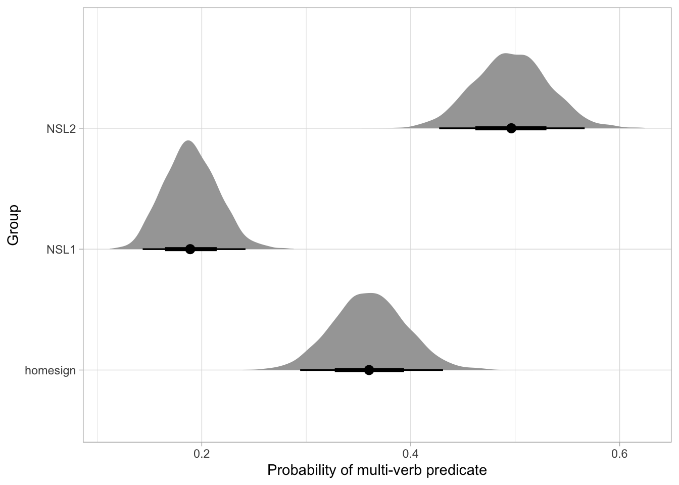
Very often, we also want to know the posterior probability of the difference between a level and another level that is not the reference: here for example we might want to know the difference between NSL1 and NSL2. It is easy: we just take the difference of the log-odds predicted draws columns NSL1 and NSL2 in mpv_bm_draws. If we want to know the difference between the probabilities rather than the log-odds, we use the inverse-logit-transformed predicted draws.
mvp_bm_draws <- mvp_bm_draws |>
  mutate(
    NSL2_NSL1_log = NSL2 - NSL1,
    NSL1_homesign_p = plogis(NSL1) - plogis(homesign),
    NSL2_NSL1_p = plogis(NSL2) - plogis(NSL1)
  )

quantile2(mvp_bm_draws$NSL1_homesign_p, c(0.1, 0.9)) |> round(2)
q10 q90
-0.22 -0.11 quantile2(mvp_bm_draws$NSL2_NSL1_log, c(0.1, 0.9)) |> round(2) q10 q90
1.17 1.73 quantile2(mvp_bm_draws$NSL2_NSL1_p, c(0.1, 0.9)) |> round(2) q10 q90
0.25 0.36 The log-odds in NSL2 are 1.17-1.73 units higher than in NSL1, at 80% probability. The probability of a multi-verb predicate is 11 to 22 percentage points lower in NSL1 than home-signers and it is 25 to 36 percentage points higher in NSL2 than NSL1, at 80% confidence. Note how we say percentage points and not percent. There isn’t a 25-36% increase, but the probability increases by 25-36 units, which for probabilities expressed as percentages are called percentage points. Mixing these things up is a common mistake, so be careful.
We fitted a Bayesian Bernoulli regression model to assess the probability of multi-verb predicates in NSL. The model was fitted with brms Bürkner (2017) in R R Core Team (2025), with the default priors, four chains with 2000 iterations each, of which 1000 for warm-up. We included group (home-signers, NSL1 and NSL2) as the only predictor, which was coded with the default treatment contrasts (home-signers as the reference level).
According to the model, there is a 32-41% probability of multi-verb predicates in home-signers, for NSL1 it is 16-22% and for NSL2 it is 45-54%, at 80% confidence. The results indicate that the hypothesis that the probability of multi-verb predicates should increase from home-signers to NSL1 to NSL2 is not borne out. The probability decreases by 11-22 percentage points from home-signers to NSL1, and increases by 25-36 points from NSL1 to NSL2. Moreover, the probability of multi-verb predicates in NSL2 indicates that single and multi-verb predicates are equally probable in NSL2.
This StackExchange answer is also useful: https://stats.stackexchange.com/a/367889/128897.↩︎