Code
ggplot() +
  aes(x = seq(-4, 4, 0.01), y = dnorm(seq(-4, 4, 0.01))) +
  geom_path(colour = "sienna", linewidth = 2) +
  labs(
    x = element_blank(), y = "Density"
  )
![]()
![]()
In the previous section, we have seen that you can visualise probability distributions by plotting the probability mass or density function for theoretical probabilities and by using kernel density estimation for sample (aka empirical) distributions. Visualising probability distributions is more practical than listing all the possible values and their probability (especially with continuous variables—since they are continuous there is an infinite number of values!). Another convenient way to express probability distributions is to specify a set of parameters, which can reconstruct the entire distribution. With theoretical distributions, the parameters allow you to reconstruct exact distributions, while empirical distributions can usually be only approximated. That’s the whole point of taking a sample: you want to reconstruct the “underlying” probability distribution that generated the sample, in other words the (theoretical) probability distribution of the population.
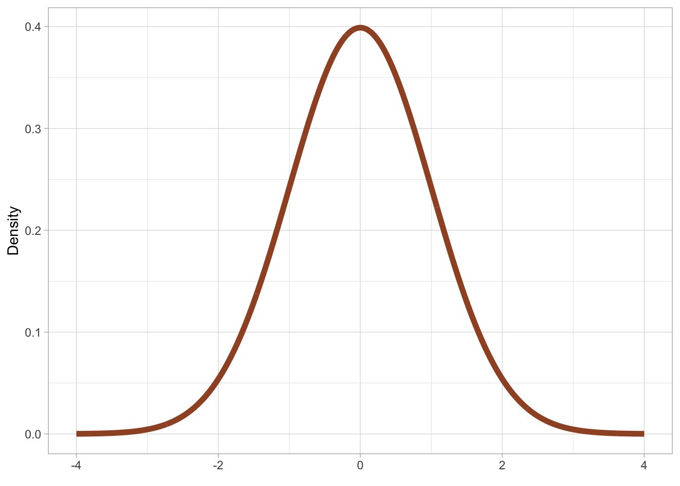
Different probability distribution families have a different number of parameters and different parameters. A probability family is an abstraction of specific probability distributions that can be represented with the same set of parameters. An example of a probability distribution family is the Gaussian [ˈgaʊsɪən] probability distribution, also called the “normal” distribution and nick-named the “bell-curve”, because it looks like the shape of a bell. Figure 19.1 should make this more obvious.
ggplot() +
aes(x = seq(-4, 4, 0.01), y = dnorm(seq(-4, 4, 0.01))) +
geom_path(colour = "sienna", linewidth = 2) +
labs(
x = element_blank(), y = "Density"
)The Gaussian distribution is a continuous probability distribution and it has two parameters:
The mean, represented with the Greek letter \(\mu\) [mjuː]. This parameter is the probability’s central tendency. Values around the mean have higher probability than values further away from the mean.
The standard deviation, represented with the Greek letter \(\sigma\) [ˈsɪgmə]. This parameter is the probability’s dispersion around the mean. The higher \(\sigma\) the greater the spread (i.e. the dispersion) of values around the mean.
You have already encountered means and standard deviations in Chapter 10. It is no coincidence that the go-to summary measures for continuous variables are the mean and the standard deviation. When you don’t know exactly what the underlying distribution of a variable is and all you want is a measure of central tendency and of dispersion, one assumes a Gaussian distribution and calculates mean and standard deviations. Note that in most cases we know a bit more than that and in fact the Gaussian distribution is very rare in nature. This is why we will call it Gaussian and not “normal”, since it is only “normal” from a statistical-theoretical perspective (it has simple mathematical properties that makes it easy to use in applied statistics).
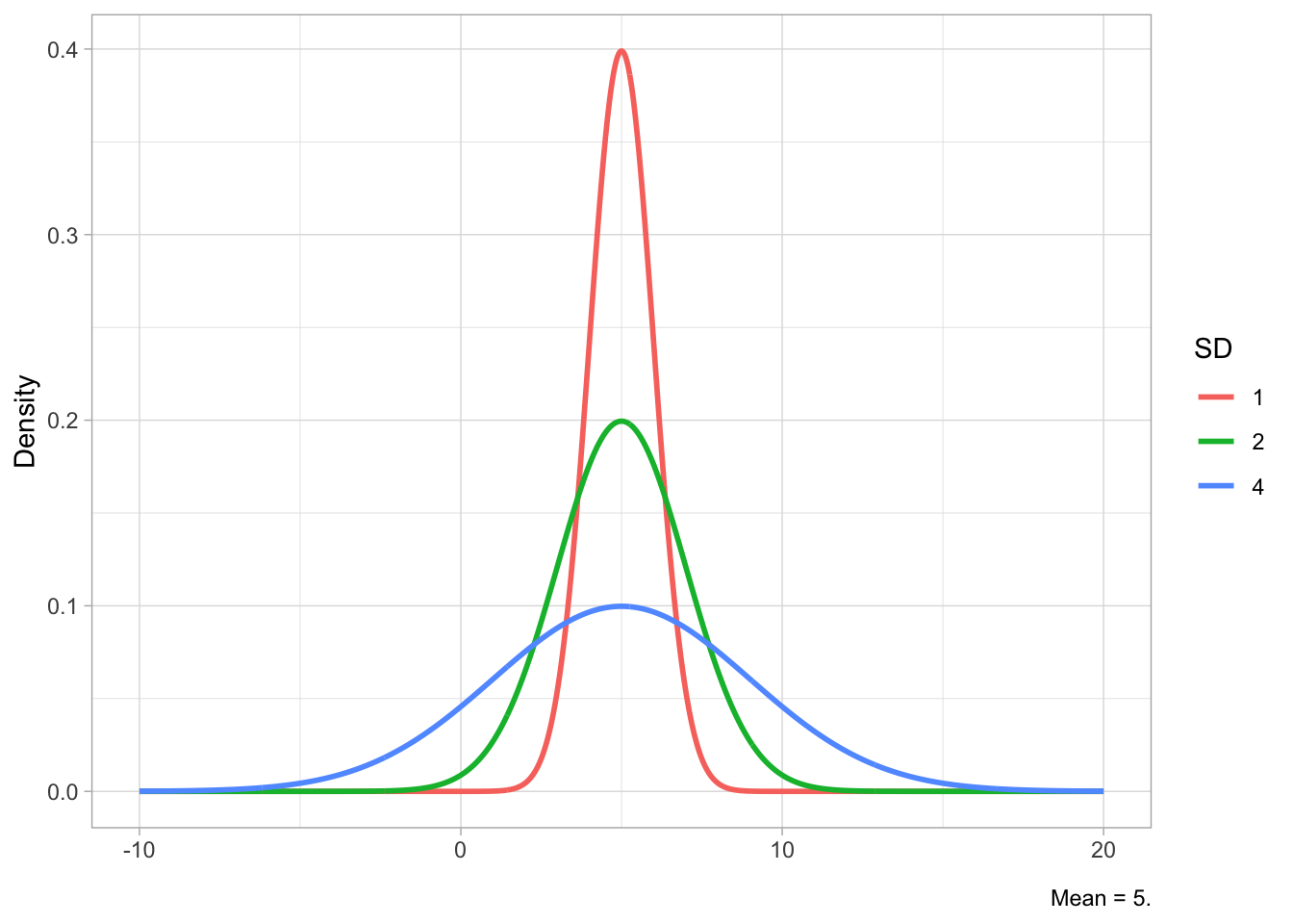
Figure 19.2 shows Gaussian distributions with fixed standard deviation (2) but different means (-5, 0, 10) in Figure 19.2 (a) and Gaussian distributions with fixed mean (5) but different SDs (1, 2, 4) in Figure 19.2 (b). The mean shifts the distribution horizontally (lower values to the left, higher values to the right), while the SD affects the width of the distribution: lower SDs correspond to a narrower or tighter distribution, while higher SDs correspond to a wider distribution. Since the total area under the curve has to sum to 1, if the distribution is narrower, the peak will also be relatively higher, while with a wider distribution the peak will be lower. You have seen this in Figure 18.4.
x <- seq(-10, 20, length.out = 1000)
means <- c(0, -5, 10)
sd_fixed <- 2

df_means <- crossing(x = x, mean = means) |>
  mutate(
    y = dnorm(x, mean = mean, sd = sd_fixed),
    mean = factor(mean)
  ) |>
  arrange(mean, x)

mu <- ggplot(df_means, aes(x = x, y = y, color = mean)) +
  geom_line(linewidth = 1) +
  labs(x = element_blank(), y = "Density", caption = "SD = 2.")

sds <- c(1, 2, 4)
mean_fixed <- 5

df_sds <- crossing(x = x, SD = sds) |>
  mutate(
    y = dnorm(x, mean = mean_fixed, sd = SD),
    SD = factor(SD)
  ) |>
  arrange(SD, x)

sig <- ggplot(df_sds, aes(x = x, y = y, color = SD)) +
  geom_line(linewidth = 1) +
  labs(x = element_blank(), y = "Density", caption = "Mean = 5.")

plot(mu)
plot(sig)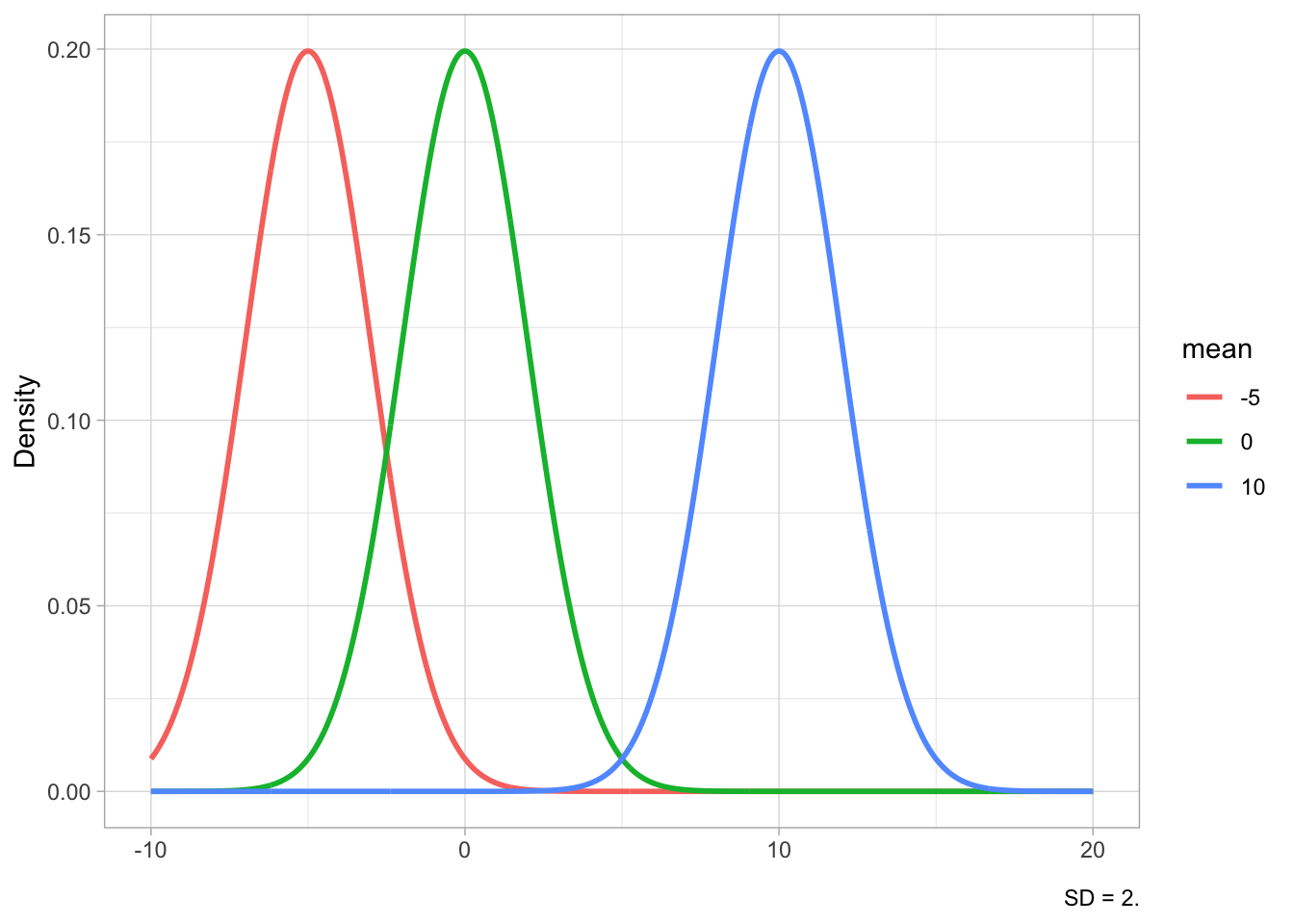
In statistical notation, we write the Gaussian distribution family like this:
\[ Gaussian(\mu, \sigma) \]
Specific types of Gaussian distributions will have specific values for the parameters \(\mu\) and \(\sigma\): for example \(Gaussian(0, 1)\), \(Gaussian(50, 32)\), \(Gaussian(2.5, 6.25)\), and so on. All of these specific probability distributions belong to the Gaussian family. So hopefully you understand now why we say that a distribution family stands for specific families: here \(Gaussian(\mu, \sigma)\) stands as the parent of all the specific Gaussian distributions (i.e. all of the Gaussian distributions with a specific mean and SD).
A useful way to investigate theoretical probability distributions is to ask what is the probability that the random variable the probability represents is less than or equal to a certain value. For example, for a distribution \(Gaussian(0, 1)\) of the random variable \(X\), what is the probability that \(X\) is -1 or less? Figure 19.3 gives us a visual explanation: the size of the shaded area under the density curve is the probability that \(X \leq -1\). This works because the area under the density curve must add to 1, so that the entire area under the curve covers 100% of the probability distribution.
q <- -1
p <- pnorm(q)
lbl <- sprintf("P(X \u2264 %.0f) = %.4f", q, p)

df <- tibble(x = seq(-4, 4, length.out = 2000)) |>
  mutate(dens = dnorm(x))

df_shade <- df |> filter(x <= q)

ggplot(df, aes(x, dens)) +
  geom_line(linewidth = 1) +
  geom_area(data = df_shade, aes(y = dens), alpha = 0.4) +
  geom_vline(xintercept = q, linetype = "dashed") +
  annotate("text", x = q - 3, y = dnorm(0) * 0.4, label = lbl, hjust = 0) +
  labs(
    y = "Density", x = "X"
  )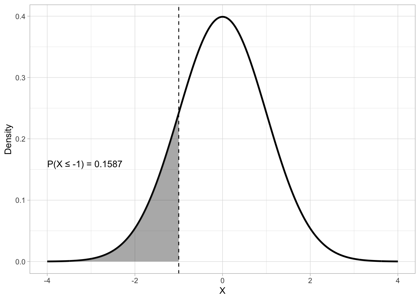
The mathematical function that calculates the probability that a variable is less than or equal to a value is the cumulative distribution function (CDF). In R, you can get the CDF value of a Gaussian distribution (i.e. the probability that \(X\) is less than or equal to any value \(x\)) with the pnorm() function (p for probability and norm for normal or Gaussian). The function takes three arguments: the \(x\) value represented by the q argument, the mean and the SD of the Gaussian distribution (the default are mean = 0 and SD = 1).
pnorm(q = -1, mean = 0, sd = 1)[1] 0.1586553# or
pnorm(-1, 0, 1)[1] 0.1586553# or
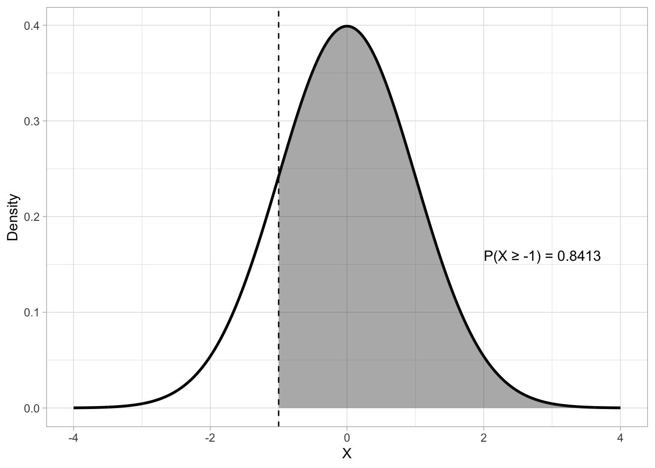
pnorm(-1)[1] 0.1586553By default, pnorm() uses the lower-tail CDF: this returns the “less than or equal to” probability. It’s on the “lower” tail of the distribution, or the tail to the left of the density peak. But we can also compute the upper-tail probability. Figure 19.4 shows an upper-tail probability with \(X \geq -1\) with \(Gaussian(0, 1)\). To obtain the upper-tail probability with pnorm(), rather than the lower-tail probability, set lower.tail to FALSE.
pnorm(-1, lower.tail = FALSE)[1] 0.8413447q <- -1
p <- pnorm(q, lower.tail = FALSE)
lbl <- sprintf("P(X \u2265 %.0f) = %.4f", q, p)
df <- tibble(x = seq(-4, 4, length.out = 2000)) |>
mutate(dens = dnorm(x))
df_shade <- df |> filter(x >= q)
ggplot(df, aes(x, dens)) +
geom_line(linewidth = 1) +
geom_area(data = df_shade, aes(y = dens), alpha = 0.4) +
geom_vline(xintercept = q, linetype = "dashed") +
annotate("text", x = q + 3, y = dnorm(0) * 0.4, label = lbl, hjust = 0) +
labs(
y = "Density", x = "X"
)
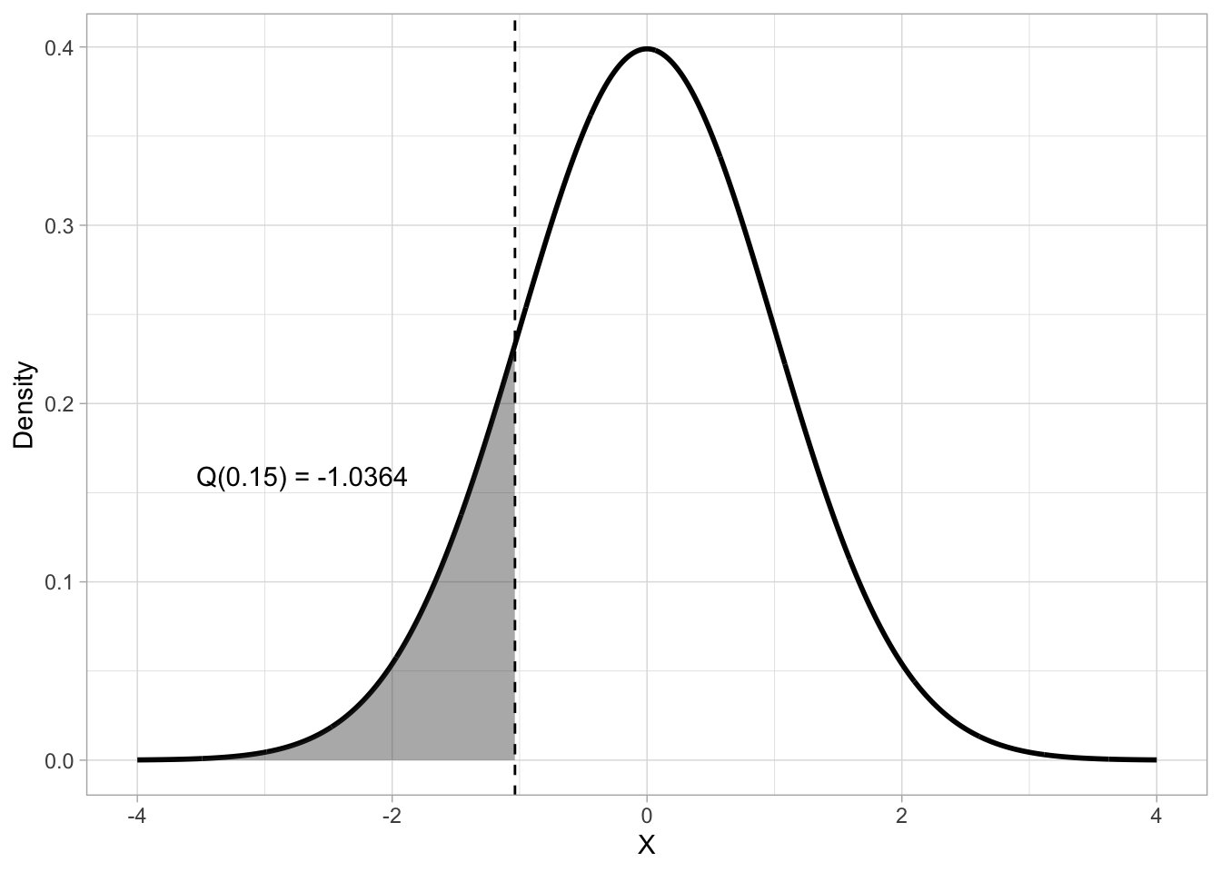
Probability intervals provide a further way of locating and interpreting values within a probability distribution. They partition the distribution into regions associated with specified probability levels. A quantile is a value below which a given proportion of the distribution lies. You can think of this as the opposite of finding the probability given \(x\): given the probability \(q\), which is \(x\)? For a continuous distribution like the Gaussian, the q-th quantile (denoted \(Q(q)\)) is defined as the value \(x\) such that:
\[ P(X \leq x) = q, 0 \leq q \leq 1 \]
which is, \(q\) is the probability that the outcome \(X\) is less than or equal to \(x\). So for example, given a Gaussian distribution with mean 0 and SD 1, which is the 0.15th quantile? To calculate a quantile, the quantile function is used. This is the inverse of the CDF. Figure 19.5 shows that the 0.15th quantile of a \(Gaussian(0, 1)\) distribution is approximately -1.04.
p <- 0.15
q <- qnorm(p)
lbl <- sprintf("Q(%.2f) = %.4f", p, q)

df <- tibble(x = seq(-4, 4, length.out = 2000)) |>
  mutate(dens = dnorm(x))

df_shade <- df |> filter(x <= q)

ggplot(df, aes(x, dens)) +
  geom_line(linewidth = 1) +
  geom_area(data = df_shade, aes(y = dens), alpha = 0.4) +
  geom_vline(xintercept = q, linetype = "dashed") +
  annotate("text", x = q - 2.5, y = dnorm(0) * 0.4, label = lbl, hjust = 0) +
  labs(
    y = "Density", x = "X"
  )
In R, qnorm() returns quantiles using the quantile function. qnorm() takes three arguments: the probability, and the mean and SD of the Gaussian distribution (again, by default 0 and 1 respectively). As with pnorm(), you can obtain the upper-tail quantile with lower.tail = FALSE. With a Gaussian distribution with mean 0 and SD 1, the upper-tail quantile value is the same the lower-tail but with opposite sign. The following code shows how to use qnorm() (the values are rounded to the second digit with round(2)).
# Lower-tail quantile with Gaussian(0, 1)
qnorm(0.15) |> round(2)
[1] -1.04# Upper-tail quantile with Gaussian(0, 1)
qnorm(0.15, lower.tail = FALSE) |> round(2)[1] 1.04# Lower-tail quantile with Gaussian(10, 2)
qnorm(0.15, 10, 2) |> round(2)[1] 7.93# Upper-tail quantile with Gaussian(10, 2)
qnorm(0.15, 10, 2, lower.tail = FALSE) |> round(2)[1] 12.07Quartiles are quantiles that split the distribution into four quarters, each holding 25% of the probability mass. With a Gaussian probability, the first quartile marks the point below which 25% of the area lies, the second quartile, also called the median (which you encountered in Chapter 10), splits it at 50%, and the third quartile leaves 25% above it, so that it covers 75% of the area. Because of the symmetry of the Gaussian, the first and third quartiles are equidistant from the mean. Figure 19.6 shows quartiles on a Gaussian distribution with mean 0 and SD 1. Note how the second quartile (Q2) splits the distribution in half: 50% of the distribution is to the left of Q2 and the other 50% is to the right of it. The interval between the first (Q1) and third quartile (Q3) is called the inter-quartile range (IQR), which indicates the middle 50% of the probability distribution.
quartiles <- qnorm(c(0, 0.25, 0.5, 0.75, 1))
quart_labels <- c("Q1", "Q2 (median)", "Q3")

df <- tibble(x = seq(-4, 4, length.out = 2000)) |>
  mutate(dens = dnorm(x))

df <- df |> mutate(
  quartile = case_when(
    x <= quartiles[2] ~ "Q1",
    x <= quartiles[3] ~ "Q2",
    x <= quartiles[4] ~ "Q3",
    TRUE ~ "Q4"
  )
)

ggplot(df, aes(x, dens, fill = quartile)) +
  geom_area(alpha = 0.5) +
  geom_line(linewidth = 1) +
  scale_fill_brewer(type = "seq", direction = -1) +
  geom_vline(xintercept = quartiles[2:4], linetype = "dashed", alpha = 0.5) +
  annotate(
    "label",
    x = quartiles[2:4],
    y = 0.2,
    label = c("Q1", "Q2", "Q3")
  ) +
  annotate(
    "text",
    x = c(-1.3, -0.35, 0.35, 1.3),
    y = 0.05,
    label = c("25%", "25%", "25%", "25%")
  ) +
  annotate(
    "errorbar",
    xmin = quartiles[2], xmax = quartiles[4],
    y = 0.1,
    colour = "purple", linewidth = 1, width = 0.025
  ) +
  annotate(
    "text",
    x = 0, y = 0.12,
    label = "IQR"
  ) +
  labs(
    y = "Density", x = element_blank()
  ) +
  theme(legend.position = "none")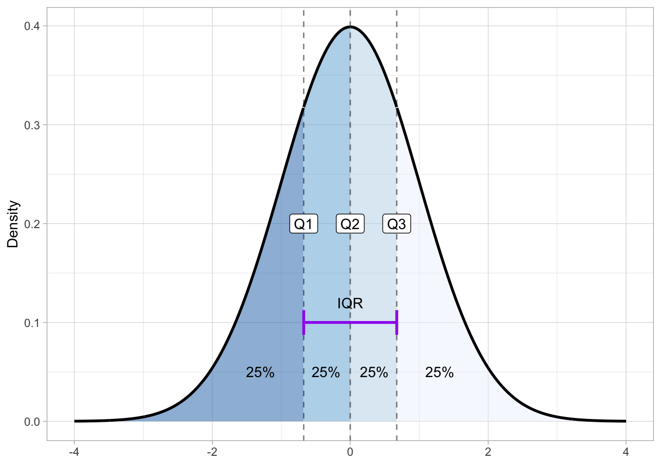
To get the quartiles of a Gaussian distribution you can use the qnorm() function: a quartile is just a type of quantile. Q1 corresponds to the 0.25th quantile, Q2 to the 0.5th and Q3 to the 0.75th quantile.
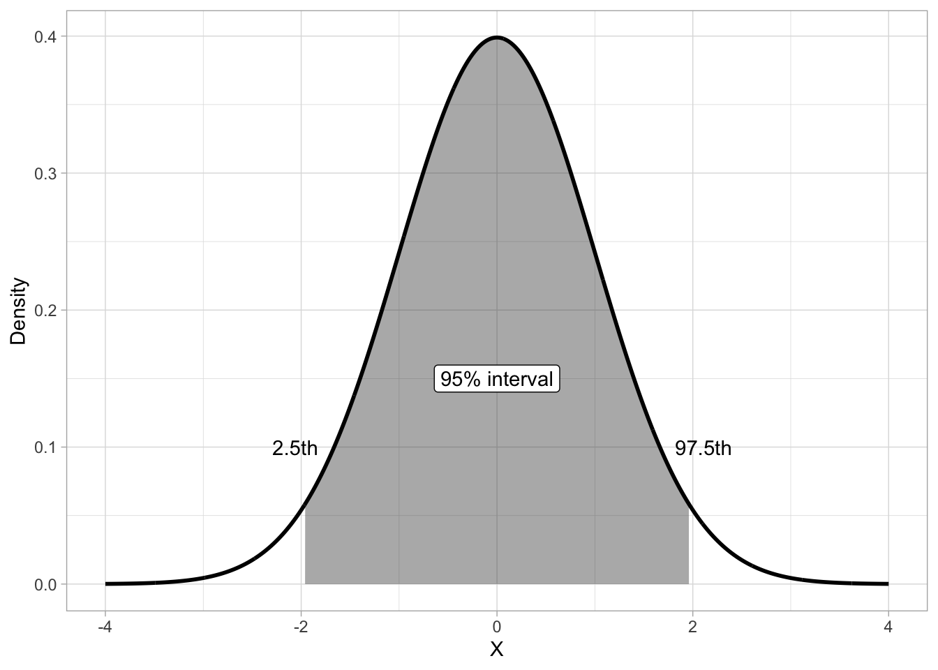
qnorm(c(0.25, 0.5, 0.75)) |> round(2)[1] -0.67 0.00 0.67Another type of quantile are percentiles. These split the probability in 100 percentiles, each holding 1% of the probability mass. Percentiles are used to define central probability intervals, i.e. probability intervals that leave equal probability in both tails of the distribution. It is usually implied that you mean a central interval, so you don’t really have to say “central” every time. A (central) 95% interval is defined as the interval between 2.5th and the 97.5th percentile of the distribution. Figure 19.7 illustrates the 95% interval of \(Gaussian(0, 1)\). The shaded are is the 95% interval, while the two white areas at the tails hold each 2.5% of the distribution, thus making the rest 5% of the distribution not included in the 95% interval. Remember, probability intervals leave equal probability on both tails.
p <- 0.15

df <- tibble(x = seq(-4, 4, length.out = 2000)) |>
  mutate(dens = dnorm(x))

df_shade <- df |> filter(x >= qnorm(0.025) & x <= qnorm(0.975))

ggplot(df, aes(x, dens)) +
  geom_area(data = df_shade, aes(y = dens), alpha = 0.4) +
  geom_line(linewidth = 1) +
  annotate(
    "label", x = 0, y = 0.15, label = "95% interval"
  ) +
  annotate(
    "text",
    x = c(qnorm(0.025) - 0.1, qnorm(0.975) + 0.15), y = 0.1,
    label = c("2.5th", "97.5th")
  ) +
  labs(
    y = "Density", x = "X"
  )