SQMB tutorial – Week 9
This tutorial will give you some practice working with continuous predictors. You’ll begin by fitting a model with a binary outcome and one continuous predictor. Then you’ll fit a model with the same binary outcome, but now predicted by an interaction between two continuous predictors.
OK, let’s rock and roll! Set up the Rmd file you’ll use for this tutorial:
Create a new
.Rmdfile, save it incode/, and name ittutorial-w09.In the
setupchunk, include the lineknitr::opts_knit$set(root.dir = here::here()).Also in the
setupchunk, include code to attach the libraries we’ll use in this tutorial:tidyverse,posterior,brms, andbroom.mixed.
Scalar inferences and scalar diversity
The data we’ll be using comes from Experiment 2 in Pankratz, E., & van Tiel, B. (2021). The role of relevance for scalar diversity: A usage-based approach. Language and Cognition, 13(4), 562–594. https://www.doi.org/10.1017/langcog.2021.13
This study looks at when people make so-called scalar inferences. A scalar inference happens when you encounter a sentence like “Fatima ate some of the cookies”, and you infer that Fatima didn’t eat all of the cookies. In particular, this study looks at the phenomenon of scalar diversity: the observation that scalar inferences are made at different rates for different words. For example, for “The food was cheap” (where “cheap” is a weaker scalar word), people do often infer that the food wasn’t free (a stronger word on the same scale of price). But, for “The village was pretty”, people don’t often infer that the village wasn’t beautiful. In this tutorial, we’ll look at the influence of a couple different predictors on whether or not people make scalar inferences.
Read and process the data
You can get the data for this tutorial by right-clicking and downloading the following link: si.csv.
Use read_csv() to read in the CSV and assign it to a variable called si (for scalar inference).
si <- ...siThe variables in this data frame that we’ll refer to in this tutorial are:
weak_adj: The weaker adjective on the tested scale (paired with the stronger adjective instrong_adj).SI: Whether or not a participant made a scalar inference for the pair of adjectives inweak_adjandstrong_adj(0 if no, 1 if yes).freq: How frequently theweak_adjco-occurred with a stronger adjective on the same scale in a large corpus.semdist: A measure of the semantic distance betweenweak_adjandstrong_adj. A negative score indicates that the words are semantically closer; a positive score indicates that the words are semantically more distant.
The first model we’ll fit will only look at SI as a function of frequency. The second will add on an interaction between frequency and semantic distance.
Before we leap into modelling, though, let’s look in more detail at our predictors freq and semdist. A little bit of pre-processing is needed here, and the next sections will walk you through it.
Transforming and centering freq
Frequencies notoriously yield an extremely skewed distribution, so it’s common practice in corpus linguistics to log-transform them before including them in an analysis.
Here’s how the frequencies look right out of the box:
si %>%
  ggplot(aes(x = freq)) +
  geom_density(fill = 'grey', alpha = 0.5) +
  geom_rug()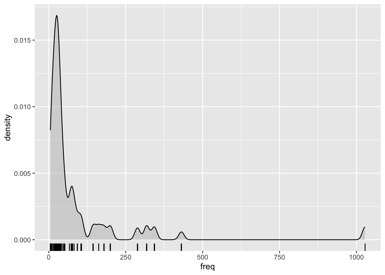
Log-transforming the frequencies helps reduce the skew. Use mutate() to take the log of freq and store the result in a new column called logfreq:
si <- si %>%
  mutate(
    ...
  )
The result should look like this:
si %>%
  ggplot(aes(x = logfreq)) +
  geom_density(fill = 'grey', alpha = 0.5) +
  geom_rug()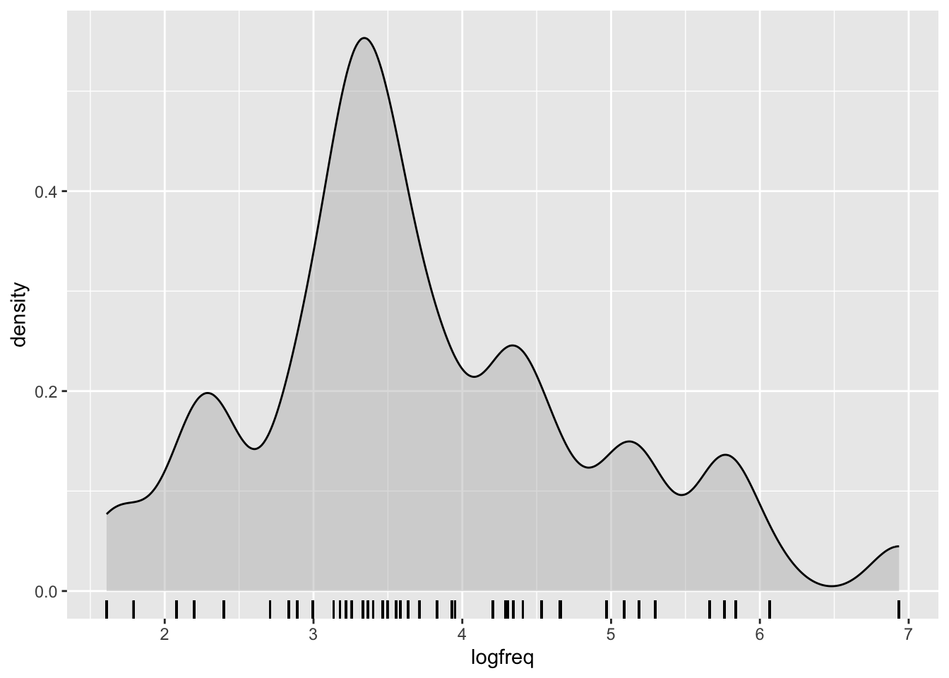
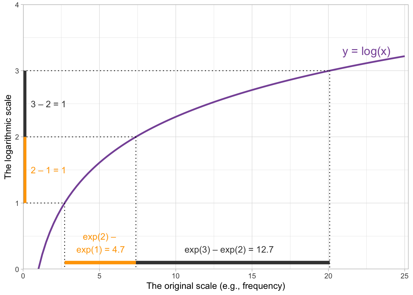
When we’re interpreting the model estimates below, we’ll be talking about the effect on scalar inferencing of one unit change on the log frequency scale. One unit change corresponds to moving from, e.g., 3 to 4 on this plot, or from 2 to 3.
We’re nearly done with logfreq—all that’s left is to centre it. As we saw in the lecture, to centre a variable, we compute its mean and subtract that from every observation of the variable. The goal is to get a new version of variable that has a mean of zero.
si <- si %>%
  mutate(
    logfreq_c = logfreq - mean(logfreq)
  )
Run the following to verify that the mean is zero:
round(mean(si$logfreq_c))[1] 0(The round() function is included because, for technical computer reasons, the mean actually comes out as an incredibly small number near zero. But effectively it’s zero, and that’s good enough for us.)
logfreq_c is now ready to be used in our analyses. Next, you’ll take care of semantic distance on your own, and then we’ll move on to the modelling.
Centering semdist
Use mutate() to create a new, centered variable based on semdist that is called semdist_c. Verify that the mean of semdist_c is 0, and display semdist_c using a density plot with a rug, as above.
Model 1: Binary ~ continuous
The first model we’ll fit in this tutorial will be predicting SI as a function of logfreq_c. Before fitting the model, let’s take a moment to plot the proportion of scalar inferences as a function of centered log frequency.
Visualising scalar inferencing and centered log frequency
The variable SI is binary: 0 if a scalar inference was not made, 1 if it was. We like to visualise binary outcomes as proportions. And here’s a useful trick for figuring out proportions when we have a variable coded as 0s and 1s: we can use the mean() function to give us the proportion of 1s in that variable. (If you feel inspired, have a think about why this works. What is a proportion? What gets computed when finding a variable’s mean?)
The following code will compute the proportion of scalar inferences for every weak_adjective and add the result as a new column to si.
si <- si %>%
  group_by(weak_adj) %>%
  mutate(
    propn_si = mean(SI)
)All right, let’s plot propn_si as a function of logfreq_c. And, why not, let’s also use geom_text() to show the corresponding weak_adj where otherwise a point would be—one of the perks of working with linguistic data :)
si %>%
  ggplot(aes(x = logfreq_c, y = propn_si)) +
  geom_text(aes(label = weak_adj)) +
  labs(
    x = 'Log co-occurrence frequency (centered)',
    y = 'Proportion of scalar inferences'
  )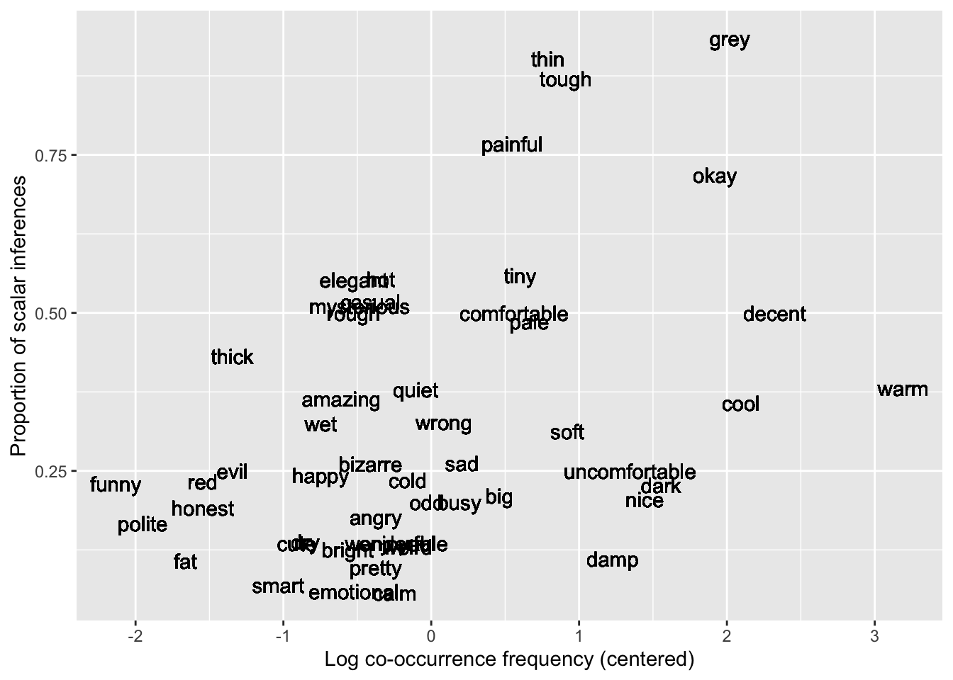
Based on this plot, it looks like we can expect a positive association between logfreq_c and SI: as frequency increases, so does scalar inferencing. Let’s see if this is borne out in the model.
(Note that we only created propn_si for visualisation! We won’t use this variable in our modelling; instead, we’ll be using the 0/1-coded variable SI.)
Fitting the model
Here’s the mathematical specification of the model that we’ll fit:
\[ \begin{aligned} \text{SI} & \sim Bernoulli(p) \\ logit(p) & = \beta_0 + (\beta_1 \cdot logfreq\_c) \\ \beta_0 & \sim Gaussian(\mu_0, \sigma_0) \\ \beta_1 & \sim Gaussian(\mu_1, \sigma_1) \\ \end{aligned} \]
Now, write code to fit a model called si_freq_bm using brm().
- The model formula should specify that we are fitting
SIas a function oflogfreq_c. - Use the appropriate family for this kind of outcome variable.
- The source of the data is the data frame
si. - Use the backend
cmdstanr. - Save the model using the
fileargument. (Note: The first time you run a model with this argument, that’s the version of the model that will be saved and loaded every time after. Beware of this if you use the samefileargument to run a model that’s different from the final one you’ll want to run!)
si_freq_bm <- brm(
  ...
)
Run the model and have a look at the summary.
summary(si_freq_bm) Family: bernoulli
Links: mu = logit
Formula: SI ~ logfreq_c
Data: si (Number of observations: 2006)
Draws: 4 chains, each with iter = 2000; warmup = 1000; thin = 1;
total post-warmup draws = 4000
Population-Level Effects:
Estimate Est.Error l-95% CI u-95% CI Rhat Bulk_ESS Tail_ESS
Intercept -0.73 0.05 -0.82 -0.63 1.00 3784 2932
logfreq_c 0.35 0.04 0.27 0.44 1.00 3601 2496
Draws were sampled using sample(hmc). For each parameter, Bulk_ESS
and Tail_ESS are effective sample size measures, and Rhat is the potential
scale reduction factor on split chains (at convergence, Rhat = 1).Interpreting the coefficients
Here’s how we can understand these coefficient estimates (recall that they are in log-odds space, because we are dealing with binary outcomes):
Intercept, \(\beta_0\): When centered log frequency is at its mean of zero, the mean log-odds of making a scalar inference are –0.73, and there is a 95% probability that the true value lies between –0.82 and –0.63 log-odds.logfreq_c, \(\beta_1\): For a unit change in centered log frequency, the change in the mean log-odds of making a scalar inference is 0.35 log-odds, and there is a 95% probability that the true change lies between 0.27 and 0.44 log-odds.
In practice, the bare minimum that you should always do is to report and interpret the model’s coefficient estimates and 95% CrIs in the space in which the model was fit (here, log-odds space). This is often all that you’ll see in published academic writing.
However, we would generally encourage you to put the cherry on top and compute the full conditional posterior probability distributions of the probability (not log-odds) of success (here, making a scalar inference). Once you have found these distributions, you are able to report the mean probability and corresponding 95% CrIs of making a scalar inference for any value of logfreq_c, and you’ll be able to create plots that nicely visualise the model’s estimates. This will help your work stand out.
The next section will walk you through how this computation works with a continuous predictor.
Conditional posterior probability distributions
In previous weeks, to compute conditional posterior probability distributions for categorical predictors, we would set the predictors’ values equal to however their levels were coded (0 or 1), multiply this coding with the \(\beta\)s and let the zeroes cancel some of the \(\beta\)s out, and then add together the ones that remained.
Back then, it was easy to know which values to set the predictors equal to: whatever coding was used for each level. But what do we do now that we have a continuous predictor that can, in principle, take on any value?
Rather than looking at the full range of values that the predictor can take on, in practice we will still choose just a few values to set the predictor to. In fact, we actually can use 0s and 1s again, as long as we bear in mind their new interpretation: 0 is the mean of logfreq_c, and 1 is one unit above its mean. Evaluating a centered predictor at 0 and 1 is fairly standard (though, as we saw in the lecture, –1, 0, and 1 is also an option, and there will be another “Deepen your understanding” box below that illustrates how to use –5, 0, and 5!).
But for now, because we are going to use 0s and 1s, the algebra looks much the same as it did before. For a linear expression of \(\beta_0 + (\beta_1 \cdot logfreq\_c)\), we get:
\[ \begin{aligned} logfreq\_c = 0 : & & \beta_0 &+ (\beta_1 \cdot 0) &&= \beta_0\\ logfreq\_c = 1 : & & \beta_0 &+ (\beta_1 \cdot 1) &&= \beta_0 + \beta_1\\ \end{aligned} \]
These sums on the right-hand side tell us how we need to add our betas together in order to compute the mean log-odds of success for these two values of logfreq_c.
Can you follow how the code in the next block is computing the conditional posterior probability distributions? (If you get stuck, you can revisit Tutorial 8, where this process was narrated step by step.)
si_freq_draws <- as_draws_df(si_freq_bm)

si_freq_draws_cond <- si_freq_draws %>%
  mutate(
    '0' = b_Intercept,               # beta_0
    '1' = b_Intercept + b_logfreq_c  # beta_0 + beta_1
  ) %>%
  select('0':'1') %>%
  pivot_longer('0':'1', names_to = 'logfreq_c', values_to = 'sampled_logodds')
Reporting means and 95% CrIs
You can find out the means and 95% CrIs of both of these conditional posterior probability distributions by running the following code, which may by now look familiar to you:
si_freq_draws_cond %>%
  group_by(logfreq_c) %>%
  summarise(
    # Summarise in log-odds space
    logodds_mean = mean(sampled_logodds),
    logodds_95_lo = round(quantile2(sampled_logodds, probs = 0.025), 2),
    logodds_95_hi = round(quantile2(sampled_logodds, probs = 0.975), 2),
    # Transform into probabilities
    p_mean   = round(plogis(logodds_mean), 2),
    p_q95_lo = round(plogis(logodds_95_lo), 2),
    p_q95_hi = round(plogis(logodds_95_hi), 2)
  )
You could report the values in the last three columns as follows:
The probability of making a scalar inference when log frequency is at its mean of zero is 33% (95% CrI: [31%, 35%]). When log frequency increases to one unit above its mean, the probability of making a scalar inference increases to 41% (95% CrI: [38%, 44%]).
Since we’re only reporting two values of logfreq_c here, giving this report in writing is relatively straightforward. But once there are more predictors in play, it’ll become more convenient to report model estimates in a table and/or visually.
Visualising the full conditional posteriors
You have seen similar code in last week’s tutorial—make sure you understand how this plot is being created.
si_freq_draws_cond <- si_freq_draws_cond %>%
  mutate(
    sampled_probs = plogis(sampled_logodds)
  )

si_freq_draws_cond %>%
  ggplot(aes(x = sampled_probs, fill = logfreq_c)) +
  geom_density(alpha = 0.5) +
  labs(x = 'Probability of making a scalar inference',
       y = 'Probability density',
       title = 'Conditional posterior probability distributions\nof the probability of making a scalar inference',
       fill = 'Log freq.')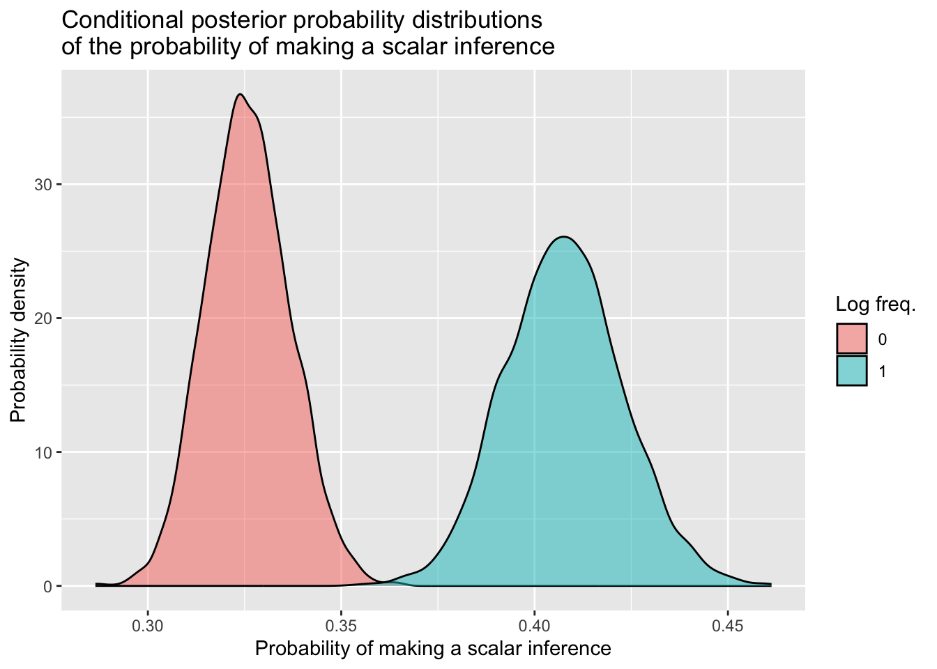
This plot shows that, when log frequency increases from its mean of zero to one unit above its mean, the probability of making a scalar inferences increases.
OK, that’s the workflow for the first model done! Let’s now complexify things a bit by introducing an interaction between log frequency and semantic distance.
Model 2: Binary ~ continuous * continuous
We’ve seen how to fit a model with one continuous outcome. What about when we want to include another one in the mix, and the two continuous predictors interact?
Visualising scalar inferencing, centered log frequency, and semantic distance
The following plot shows the proportion of scalar inferences as a function of logfreq_c again, and the words are now coloured based on their centered semantic distance (i.e., the value in semdist_c).
si %>%
  ggplot(aes(x = logfreq_c, y = propn_si, colour = semdist_c)) +
  labs(
    x = 'Log co-occurrence frequency (centered)',
    y = 'Proportion of scalar inferences',
    colour = 'Semantic\ndistance\n(centered)'
  ) +
  geom_text(aes(label = weak_adj)) +
  scale_colour_gradient(low = 'cyan', high = 'red')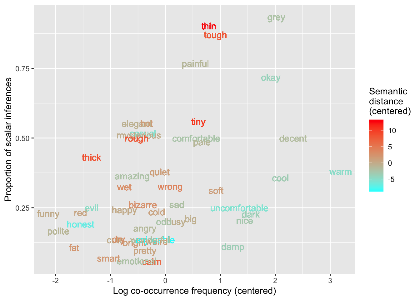
To see the interaction, the key observation here is that cyan words (low semantic distance) tend to be around the bottom of this plot, and their proportions of scalar inferences may increase more slowly than those of the red words (high semantic distance), which are around the top of the plot and seem to increase in scalar inferencing more rapidly. For continuous predictors, a difference of differences can be thought of as a difference of slopes. The red words (greater semantic distance) seem to have a larger positive slope than the cyan words (lower semantic distance), which may have a more gradual slope.
Fitting the model
Here’s the mathematical specification of the model we’ll fit:
\[ \begin{aligned} \text{SI} & \sim Bernoulli(p) \\ logit(p) & = \beta_0 + (\beta_1 \cdot logfreq\_c) + (\beta_2 \cdot semdist\_c) + (\beta_3 \cdot logfreq\_c \cdot semdist\_c)\\ \beta_0 & \sim Gaussian(\mu_0, \sigma_0) \\ \beta_1 & \sim Gaussian(\mu_1, \sigma_1) \\ \beta_2 & \sim Gaussian(\mu_2, \sigma_2) \\ \beta_3 & \sim Gaussian(\mu_3, \sigma_3) \\ \end{aligned} \]
Write brm() code for this model, and call it si_freq_dist_bm.
- The model formula should specify that we are predicting
SIas a function oflogfreq_c,semdist_c, and their interaction. - Use the appropriate model family.
- The data comes from
si. - The backend is
cmdstanr. - Save the model to a file.
si_freq_dist_bm <- brm(
  ...
)
Your model summary should look similar to this one.
summary(si_freq_dist_bm) Family: bernoulli
Links: mu = logit
Formula: SI ~ logfreq_c + semdist_c + logfreq_c:semdist_c
Data: si (Number of observations: 2006)
Draws: 4 chains, each with iter = 2000; warmup = 1000; thin = 1;
total post-warmup draws = 4000
Population-Level Effects:
Estimate Est.Error l-95% CI u-95% CI Rhat Bulk_ESS Tail_ESS
Intercept -0.70 0.05 -0.80 -0.59 1.00 4208 3179
logfreq_c 0.53 0.05 0.42 0.63 1.00 3469 2569
semdist_c 0.08 0.01 0.06 0.11 1.00 3893 3330
logfreq_c:semdist_c 0.05 0.01 0.03 0.08 1.00 3776 2734
Draws were sampled using sample(hmc). For each parameter, Bulk_ESS
and Tail_ESS are effective sample size measures, and Rhat is the potential
scale reduction factor on split chains (at convergence, Rhat = 1).Interpreting the coefficients
Intercept, \(\beta_0\): When both log frequency and semantic distance are at their means of zero, the mean log-odds of making a scalar inference is –0.70, and there is a 95% probability that the true value lies between –0.80 and –0.59 log-odds.logfreq_c, \(\beta_1\): When semantic distance is at its mean of zero, for a unit change in log frequency, the change in the mean log-odds of making a scalar inference is 0.53 log-odds. There is a 95% probability that the true change lies between 0.42 and 0.63 log-odds.semdist_c, \(\beta_2\): When log frequency is at its mean of zero, for a unit change in semantic distance, the change in the mean log-odds of making a scalar inference is 0.08 log-odds. There is a 95% probability that the true change lies between 0.06 and 0.11 log-odds.logfreq_c:semdist_c, \(\beta_3\): As usual, this coefficient has two interpretations.
Interpreting the interaction between two continuous predictors:
(1) A unit change in log frequency is associated with a positive adjustment of 0.05 log-odds to the effect of semantic distance, and there is a 95% probability that the true adjustment is between 0.03 and 0.08 log-odds.
- In other words: As log frequency increases, the effect of semantic distance (i.e., the difference between semantically closer and semantically more distant words) increases as well.
(2) A unit change in semantic distance is associated with a positive adjustment of 0.05 log-odds to the effect of log frequency, and there is a 95% probability that the true adjustment is between 0.03 and 0.08 log-odds.
- In other words: As semantic distance increases, the effect of log frequency (i.e., the difference between lower- and higher-frequency words) increases as well.
Both of these interpretations are in line with the plot we created above.
Conditional posterior probability distributions
Let’s polish off this section by getting the model’s posterior draws and using them to compute conditional posterior probability distributions for four combinations of values: when logfreq_c is equal to 0 and 1, crossed with semdist_c set equal to 0 and 1.
Because these variables are both centered, 0 is the mean for both, and 1 corresponds in both cases to one unit above the mean.
\[ \begin{aligned} \text{log freq. = 0, sem. dist. = 0:} && \beta_0 &+ (\beta_1 \cdot 0) + (\beta_2 \cdot 0) + (\beta_3 \cdot 0) &&= \beta_0 &\\ \text{log freq. = 0, sem. dist. = 1:} && \beta_0 &+ (\beta_1 \cdot 0) + (\beta_2 \cdot 1) + (\beta_3 \cdot 0) &&= \beta_0 + \beta_2 &\\ \text{log freq. = 1, sem. dist. = 0:} && \beta_0 &+ (\beta_1 \cdot 1) + (\beta_2 \cdot 0) + (\beta_3 \cdot 0) &&= \beta_0 + \beta_1 &\\ \text{log freq. = 1, sem. dist. = 1:} && \beta_0 &+ (\beta_1 \cdot 1) + (\beta_2 \cdot 1) + (\beta_3 \cdot 1) &&= \beta_0 + \beta_1 + \beta_2 + \beta_3 &\\ \end{aligned} \]
Again, try to follow what this code is doing (and revisit Tutorial 8 if you’d like a refresher).
si_freq_dist_draws <- as_draws_df(si_freq_dist_bm)

si_freq_dist_draws_cond <- si_freq_dist_draws %>%
  # Recall our trick for combining the values of multiple predictors
  # in one column name, separated by "_"
  mutate(
    '0_0' = b_Intercept,                # beta_0
    '0_1' = b_Intercept + b_semdist_c,  # beta_0 + beta_2
    '1_0' = b_Intercept + b_logfreq_c,  # beta_0 + beta_1
    '1_1' = b_Intercept + b_logfreq_c + b_semdist_c + `b_logfreq_c:semdist_c`
    # ^ beta_0 + beta_1 + beta_2 + beta_3
  ) %>%
  select('0_0':'1_1') %>%
  pivot_longer('0_0':'1_1', names_to = 'predvals', values_to = 'sampled_logodds') %>%
  separate(predvals, into = c('logfreq_c', 'semdist_c'), sep = '_')
Reporting means and 95% CrIs
si_freq_dist_draws_cond %>%
  group_by(logfreq_c, semdist_c) %>%
  summarise(
    # Summarise in log-odds space
    logodds_mean = mean(sampled_logodds),
    logodds_95_lo = round(quantile2(sampled_logodds, probs = 0.025), 2),
    logodds_95_hi = round(quantile2(sampled_logodds, probs = 0.975), 2),
    # Transform into probabilities
    p_mean   = round(plogis(logodds_mean), 2),
    p_q95_lo = round(plogis(logodds_95_lo), 2),
    p_q95_hi = round(plogis(logodds_95_hi), 2)
  )
`summarise()` has grouped output by 'logfreq_c'. You can override using the
`.groups` argument.At this point, there are enough rows in this table that reporting these means and 95% CrIs in prose might get a little unwieldy for you to write, not to mention difficult for the reader to follow. A better option might be to display the probability space estimates in a table, and/or as a density plot as usual.
Visualising the full conditional posteriors
si_freq_dist_draws_cond <- si_freq_dist_draws_cond %>%
  mutate(
    sampled_probs = plogis(sampled_logodds)
  )

si_freq_dist_draws_cond %>%
  ggplot(aes(x = sampled_probs, fill = logfreq_c)) +
  geom_density(alpha = 0.5) +
  facet_wrap(~ semdist_c, nrow = 2, labeller = labeller(semdist_c = label_both)) +
  labs(x = 'Probability of making a scalar inference',
       y = 'Probability density',
       title = 'Conditional posterior probability distributions\nof the probability of making a scalar inference',
       fill = 'Log freq.')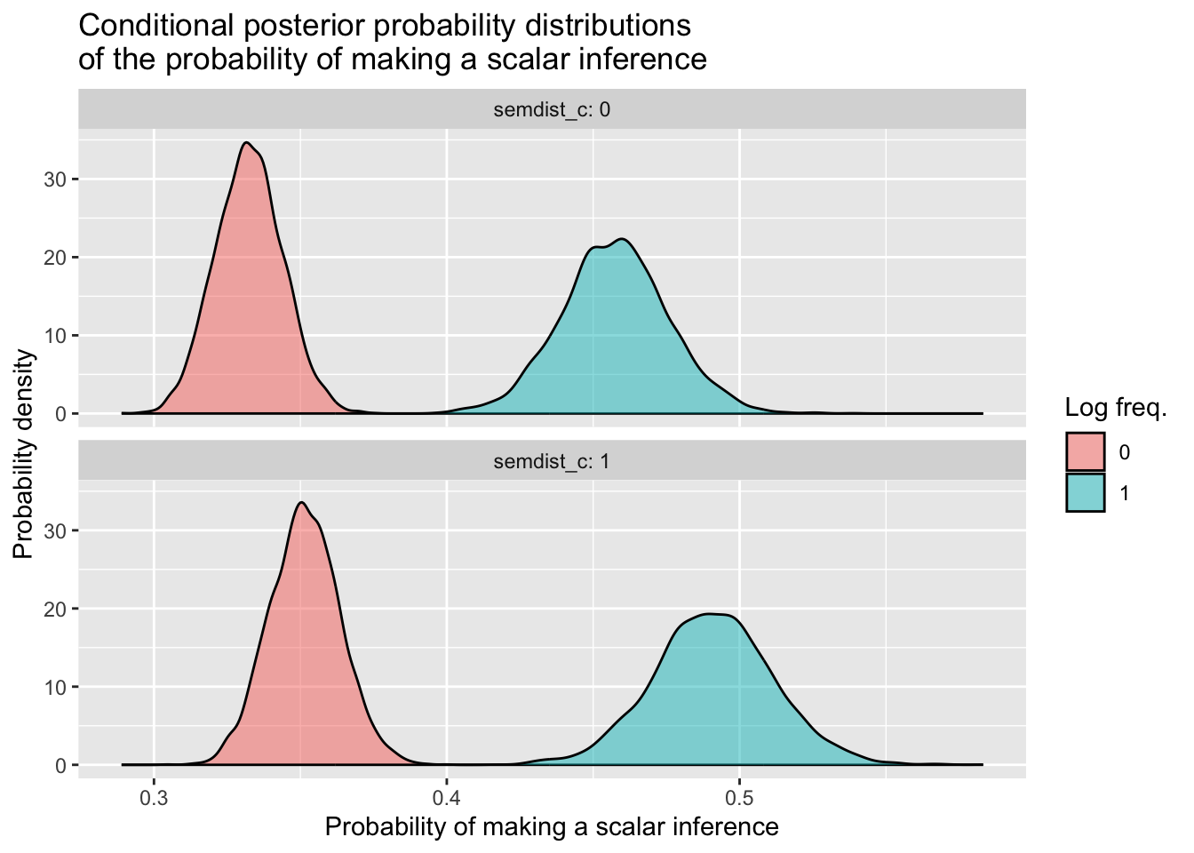
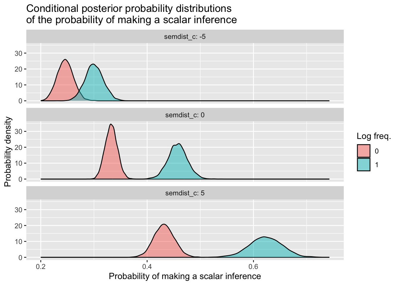
The interaction is quite small, so we don’t see a massive difference of differences here between semdist_c = 0 and semdist_c = 1. If you want to learn how to incorporate other values of semdist_c beyond 0 and 1 that will illustrate the interaction more clearly, have a look at the box below. Otherwise, you’ve made it to the end—congratulations!
