SQMB tutorial – Week 8
This tutorial has two sections, and each will guide you through one example of an interaction between two binary variables. The first section revisits the morphological processing data from the lecture. The second section focuses on a different data set, this time with a continuous outcome. This analysis will require you to adapt the code from earlier in the tutorial, as well as recall from earlier weeks how to fit and interpret a Gaussian model.
As usual, though, first things first:
Create a new
.Rmdfile, save it incode/, and name ittutorial-w08.Include
knitr::opts_knit$set(root.dir = here::here())in thesetupchunk.Also in the
setupchunk, include code to attach the libraries we’ll use in this tutorial:tidyverse,posterior,brms, andbroom.mixed.
Lexical decision accuracy
Read and process the data
We’ve played with the data in shallow.csv before, way back in week 2 (ah, the good old days!). This means you might already have it in your data/ folder, but if not, you can download it again from here: shallow.csv.
Use the usual read_csv() function to read in the dataset, and assign it to a variable called shallow.
shallow <- ...Run the following code to filter this data frame for only the data we need for this example.
shallow <- shallow %>%
  filter(
    Group == "L1",
    Critical_Filler == "Critical",
    RT > 0,
    Relation_type != 'NonConstituent'
  )
Next, we’ll prepare our variables for analysis.
The outcome variable that we want is:
Accuracy, with two levels:incorrect(which we want coded as 0);correct(which we want coded as 1).
Right now, shallow doesn’t contain a column Accuracy. There is a column called ACC that contains the same information, though, so below we’ll use that to create the Accuracy column of our dreams.
Also, the two predictors we want are:
Relation_type, with two levels:Unrelated(which we want coded as 0);Constituent(which we want coded as 1).
Branching, with two levels:Left(which we want coded as 0);Right(which we want coded as 1).
Can you see how the code below will ensure that each level receives our desired coding of 0 or 1?
shallow <- shallow %>%
  mutate(
    # Create Accuracy column based on ACC
    Accuracy      = ifelse(ACC == 1, 'correct', 'incorrect'),
    # Order factor levels
    Accuracy      = factor(Accuracy, levels = c('incorrect', 'correct')),
    Relation_type = factor(Relation_type, levels = c('Unrelated', 'Constituent')),
    Branching     = factor(Branching, levels = c('Left', 'Right'))
  )
Visualise the data
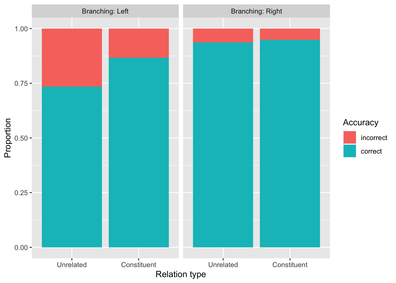
Use shallow to create a bar plot that looks like this one. Show the proportion of correct/incorrect responses by Relation_type, faceting by Branching.
A couple hints:
- To make
geom_bar()display proportions instead of counts, you can writegeom_bar(position = 'fill'). - To include the text “Branching” in the facet labels, give the function
facet_grid()the following arguments:- First,
~ Branching, to tell it to facet by branching, - and then
labeller = labeller(Branching = label_both).
- First,
Notice that this plot reveals a difference of differences: The difference between Relation_type == Unrelated and Relation_Type == Constituent is bigger when Branching == Left, and smaller when Branching == Right. It is this difference of differences that suggests that our model should probably include an interaction between these two variables.
Before we dive into the model, though, let’s verify that our variables are indeed going to be coded the way we want.
Check in on our contrasts
The contrasts() function takes as its argument a factor, and returns the coding that R will use to represent this factor in a model.
Accuracy
contrasts(shallow$Accuracy) correct
incorrect 0
correct 1Which level of Accuracy, our outcome variable, corresponds to a “success” in Bernoulli terms? How do we know? What does this mean for the estimates that the model will produce?
Relation_Type
contrasts(shallow$Relation_type) Constituent
Unrelated 0
Constituent 1Because we are using 0/1 treatment coding, Relation_type’s \(\beta\) coefficient tells us the effect of moving from the baseline level to the non-baseline level. In this case, the baseline is Unrelated, coded as 0. This means that the \(\beta\) coefficient will represent the estimated effect of moving from Unrelated to Constituent.
In other words:
Relation_type’s \(\beta\) coefficient’s 95% CrI will be mostly or entirely positive if greater accuracy is associated withRelation_type == Constituentthan withRelation_type == Unrelated.- Its \(\beta\) coefficient’s 95% CrI will be mostly or entirely negative if lower accuracy is associated with
Relation_type == Constituentthan withRelation_type == Unrelated. - Its \(\beta\) coefficient’s 95% CrI will be centered around zero if there is no clear association between accuracy and relation type.
Based on this information and on the bar plot above, do you expect that the coefficient’s posterior distribution will be largely positive, negative, or around zero?
Branching
contrasts(shallow$Branching) Right
Left 0
Right 1Here, the baseline is Left, so the \(\beta\) for Branching will represent the estimated effect of moving from Left to Right.
In other words:
Branching’s \(\beta\) coefficient’s 95% CrI will be mostly or entirely positive if greater accuracy is associated withBranching == Rightthan withBranching == Left.- Its \(\beta\) coefficient’s 95% CrI will be mostly or entirely negative if lower accuracy is associated with
Branching == Rightthan withBranching == Left. - Its \(\beta\) coefficient’s 95% CrI will be centered around zero if there is no clear association between accuracy and branching.
Again, based on this, what kind of expectations do you have about this coefficient’s posterior distribution?
Let’s see if those expectations are borne out!
Fit the model
From the lecture slides, here is the mathematical specification of the model we want to fit.
\[ \begin{aligned} \text{acc} & \sim Bernoulli(p) \\ logit(p) & = \beta_0 + (\beta_1 \cdot relation) + (\beta_2 \cdot branch) + (\beta_3 \cdot relation \cdot branch)\\ \beta_0 & \sim Gaussian(\mu_0, \sigma_0) \\ \beta_1 & \sim Gaussian(\mu_1, \sigma_1) \\ \beta_2 & \sim Gaussian(\mu_2, \sigma_2) \\ \beta_3 & \sim Gaussian(\mu_3, \sigma_3) \\ \end{aligned} \]
Try to understand what each line is saying.
Now, we’ll use brm() to fit a model called acc_inter_bm.
- The model formula should specify that we’re predicting
Accuracyas a function ofRelation_type,Branching, and their interaction. - Specify the correct family for the model as well as the data we’ll draw on.
- Include
backend = "cmdstanr". - Finish off by saving the model file using
brm()’sfileargument.
acc_inter_bm <- brm(
  ...
)
Run the model.
The summary should look something like this (but don’t worry if your numbers are slightly different from these! That’ll happen due to the randomness inherent in the MCMC sampling process).
summary(acc_inter_bm) Family: bernoulli
Links: mu = logit
Formula: Accuracy ~ Relation_type + Branching + Relation_type:Branching
Data: shallow (Number of observations: 692)
Draws: 4 chains, each with iter = 2000; warmup = 1000; thin = 1;
total post-warmup draws = 4000
Population-Level Effects:
Estimate Est.Error l-95% CI u-95% CI
Intercept 1.02 0.17 0.69 1.38
Relation_typeConstituent 0.85 0.29 0.28 1.43
BranchingRight 1.69 0.36 1.04 2.42
Relation_typeConstituent:BranchingRight -0.63 0.55 -1.72 0.42
Rhat Bulk_ESS Tail_ESS
Intercept 1.00 3445 3109
Relation_typeConstituent 1.00 2527 2141
BranchingRight 1.00 2131 2325
Relation_typeConstituent:BranchingRight 1.00 1860 2203
Draws were sampled using sample(hmc). For each parameter, Bulk_ESS
and Tail_ESS are effective sample size measures, and Rhat is the potential
scale reduction factor on split chains (at convergence, Rhat = 1).Do the coefficient estimates match the predictions you made above? If they don’t, can you figure out why not?
Interpreting the interaction
In general, for treatment-coded predictors, a positive interaction coefficient represents a positive adjustment to one variable’s effect, when we move from the other variable’s baseline level to its non-baseline level (or in other words, when we compare the non-baseline level to the baseline). And a negative interaction coefficient represents a negative adjustment.
As we observed in the lecture, this interaction’s mean estimate of \(-0.63\) suggests that, equivalently,
- there is a smaller effect of
Relation_typeinBranching == Right(non-baseline) when compared toBranching == Left(baseline); and - there is a smaller effect of
BranchinginRelation_type == Constituent(non-baseline) when compared toRelation_type == Unrelated(baseline).
The 95% CrI of \([-1.72, 0.42]\) suggests that the model thinks that a negative interaction is most probable (there is more probability mass on the negative side of zero than on the positive side). However, since positive values also come into question, this suggests that the model is slightly uncertain about the direction of the interaction.
Conditional posterior probability distributions
Getting the conditional posterior probability distributions when so many predictors are at play is a bit of a process, but we’ll approach it step by step.
The first thing to do is to get the posterior draws from our model, using as_draws_df(). (Fun fact: these are the very samples that summary() summarises when it shows us the model’s estimates.)
acc_draws <- as_draws_df(acc_inter_bm)
acc_draws
Each column that begins with b_ represents a posterior probability distribution of one of our model’s \(\beta\) parameters. (Or, more accurately, each column contains a number of samples from the posterior distribution.) Can you identify which column corresponds to which \(\beta\)?
To know how to combine these columns to get the correct conditional posterior probability distributions, we have to reason about how the 0/1 treatment coding affects the presence or absence of the \(\beta\)s.
The basic linear expression in this model is
\[ logit(p) = \beta_0 + (\beta_1 \cdot relation) + (\beta_2 \cdot branch) + (\beta_3 \cdot relation \cdot branch) \]
Our goal is to figure out the conditional posterior probability distribution of \(logit(p)\) (i.e., the log-odds of answering correctly) in each of our four combinations of levels. To do this, we substitute the appropriate 0s and 1s in for \(relation\) and \(branch\).
Again, from the lecture:
\[ \begin{aligned} \text{Unrelated, Left:} && \beta_0 &+ (\beta_1 \cdot 0) + (\beta_2 \cdot 0) + (\beta_3 \cdot 0) &&= \beta_0 &\\ \text{Unrelated, Right:} && \beta_0 &+ (\beta_1 \cdot 0) + (\beta_2 \cdot 1) + (\beta_3 \cdot 0) &&= \beta_0 + \beta_2 &\\ \text{Constituent, Left:} && \beta_0 &+ (\beta_1 \cdot 1) + (\beta_2 \cdot 0) + (\beta_3 \cdot 0) &&= \beta_0 + \beta_1 &\\ \text{Constituent, Right:} && \beta_0 &+ (\beta_1 \cdot 1) + (\beta_2 \cdot 1) + (\beta_3 \cdot 1) &&= \beta_0 + \beta_1 + \beta_2 + \beta_3 &\\ \end{aligned} \]
Make sure you understand why each 0 and 1 appears where it does.
Now in R, we’ll use this working-out to tell us which columns to add together. The result will be a data frame where each column contains the conditional posterior probability distribution of \(logit(p)\) for one of the four combination of levels.
acc_draws_cond <- acc_draws %>%
  mutate(
    Unrelated_Left = b_Intercept,
    Unrelated_Right = b_Intercept + b_BranchingRight,
    Constituent_Left = b_Intercept + b_Relation_typeConstituent,
    Constituent_Right = b_Intercept + b_BranchingRight + b_Relation_typeConstituent + `b_Relation_typeConstituent:BranchingRight`
  ) %>%
  select(Unrelated_Left:Constituent_Right)

acc_draws_cond
(Note that, in acc_draws, the column name that corresponds to the interaction’s \(\beta\) contains the symbol :, which can be confusing to R. To avoid problems, we can wrap that column name in tick marks.)
Now these conditional posterior probability distributions are almost ready to work with! There’s just one more big data-manipulation step left before we can compute some summary statistics and create some pretty plots.
That step is to transform this data frame into “long” format using pivot_longer(). The goal is to have a data frame with the following columns:
predictors, which contains what is currently in the column headers;sampled_logodds, which contains all of the values that currently fill the four columns.
acc_draws_cond_long <- acc_draws_cond %>%
  pivot_longer(
    # The range of columns to pivot:
    Unrelated_Left:Constituent_Right,
    # Name the column that will contain the current headers:
    names_to = 'predictors',
    # Name the column that will contain the current values:
    values_to = 'sampled_logodds'
  )
acc_draws_cond_long
Can you see how acc_draws_cond_long contains the same data as acc_draws_cond?
Okay, just a couple tiny things left:
- We’re going to use a function from the tidyverse called
separate()to split thepredictorscolumn up into two columns: one forRelation_type, and another forBranching. Have a look at the documentation forseparate()if you’re curious about the details. acc_draws_cond_longis a new data frame, so R will apply its defaults for factor ordering unless we again set the factor levels manually.
acc_draws_cond_long <- acc_draws_cond_long %>%
  # Split `predictors` on '_' into one column per predictor.
  separate(predictors, into = c('Relation_type', 'Branching')) %>%
  # Set factor levels.
  mutate(
    Relation_type = factor(Relation_type, levels = c('Unrelated', 'Constituent')),
    Branching     = factor(Branching, levels = c('Left', 'Right'))
  )
acc_draws_cond_long
Nice!
We are finally ready to summarise and plot these distributions.
Compute means and 95% CrIs
Before moving on to plotting, we’ll use acc_draws_cond_long to compute summary statistics of the posteriors. We can do this using some now-familiar machinery: group_by(), summarise(), mean(), and quantile2().
acc_cond_summ <- acc_draws_cond_long %>%
  group_by(Relation_type, Branching) %>%
  summarise(
    # Calculate the lower and upper bounds of a 95% CrI + mean
    mean_logodds = mean(sampled_logodds),
    q95_lo = round(quantile2(sampled_logodds, probs = 0.025), 2),
    q95_hi = round(quantile2(sampled_logodds, probs = 0.975), 2),
    # Transform into probabilities
    p_mean   = round(plogis(mean_logodds), 2),
    p_q95_lo = round(plogis(q95_lo), 2),
    p_q95_hi = round(plogis(q95_hi), 2)
  )
acc_cond_summ
A good sense check to make sure that we did this computation correctly is to compare it to the output of summary(). Because summary() also computes summary measures using posterior draws, we can compare the numbers in the model summary and in acc_cond_summ that we’d expect to be the same. Specifically, in the model summary, the estimates for Intercept should match the summary measures here for Relation_type == Unrelated and Branching == Left (since those are the two baseline levels).
Let’s have a look:
cat(capture.output(summary(acc_inter_bm))[8:13], sep = "\n")Population-Level Effects:
Estimate Est.Error l-95% CI u-95% CI
Intercept 1.02 0.17 0.69 1.38
Relation_typeConstituent 0.85 0.29 0.28 1.43
BranchingRight 1.69 0.36 1.04 2.42
Relation_typeConstituent:BranchingRight -0.63 0.55 -1.72 0.42Yes! The intercept’s Estimate matches the mean when Relation_type == Unrelated and Branching == Left, and the lower and upper bounds of the 95% CrI match as well. So now we can be reassured that our computation is reasonable.
Plot multiple posterior densities
Finally, we’ll use the conditional posterior probability distributions to create a density plot.
See if you understand how the following code creates the plot we see below.
acc_draws_cond_long %>%
  ggplot(aes(x = sampled_logodds, fill = Relation_type)) +
  geom_density(alpha = 0.5) +
  facet_wrap(~ Branching, nrow=2, labeller = labeller(Branching = label_both)) +
  labs(x = 'Log-odds',
       y = 'Probability density',
       title = 'Conditional posterior probability of log-odds of "correct" response',
       fill = 'Relation type')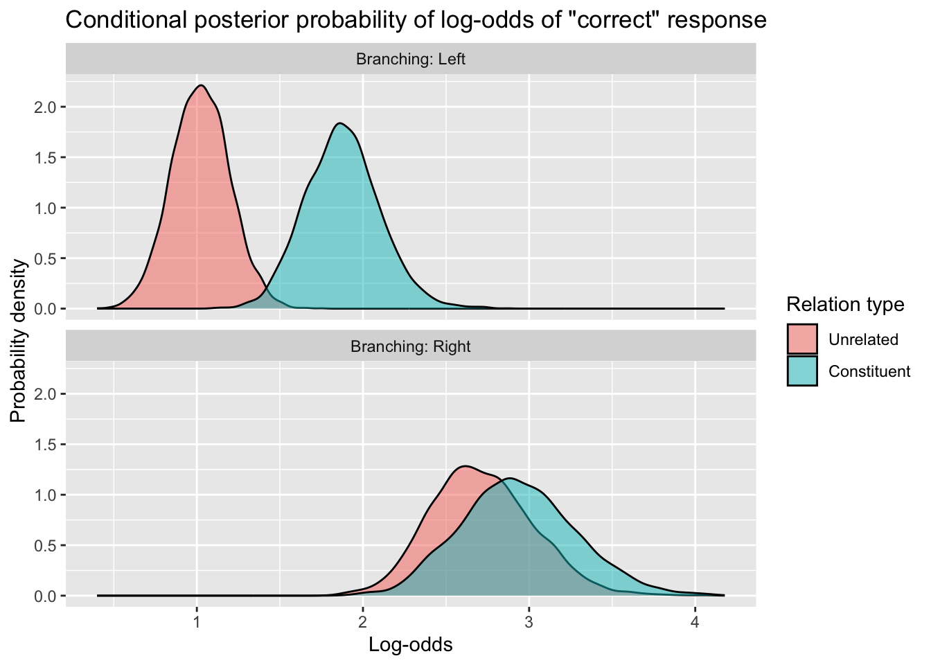
How would you create the same plot, but instead of the x axis showing the data in log-odds, have the x axis showing the data back-transformed to probabilities? Something like this:
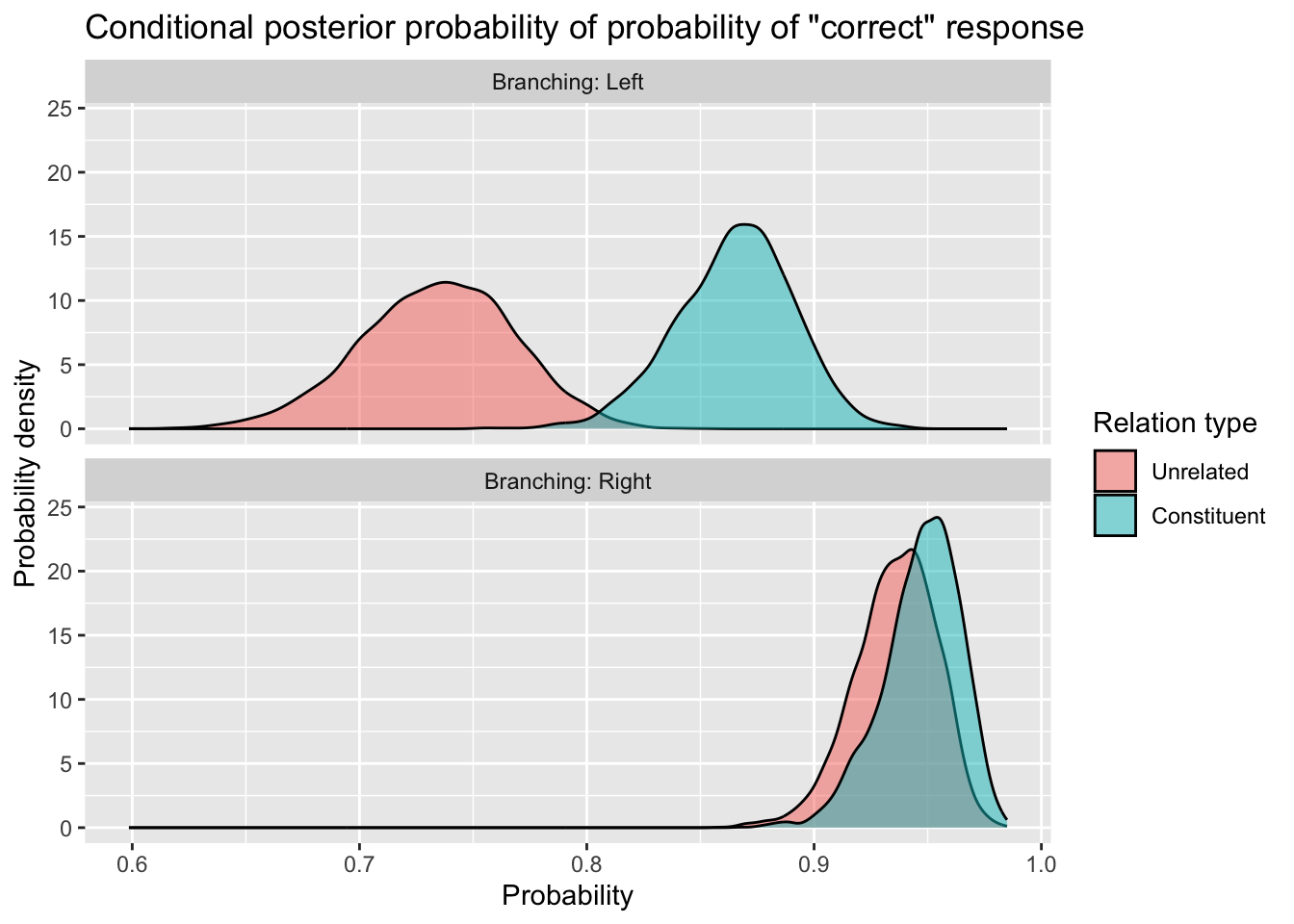
Give it a shot. Creating this kind of plot is really worth practicing, because these are exactly the kinds of plots you’ll want to show in your reports and dissertations.
OK, that’s it for our first model! Now we’ll turn to the second part of the tutorial: a more loosely-guided walkthrough of how to put a few different things you’ve learned so far into practice.
Vowel duration in Italian and Polish
The data we’ll use in this section comes from Coretta, S., (2019) “An exploratory study of voicing-related differences in vowel duration as compensatory temporal adjustment in Italian and Polish”, Glossa: a journal of general linguistics 4(1): 125. doi: https://doi.org/10.5334/gjgl.869.
The dataset can be downloaded here: dur-ita-pol.csv.
Read in the data
Save dur-ita-pol.csv in your data/ folder, and read it in using read_csv().
dur_ita_pol <- ...The data you see should look something like this (selecting only a handful of the many columns to view!).
dur_ita_pol %>%
  select(speaker, word, vowel, v1_duration, c2_phonation, language)
The variables of interest for us are:
v1_duration: Vowel duration in milliseconds (ms).c2_phonation: Whether the word’s second consonant is voiced or voiceless.language: The first language of the speaker (Italian or Polish).
The model we’ll build below will predict v1_duration as a function of c2_phonation, language, and their interaction.
Visualise (and process) the data
What kinds of transformations and level re-orderings, if any, will we need to do to prepare the data for analysis?
We’ll begin with the outcome variable, v1_duration.
Vowel duration
Let’s create a density plot to see how vowel duration is distributed.
dur_ita_pol %>%
  ggplot(aes(x = v1_duration)) +
  geom_density(fill = 'grey', alpha = 0.5) +
  geom_rug() +
  labs(x = 'Vowel duration (ms)')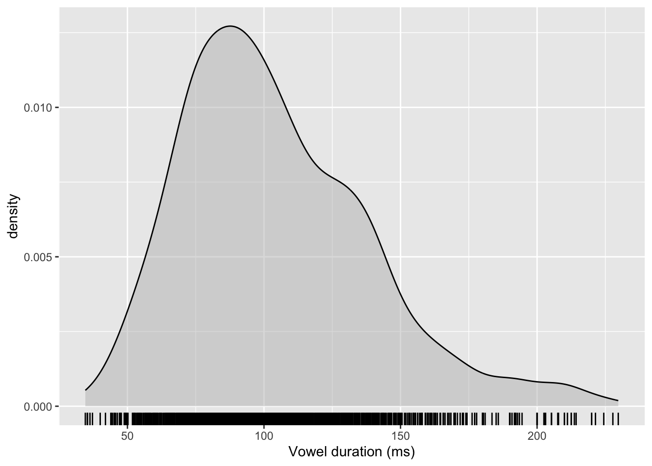
Some observations:
- Vowel duration can only be positive.
- The distribution is slightly right-skewed (that is, it is asymmetrical and has a longer tail going off to the right).
These two things suggest that this variable, taken as-is, should perhaps not be modelled using a Gaussian distribution. Rather, we’ll want to transform it.
We want to make this variable
- in principle able to be positive or negative, and
- look less asymmetrical, more Gaussian.
Which transformation that we’ve encountered before do you think would improve the situation?
Before moving on:
- Use
mutate()to apply the transformation you’ve chosen to thev1_durationvariable. - Make a new density plot to see whether your transformation has worked.
(For real! Pause here and work through it yourself first.)
Spoiler alert: The transformation that we’ll use for the rest of this tutorial is the log transformation. (Is that the transformation you chose? If not, how does your choice of transformation compare?)
Here’s one way to log-transform v1_duration. The result, log_v1_dur, is what we’ll use as the outcome variable in our model below.
dur_ita_pol <- dur_ita_pol %>%
  mutate(
    log_v1_dur = log(v1_duration)
  )
OK, let’s now have a look at how the categorical predictors are associated with vowel duration.
Vowel duration by phonation
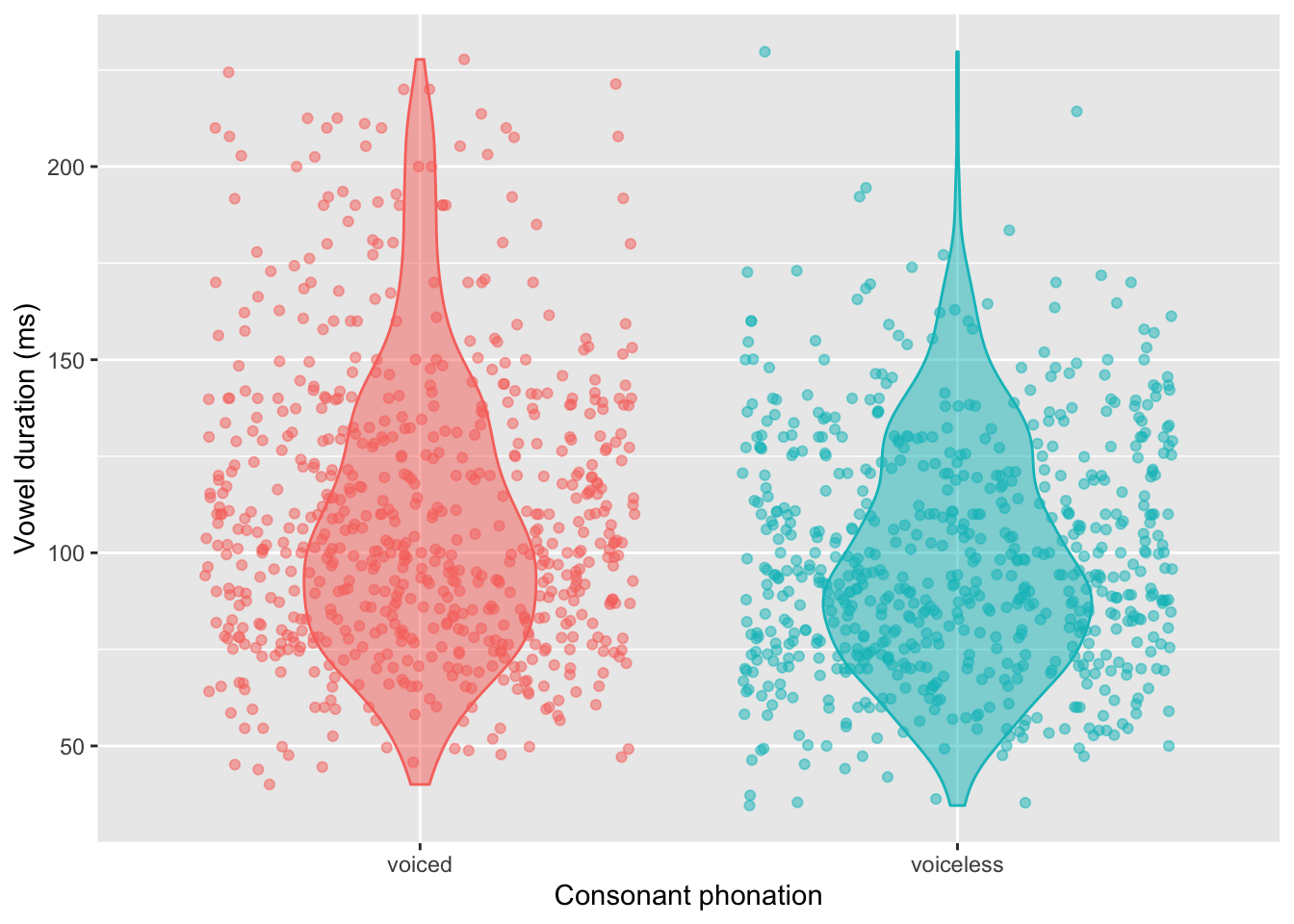
The following code creates a violin plot with overlaid jittered points to illustrate vowel duration (ms) by c2_phonation.
dur_ita_pol %>%
  ggplot(aes(x = c2_phonation,
             y = v1_duration,
             fill = c2_phonation,    # fills the violin plots
             colour = c2_phonation)  # colours the points and violin outlines
         ) +
  geom_violin(alpha = 0.5, width = 0.5) +
  geom_jitter(alpha = 0.5) +
  theme(legend.position = 'none') +
  labs(
    y = 'Vowel duration (ms)',
    x = 'Consonant phonation'
  )
An optional activity, if you like playing around with plots: Change the y axis from the ms scale to the transformed log scale. (And be sure to also change the label of the y axis, since the units shown are no longer going to be milliseconds, but log(ms).)
Vowel duration by language
language is also a two-level variable, so you should be able to adapt the code shown above to create another violin plot with jittered points, this time showing how vowel duration (either on the ms or log(ms) scale) differs by language. What can you discover about how long the vowels are in Italian vs. Polish?
Vowel duration by phonation and language
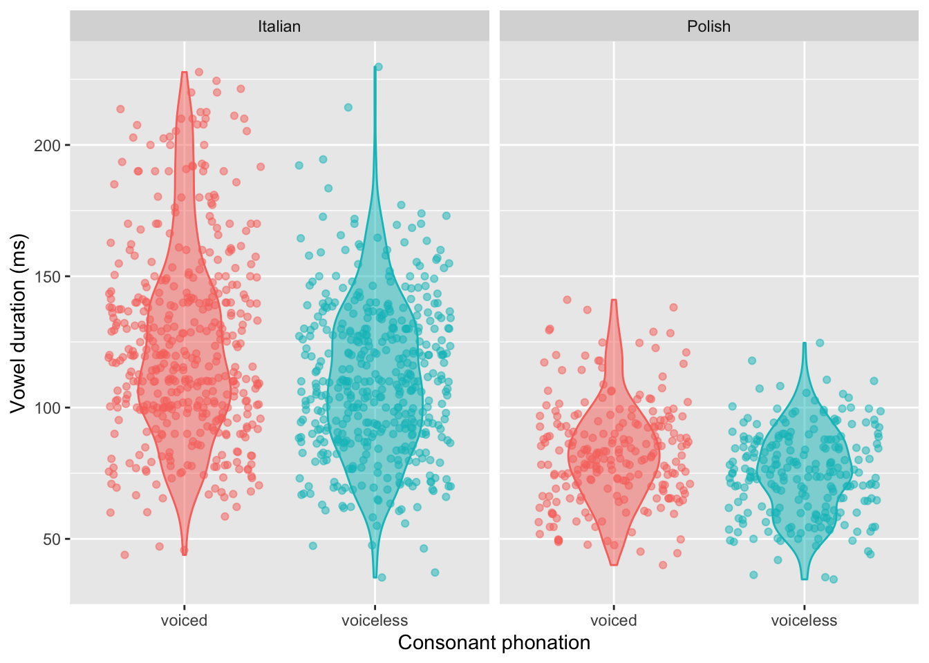
One final plot before we turn to the contrast coding! We’ll now visualise both c2_phonation and language together. Specifically, we’ll fill/colour the geoms by c2_phonation and facet the plot by language.
dur_ita_pol %>%
  ggplot(aes(x = c2_phonation,
             y = v1_duration,
             fill = c2_phonation,
             colour = c2_phonation)
         ) +
  geom_violin(alpha = 0.5, width = 0.5) +
  geom_jitter(alpha = 0.5) +
  facet_wrap(~ language) +
  theme(legend.position = 'none') +
  labs(
    y = 'Vowel duration (ms)',
    x = 'Consonant phonation'
  )
(Again, if you would like, create a version of this plot with log(ms) on the y axis instead.)
Interpret the contrasts
Use contrasts() to display the contrasts that R will use for c2_phonation and language.
With respect to those contrasts, try to answer the following questions:
- Which level of each predictor corresponds to the baseline level (a.k.a., the reference level)? How do we know?
- Based on the plots above and on the coding of
c2_phonation, do you think the model’s estimate for the coefficient ofc2_phonationwill be positive, negative, or near zero? - What about for
language? - What about for the interaction between
c2_phonationandlanguage?
Fit the model
dur_bm <- brm(
  ...
)- The model formula should specify that we’re predicting log vowel duration as a function of
c2_phonation,language, and their interaction. - Use the appropriate model family.
- Tell the model which dataset to draw from.
- Use cmdstanr as the backend.
- Save the model to a file.
Here’s what your model summary should look like (more or less!).
summary(dur_bm) Family: gaussian
Links: mu = identity; sigma = identity
Formula: log_v1_dur ~ c2_phonation * language
Data: dur_ita_pol (Number of observations: 1334)
Draws: 4 chains, each with iter = 2000; warmup = 1000; thin = 1;
total post-warmup draws = 4000
Population-Level Effects:
Estimate Est.Error l-95% CI u-95% CI Rhat
Intercept 4.78 0.01 4.75 4.80 1.00
c2_phonationvoiceless -0.11 0.02 -0.15 -0.07 1.00
languagePolish -0.39 0.02 -0.43 -0.34 1.00
c2_phonationvoiceless:languagePolish 0.01 0.03 -0.05 0.07 1.00
Bulk_ESS Tail_ESS
Intercept 3203 2925
c2_phonationvoiceless 2911 2684
languagePolish 2707 3082
c2_phonationvoiceless:languagePolish 2283 2884
Family Specific Parameters:
Estimate Est.Error l-95% CI u-95% CI Rhat Bulk_ESS Tail_ESS
sigma 0.27 0.01 0.26 0.28 1.00 3972 2723
Draws were sampled using sample(hmc). For each parameter, Bulk_ESS
and Tail_ESS are effective sample size measures, and Rhat is the potential
scale reduction factor on split chains (at convergence, Rhat = 1).How does this line up with the predictions you made?
Interpreting the interaction
Here, the interaction coefficient’s mean is estimated at 0.01 (95% CrI: –0.05, 0.07). This posterior distribution is basically centered on zero, with near-equal probability assigned to both negative and positive values. This means that the model isn’t at all certain about the direction of the interaction’s effect, or even whether there is one at all.
(Keep in mind that null results like this are just part of doing research, and that a model that yields null results isn’t an inherently bad or uninteresting model.)
Conditional posterior probability distributions
Reproduce the workflow we went through above with your new model. This will involve:
- Getting the posterior draws from the model using
as_draws_df(). - Work out which columns correspond to which \(\beta\)s.
- Add those columns together appropriately to cover all four combinations of the levels of
c2_phonationandlanguage. - Transform the resulting data frame into “long” format using
pivot_longer(). - Separate the column headers into two columns, one of which corresponds to
c2_phonationand the other,language.
Your data frame should have three columns: c2_phonation, language, and whatever you’ve chosen to name the column that contains all the posterior samples (perhaps something like sampled_logms).
Using this data, compute the mean and 95% CrIs of the conditional posterior probability distributions for every combination of c2_phonation and language, and generate density plots of the conditional posterior probability distributions.
These conditional posterior probability distributions are going to be in log space, because we log-transformed the durations to make them modellable as Gaussian. So, like the way we back-transformed the log-odds into probabilities above using plogis(), you’ll also want to back-transform the log(ms) into ms by using the inverse of the log() function, which is exp().