SQM tutorial - Week 4
Let’s pick up from where we left off last week.
In week 3, you learnt how to use ggplot2 to create bar charts and how to create different panels. Bar charts are great for categorical data.
This week you will learn how to make density and violin plots, which work very well with numeric data in combination of categorical data (for example, when you want to show values of a numeric variable across different groups).
Then, you will use the brm() function from the brms package to model continuous variables.
But first, let’s read some data and transform it so that we can use it in the tutorial.
Mutating data
The alb_vot data
Let’s play around with the Albanian VOT data we used in class.
The data comes from the paper by Coretta and colleagues, 2022. Northern Tosk Albanian. DOI: 10.1017/S0025100322000044. This is an IPA Illustration of Northern Tosk Albanian. It contains data from voiceless and voiced consonants of Nothern Tosk Albanian, as uttered in a set of words by 5 speakers.
To download the file with the data right-click on the following link and download the file: alb_vot.csv. (Note that tutorial files are also linked in the Syllabus). Remember to save the file in data/ in the course project folder.
Create a new .Rmd file first, save it in code/ and name it tutorial-w04 (the extension .Rmd is added automatically!).
I leave to you creating title headings in your file as you please. Remember to to add knitr::opts_knit$set(root.dir = here::here()) in the setup chunk and to attach the tidyverse.
Now you can create a new code chunk and read the alb_vot.csv file in R. Remember how to do this?
alb_vot <- ...Great!
alb_votThe data frame has the following columns:
speaker: the speaker ID.file: the file the measurements are take from.label: the label in the interval.release: the time of the consonant’s closure release in seconds.voi_onset: the onset of voicing of the vowel following the target consonant in seconds.consonant: the IPA transcription of the target consonant.
Now we need to create a new column with the Voice Onset Time (vot) values. Note that VOT is simply the difference between the onset of voicing (voi_onset) and the time of release (release).
Create a new column
To change or create columns, we can use the mutate() function from the dplyr package. This is another tidyverse package, and it’s attached when you attach the tidyverse. The summarise() and count() functions you used in Week 2 are from this same package.
Let’s calculate VOT now.
alb_vot <- alb_vot %>%
  mutate(
    vot = voi_onset - release
  )
Since we are mutating alb_vot, we need to assign (<-) the output of mutate() back into alb_vot. Check the alb_vot data frame now to view the newly created column vot (to view the data frame, click on alb_vot in the Environment tab, in the top-right panel of Rstudio).
Well done!
Normally, VOT is measured in milliseconds (ms), but the vot column is now in seconds (because release and voi_onset are in seconds).
Let’s change this. We can overwrite the vot column:
alb_vot <- alb_vot %>%
  mutate(
    # Multiply by 1000 to get ms from s
    vot = (voi_onset - release) * 1000
  )
Check alb_vot now to see that it worked.
Density plots
Density plots show the distribution (i.e. the probability density) of the values of a continuous variable.
VOT is a numeric continuous variable so density plots are appropriate.
To plot the probability density of a continuous variable, you can use the density geometry. Remember, all geometry functions start with geom_.
Fill in the … in the following code to create a density plot of VOT values in alb_vot.
alb_vot %>%
  ggplot(aes(x = vot)) +
  ...
Note that to create a density plot, you only need to specify the x-axis. The y-axis is the probability density, which is automatically calculated.
What can you notice about the distribution of VOT values?
Make things cozy with a rug
The density line shows you a smoothed representation of the data distribution over the VOT values, but you might also want to see the raw data.
You can do so by adding the rug geometry.
alb_vot %>%
  ggplot(aes(vot)) +
  geom_density() +
  ...
Nice huh?
If-else
What if we want to plot the density of voiceless and voiced consonants separately?
We could use faceting, as you learnt in Week 3, or we can use the aesthetics fill and/or colour.
However, first we need to create a new column that indicated if a consonant is voiceless or voiced!
We will use the mutate() function again to create a new voicing column. But how do we get the values for this new column (without having to manually code each consonant as voiceless or voiced)?
We can use the ifelse() function!
The ifelse() function works a bit like the English sentence “If X is true, do Y, otherwise do Z”. The “X” has to be a “logical statement”, i.e. an expression using logical operators. So let’s talk about logical operators (we will get back to them below, when we will filter the VOT data).
Logical operators
There are four main logical operators:
x == y:xequalsy.x != y:xis not equal toy.x > y:xis greater thany.x < y:xis smaller thany.
Logical operators return TRUE or FALSE depending on whether the statement they convey is true or false. Remember, TRUE and FALSE are logical values.
Try these out in the Console:
# This will return FALSE
1 == 2
[1] FALSE# FALSE
"apples" == "oranges"[1] FALSE# TRUE
10 > 5[1] TRUE# FALSE
10 > 15[1] FALSE# TRUE
3 < 4[1] TRUEFinding unique values
Let’s create a new column that states whether a consonant is voiced or voiceless. Because we’re modifying the data frame, let’s move back into the editor so that all of our manipulations are recorded.
So, the data contains the following consonants:
cons_ipa <- alb_vot$consonant

unique(cons_ipa)
[1] "ts" "b" "ɡ" "k" "p" "t" "d" "dz" "tʃ" "d̻ʒ̻" "t̻ʃ̻" "dʒ"Wait, what’s that $ in alb_vot$consonant there? That is a base R way of extracting a single column (in this case consonant) from a data frame (alb_vot).
If you check cons_ipa in the Environment tab, it will say that this is chr vector, i.e. a character vector. This makes sense, because consonant is a character column in alb_vot.
The unique() function shows the unique values of a vector (it works with any type of vector, numeric, character, logical, …).
This is great, we now know all the consonants in the consonant column, but maybe it will be easier to type them later if we use the custom transcription in label rather than IPA.
cons_lab <- alb_vot$label

unique(cons_lab)
[1] "ts" "b" "g" "k" "p" "t" "d" "dz" "tS" "J" "c" "dZ"Great! Now, to make things easier, let me tell you which consonants are voiceless and which are voiced:
voiceless:
c("ts", "k", "p", "t", "tS", "c").voiced:
c("b", "g", "d", "dz", "J", "dZ").
Don’t worry about assigning these vectors to variables right now.
The %in% operator
Now with this knowledge we can create a new column with voiceless and voiced values for each row in the data frame. Like so:
alb_vot <- alb_vot %>%
  mutate(
    voicing = ifelse(
      # IF this is TRUE
      label %in% c("ts", "k", "p", "t", "tS", "c"),
      # Write
      "voiceless",
      # OR ELSE write
      "voiced"
    )
  )
Let’s unpack this. First of all, what is label %in% c("ts", "k", "p", "t", "tS", "c") doing?
The %in% operator is a special logical operator that returns TRUE if the value to the left is one of the values in the list to its right, and FALSE if not.
Try these in the Console:
# TRUE
5 %in% c(1, 2, 5, 7)
[1] TRUE# FALSE
"apples" %in% c("oranges", "bananas")[1] FALSEBut %in% is even more powerful because the value on the left does not have to be a single value, but it can also be a vector! We say %in% is vectorised because it can work with vectors (most functions and operators in R are vectorised).
# TRUE, TRUE
c(1, 5) %in% c(4, 1, 7, 5, 8)
[1] TRUE TRUEstocked <- c("durian", "bananas", "grapes")
needed <- c("durian", "apples")
# TRUE, FALSE
needed %in% stocked[1] TRUE FALSETry to understand what is going on in the code above before moving on.
Voiceless or voiced?
So now run the code to create a new column voicing (this is the same code as above).
alb_vot <- alb_vot %>%
  mutate(
    voicing = ifelse(
      # IF this is TRUE
      label %in% c("ts", "k", "p", "t", "tS", "c"),
      # Write
      "voiceless",
      # OR ELSE write
      "voiced"
    )
  )
The ifelse() function is doing the following:
If the value in the column
labelis among (%in%) the values in the vectorc("ts", "k", "p", "t", "tS", "c").Write
voicelessin thevoicingcolumn.Otherwise write
voiced.
Check out the voicing column in alb_vot.
Now that we have the info we need to plot voiceless and voiced consonants separately, let’s do that! But to spice things up a bit, let’s do it with violin plots.
Violin plots
An efficient way of showing the distribution of continuous variables depending on discrete groups (like voicing) are the so-called violin plots.
Go ahead and run the following code.
alb_vot %>%
  ggplot(aes(voicing, vot)) +
  geom_violin()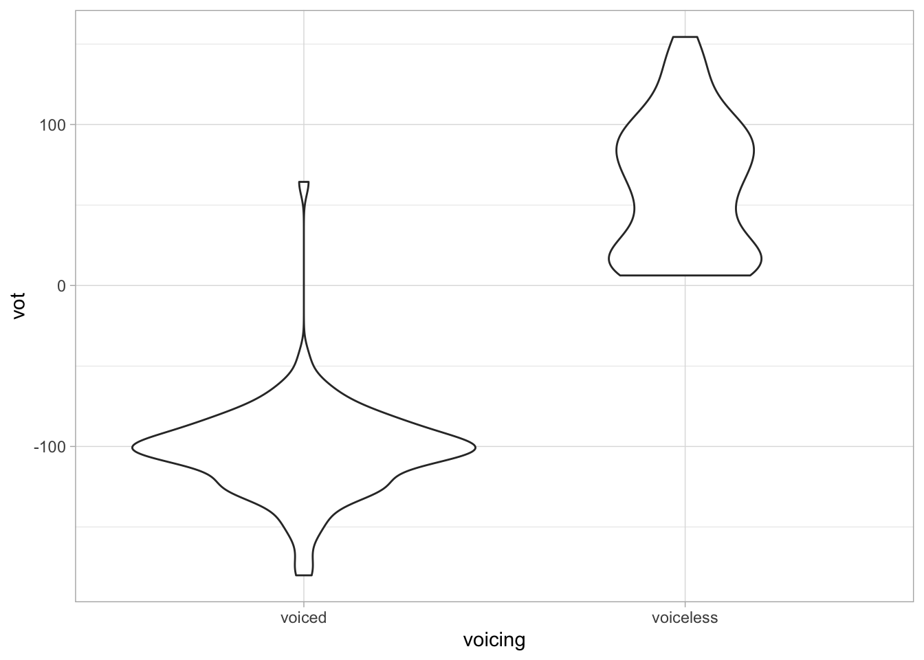
They are called violin plots because they look like violins! The geometry for violin plots is… geom_violin().
Usually, you need the following aesthetics:
x-axis: a categorical variable, likevoicing.y-axis: a continuous numeric variable, likevot.
Lay over the raw data
You can lay over raw data on top of the violins. To do so, you can use the jitter geometry.
geom_jitter() creates so-called strip charts. Let’s first see how these look like without violins.
alb_vot %>%
  ggplot(aes(voicing, vot)) +
  geom_jitter()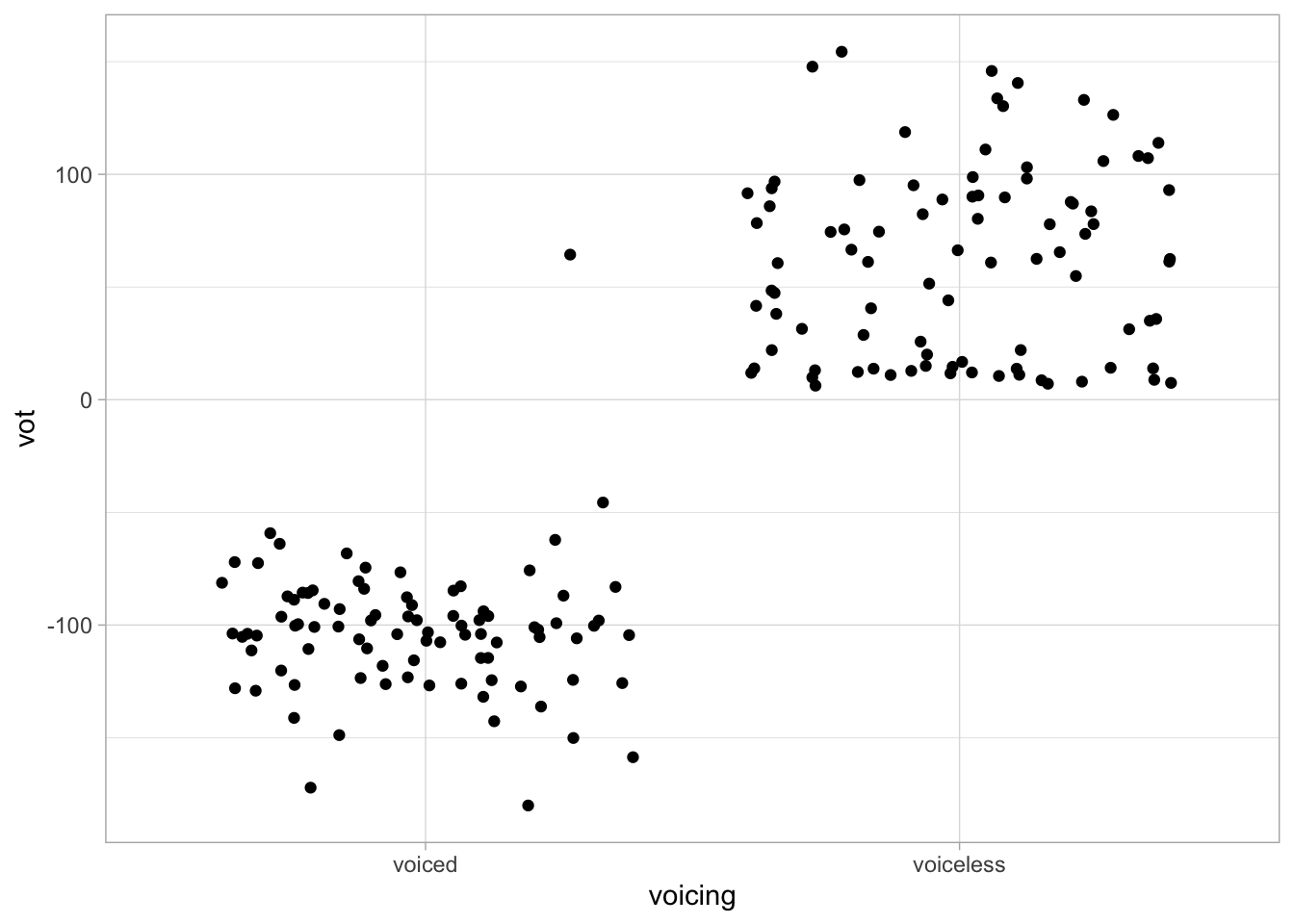
That doesn’t look great right? The points are spread too widely.
We can fix that by specifying the argument width in the jitter geometry to be something smaller than 0.5. Try a few values until you think it looks better.
alb_vot %>%
  ggplot(aes(voicing, vot)) +
  geom_jitter(width = ...)
When you are satisfied, create a violin plot with overlaid strip charts.
alb_vot %>%
  ggplot(aes(voicing, vot)) +
  geom_violin() +
  geom_jitter(width = ...)
Note that the order between the violin and jitter geoms is important. If you add the jitter geometry before the violin geometry, the violins will just cover the jittered points (see why it is called “layered” grammar of graphics?).
Let’s add some colour
Let’s fill the violins with colour. For now, just colour the violins depending on voicing.
alb_vot %>%
  ggplot(aes(voicing, vot, fill = voicing)) +
  geom_violin() +
  geom_jitter(width = 0.05)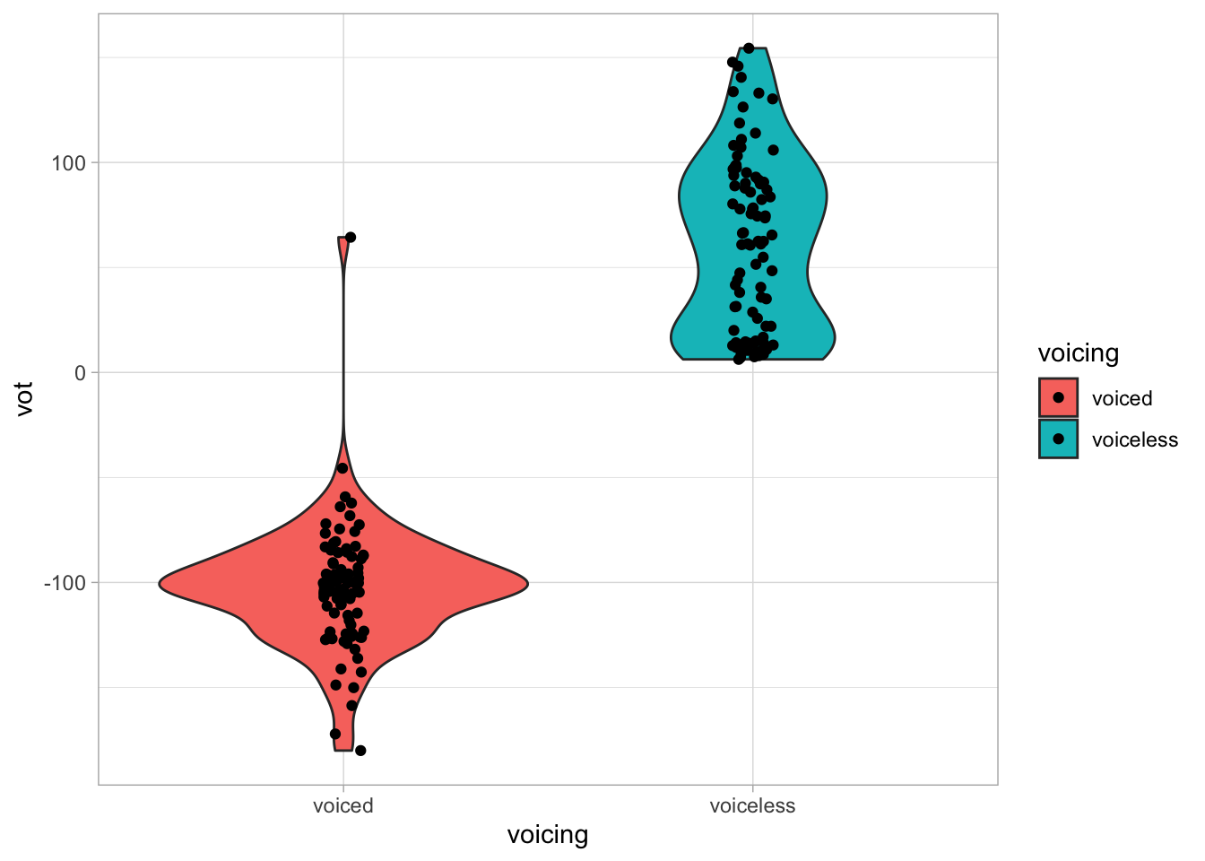
Not bad! But maybe we can improve by making the fill a bit transparent?
You can achieve that with the alpha argument in geom_violin(), which takes a number between 0 (completely transparent) and 1 (completely opaque).
Add it to the code above to make the fill transparent. Try different values until you are satisfied with the output. You could also add alpha to geom_jitter() to make the points a bit transparent.
alb_vot %>%
  ggplot(aes(voicing, vot, fill = voicing)) +
  geom_violin(...) +
  geom_jitter(width = 0.05)
Wonderful! Now, what can you tell about VOT in voiceless and voiced consonants in Albanian based on this plot?
Filtering data
We are getting closer and closer to start modelling our VOT data to learn more about them.
Normally, you would approach data modelling by using the entire data set and including as many variables as it makes sense.
Since you are just starting to learn how to model data with brms, we will first take a pedagogical approach and start small.
To do, we will filter the data so that we include only voiceless plosives that don’t have a VOT longer than 20 ms. (Again, we are doing this now for pedagogical reasons, not because this is what you would do with this data in real-life research).
The filter() function
Filtering in R with the tidyverse is straightforward. You can use the filter() function.
In the code below, we are filtering the alb_vot data so that we only include the voiceless stops c("p", "t", "k"). Moreover, we want only rows for with the VOT is less than 20 ms.
alb_vot_vl <- alb_vot %>%
  filter(
    label %in% c("p", "t", "k"),
    vot < 20
  )
This should not look too alien! The first statement, label %in% c("p", "t", "k") works like the %in% statement we used above with mutate().
In filter(), you can add multiple statements to filter the data with, separated by commas. Here we have a second statement, vot < 20, i.e. “give me VOT values that are less than 20 ms”. Combining statements like this will give you only those rows where both conditions apply.
You might have noticed that we need to assign the output of filter(), which is a data frame, to a new variable alb_vot_vl (“vl” for “voiceless”). This will be the data frame you will use in the next section.
Modelling with brm()
In the lecture, we have seen that we can assume voiceless VOT values to be distributed according to a Gaussian distribution (you may also have encountered Gaussian distributions under the name “normal distribution”).
\[vot \sim Gaussian(\mu, \sigma)\]
We can calculate the sample mean and standard deviation easily, using the summarise() function, as you learnt in Week 2.
alb_vot_vl %>%
  summarise(
    vot_mean = mean(vot),
    vot_sd = sd(vot)
  )
But now we want to make inference from our sample (N = 24) to the entire population of VOT values of the Albanian voiceless plosives /p/, /t/, /k/.
We want to estimate the following probability distributions:
\[\mu = Gaussian(\mu_1, \sigma_1)\] \[\sigma = TruncGaussian(\mu_2, \sigma_2)\]
In other words, we are trying to estimate the following parameters (called “hyperparameters”): \(\mu_1\), \(\sigma_1\), \(\mu_2\), \(\sigma_2\).
We can achieve this by modelling the data using the brm() function from the brms package (BRM stands for Bayesian Regression Model). We will go into more details about what this means in the weeks to follow. For now, note that regression is a synonym of linear model, a type of modelling approach that you are learning in this course).
Add library(brms) in the setup chunk and run that chunk again. Then, run the following code.
alb_vot_bm <- brm(
  vot ~ 1,
  family = gaussian(),
  data = alb_vot_vl,
  backend = "cmdstanr"
)
You will see the message Compiling Stan program... followed by Start sampling and Running MCMC with 4 sequential chains.... Something like in the figure below.
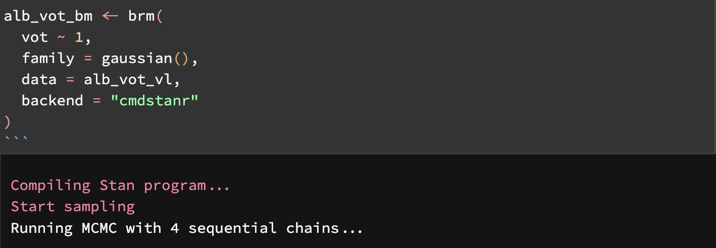
We will get back to what all this means in the coming weeks. For now know that Stan is a programming language that can run Bayesian models. brm() is an R interface to Stan, so that you can use R and R syntax to run Bayesian models without having to learn Stan! (If you feel adventurous, nobody stops you from learning Stan too, although it is not required for this course).
After those initial messages, you will see a list of messages about chains and interactions, as in the figure below.
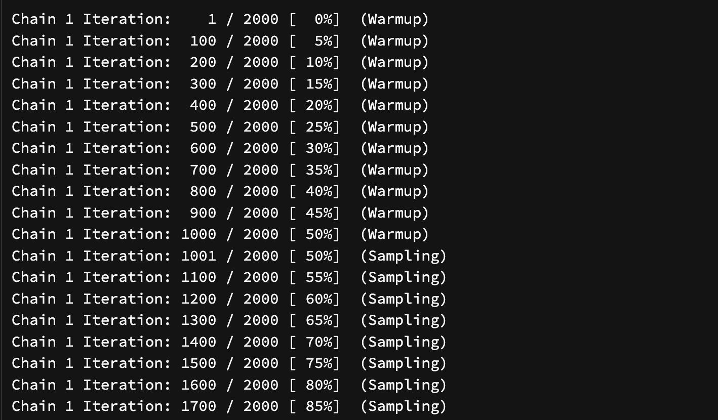
These are about the MCMC stuff mentioned in one of the messages above: MCMC stands for Markov-Chain Monte Carlo. Keep reading for a quick intro.
Markov-Chain Monte Carlo (MCMC)
You don’t need to understand the details of this. For now, just remember that several draws are made (i.e. the algorithm is run for several iterations), and that the model runs 4 chains of these iterations.
We will learn more about chains and iterations in the coming weeks and you will know how to use information about these to diagnose the robustness of the estimated parameters.
Model summary
Now we can inspect the model output using the summary() function (don’t confuse this with the summarise() function, used to get statistical summaries of data).
summary(alb_vot_bm) Family: gaussian
Links: mu = identity; sigma = identity
Formula: vot ~ 1
Data: alb_vot_vl (Number of observations: 24)
Draws: 4 chains, each with iter = 2000; warmup = 1000; thin = 1;
total post-warmup draws = 4000
Population-Level Effects:
Estimate Est.Error l-95% CI u-95% CI Rhat Bulk_ESS Tail_ESS
Intercept 11.62 0.59 10.48 12.78 1.00 2559 2158
Family Specific Parameters:
Estimate Est.Error l-95% CI u-95% CI Rhat Bulk_ESS Tail_ESS
sigma 2.88 0.44 2.18 3.88 1.00 2327 2013
Draws were sampled using sample(hmc). For each parameter, Bulk_ESS
and Tail_ESS are effective sample size measures, and Rhat is the potential
scale reduction factor on split chains (at convergence, Rhat = 1).We have seen the summary of this model during the lecture. Do you remember how to interpret it?
You can use the tidy() function from the broom.mixed package to extract the information on the estimated parameters as a table (remember to attach the package in the setup chunk; you might also need to install the package).
tidy(alb_vot_bm)The term column gives us the two parameters we wanted to estimate:
(Intercept)is actually \(\mu\).sd__Observationis \(\sigma\).
Note that sd__Observation in the tidy table corresponds to sigma in the model summary above.
Now, for each of the two parameters, you get estimate and std.error. There are the hyper-parameters of the probability distributions for \(\mu\) and \(\sigma\).
For (Intercept) (\(\mu\)):
estimateis \(\mu_1\): 11.62 ms.std.erroris \(\sigma_1\): 0.57 ms.
For sd__Observation (\(\sigma\)):
estimateis \(\mu_2\): 2.86 ms.std.erroris \(\sigma_2\): 0.44 ms.
In other words:
\[vot \sim Gaussian(\mu, \sigma)\] \[\mu = Gaussian(11.62, 0.57)\] \[\sigma = TruncGaussian(2.86, 0.44)\]
Based on the model summary and on the tidy summary, we also know the 95% Credible Intervals (CIs or CrIs) of the probability distributions of \(\mu\) and \(sigma\). They are in the columns called conf.low and conf.high.
At 95% confidence, the mean (\(\mu\)) VOT value for Albanian voiceless stops is between 10.5 and 12.8 ms.
As for the standard deviation (\(\sigma\)), we can be 95% confident that it is between 2.18 and 3.88 ms.
One way to describe probability distributions is to state the values of their parameters and their 95% CrIs, as we just did.
Another way is to visualise probability distributions by plotting probability densities. You will learn how to do this next week.
In the meantime, read on to find out how to add titles and change axis labels to plots and how to position the legend!
Legends and labels in plots
Plot titles and labels
The labs() function allows you to set the plot title, subtitle, axis labels and more.
Since these are strings (i.e. text), they must be quoted with "". Replace the ... below with an appropriate title, like "VOT of Albanian stops".
alb_vot %>%
  ggplot(aes(voicing, vot, fill = voicing)) +
  geom_violin() +
  geom_jitter(width = 0.05, alpha = 0.2) +
  labs(
    title = ...
  )
Axis labels
To change the the axis labels, you can specify a string for x and y in the labs() function.
I have changed the x label here below. Go ahead and change y to "VOT (ms)". (Remember to also add the title).
alb_vot %>%
  ggplot(aes(voicing, vot, fill = voicing)) +
  geom_violin() +
  geom_jitter(width = 0.05, alpha = 0.2) +
  labs(
    title = ...,
    x = "Consonant voicing",
    ...
  )
Positioning the legend
The position of the legend can be set with the legend.position argument in the theme() function.
alb_vot %>%
  ggplot(aes(voicing, vot, fill = voicing)) +
  geom_violin() +
  geom_jitter(width = 0.05, alpha = 0.2) +
  theme(legend.position = "bottom")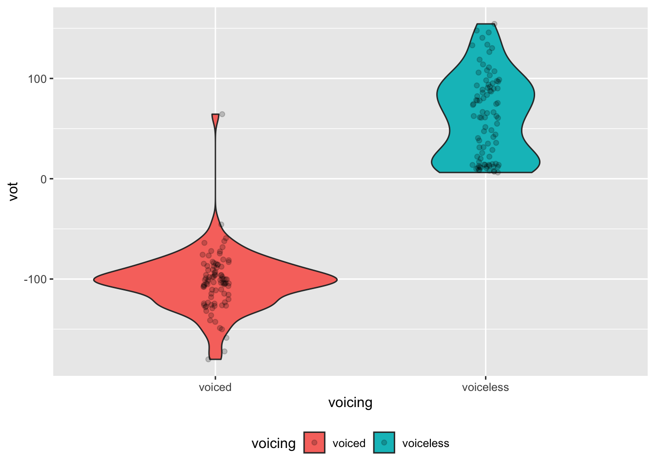
Sometimes you don’t want the legend at all. You can achieve that with "none" as the value to the legend.position argument.
alb_vot %>%
  ggplot(aes(voicing, vot, fill = voicing)) +
  geom_violin() +
  geom_jitter(width = 0.05, alpha = 0.2) +
  theme(legend.position = ...)