SQM tutorial - Week 3
Rmarkdown
Last week, you learnt how to use R scripts to save your code.
Keeping track of the code you use for data analysis is a very important aspect of research project managing: not only the code is there if you need to rerun it later, but it allows your data analysis to be reproducible (i.e., it can be reproduced by you or other people in such a way that starting with the same data and code you get to the same results).
R scripts are great for writing code, and you can even document the code (add explanations or notes) with comments (i.e. lines that start with #).
But for longer text or complex data analysis reports, R scripts can be a bit cumbersome.
A solution to this is using Rmarkdown files (they have the .Rmd) extension.
Code… and text!
Rmarkdown is a file format that allows you to mix code and formatted text in the same file.
This means that you can write dynamic reports using Rmd files: dynamic reports are just like analysis reports (i.e. they include formatted text, plots, tables, code output, code, etc…) but they are dynamic in the sense that if, for example, data or code changes, you can just rerun the report Rmd file and all code output (plots, tables, etc…) are updated accordingly!
You can watch this short video for a quick tour.
Formatting text
R comments in R scripts cannot be formatted (for example, you can’t make bold or italic texts).
Text in Rmd files can be fully formatted using a simple but powerful mark-up language called markdown.
You don’t have to learn markdown all in one go, so I encourage you to just learn it bit by bit, in your time. You can look at the the Markdown Guide for an in-depth intro and/or dive in the Markdown Tutorial for a hands-on approach.
A few quick pointers (you can test them in the Markdown Live Preview):
Text can be made italics by enclosing it between single stars:
*this text is in italics*.You can make text bold with two stars:
**this text is bold!**.Heading are created with
#:# This is a level-1 heading.## This is a level-2 heading.
Create an Rmd file
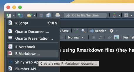
To create a new Rmd file, just click on the click on the New file button, then R Markdown.... (If you are asked to install/update packages, do so.)
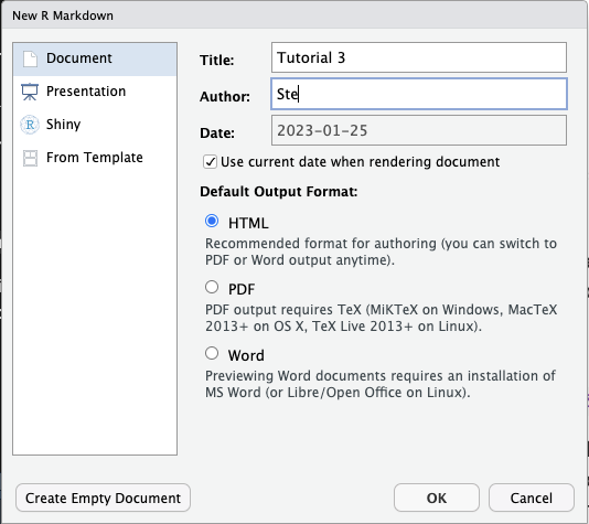
A window will open. Add a title of your choice and your name, then click OK.
A new Rmd file will be created and will open in the File Editor panel in RStudio.
Note that creating an Rmd file does not automatically saves it on your computer. To do so, either use the keyboard short-cut CMD+S/CTRL+S or click on the floppy disk icon in the menu below the file tab.
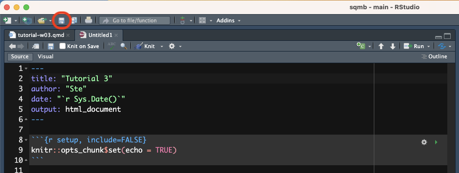
Save the file inside the code/ folder with the following name: tutorial-w03.Rmd.
Remember that all the files of your RStudio project don’t live inside RStudio but on your computer. So you can always access them from the Finder or File Explorer!
Parts of an Rmd file
An Rmd file usually has three main parts:
The preamble (green).
Code chunks (orange).
Text (blue).
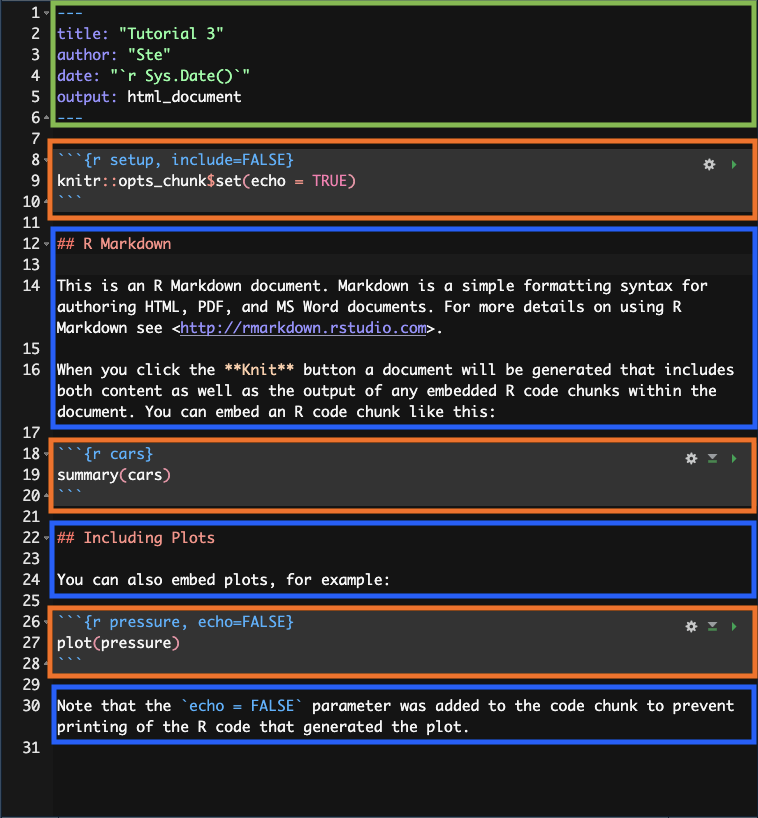
Each Rmd file has to start with a preamble, but you can include as many code chunks and as much text as you wish, in any order.
Render Rmd files to HTML
You can render an Rmd file into a nicely formatted HTML file.
To render an Rmd file, just click on the Knit button and an HTML file will be created and saved in the same location of the Rmd file.

It will also be shown in the Viewer pane, in the bottom-right panel of RStudio.
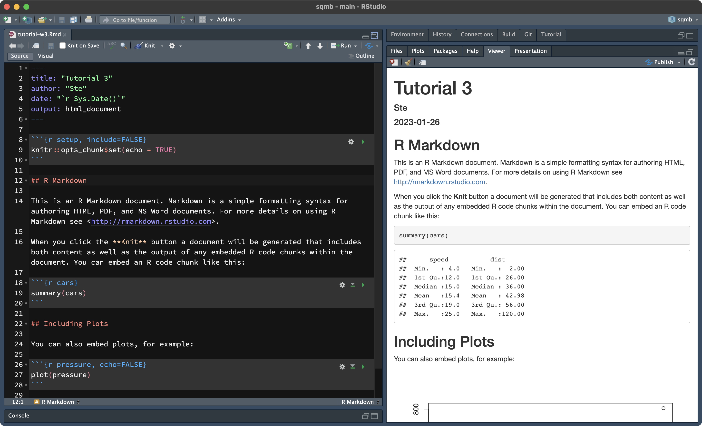
Rendering Rmd files is not restricted to HTML, but also PDFs and even Word documents!
This is very handy when you are writing an analysis report you need to share with others.
How to run code
The first code chunk in an Rmd file is a special one: it’s called setup and it’s where you attach all the packages needed for running the code in the file. (You can find the name of a code chunk—or define one yourself!—in the first line of a code block: ```{r chunk-name}). The first code chunk of an Rmd file should always be named setup.
The setup code chunk also has special code from the knitr package. The knitr package is what allows you to run R code from Rmd files.
The line knitr::opts_chunk$set(echo = TRUE) sets the option echo to TRUE. The echo option let’s you decide whether you want the R code printed (echoed) in the rendered Rmd file. When echo = TRUE the code is printed, when echo = FALSE the code is not printed.
Now go ahead and add library(tidyverse) in the line next to the knitr::opts_chunk line.
To run the code of a code chunk you can use different approaches:
Click on the green arrow to the right of the code chunk to run the entire code chunk.
Alternatively, place the text cursor inside the code chunk and press
CMD/CTRL + SHIFT + ENTER.You can also run line by line as you do in an R script by placing the text cursor on the line you want to run and press
CMD/CTRL + ENTER.
Now delete everything after the setup code chunk and write a new level-2 heading after the chunk with the name “Plotting basics”. (Remember to leave an empty line between the chunk and the heading.)
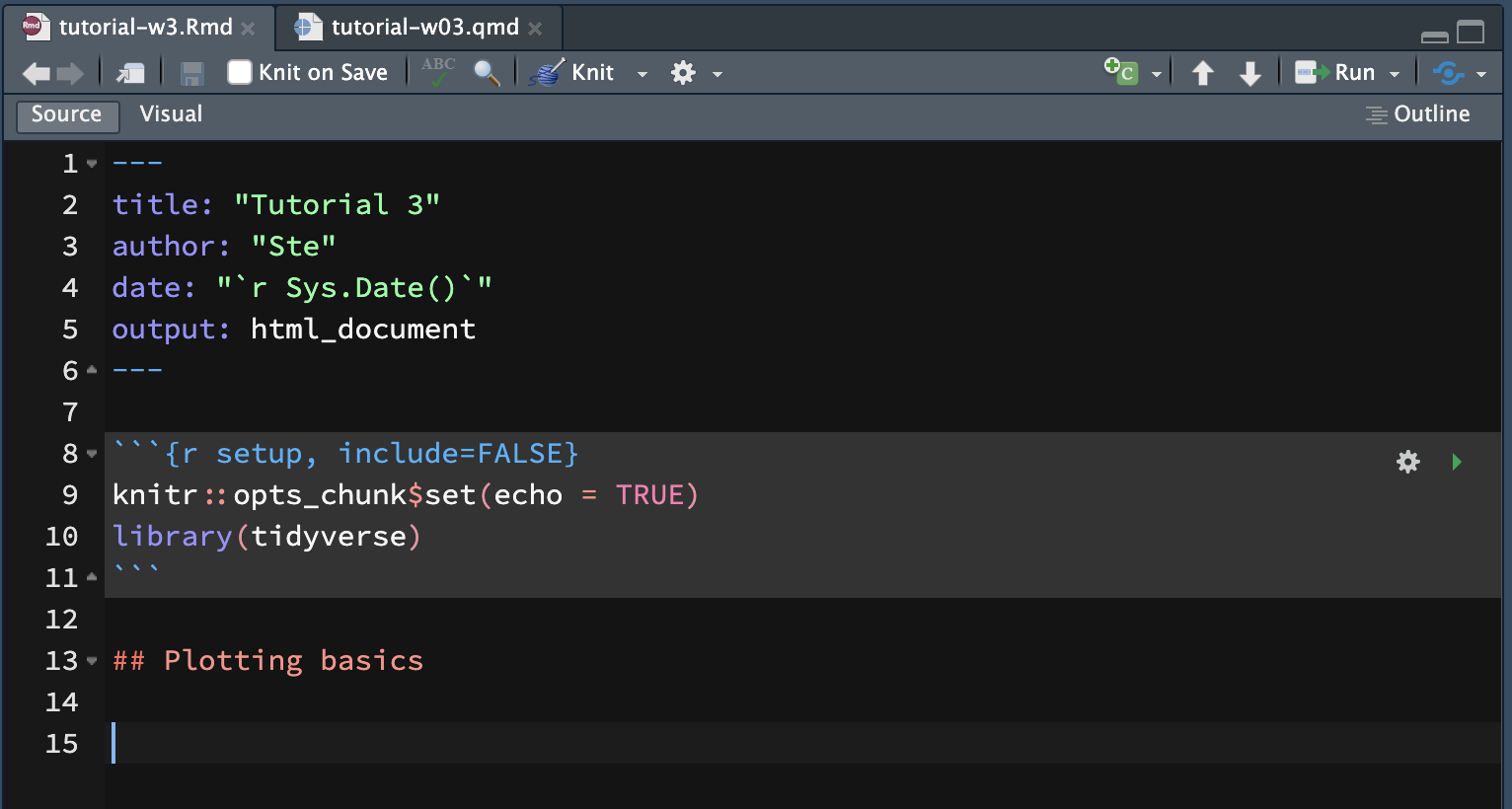
You will use this Rmd file to write text and code for this tutorial. To insert a new code chunk, you can click on the Insert a new code chunk button and then select R, or you can press OPT/ALT + CMD/CTRL + I.
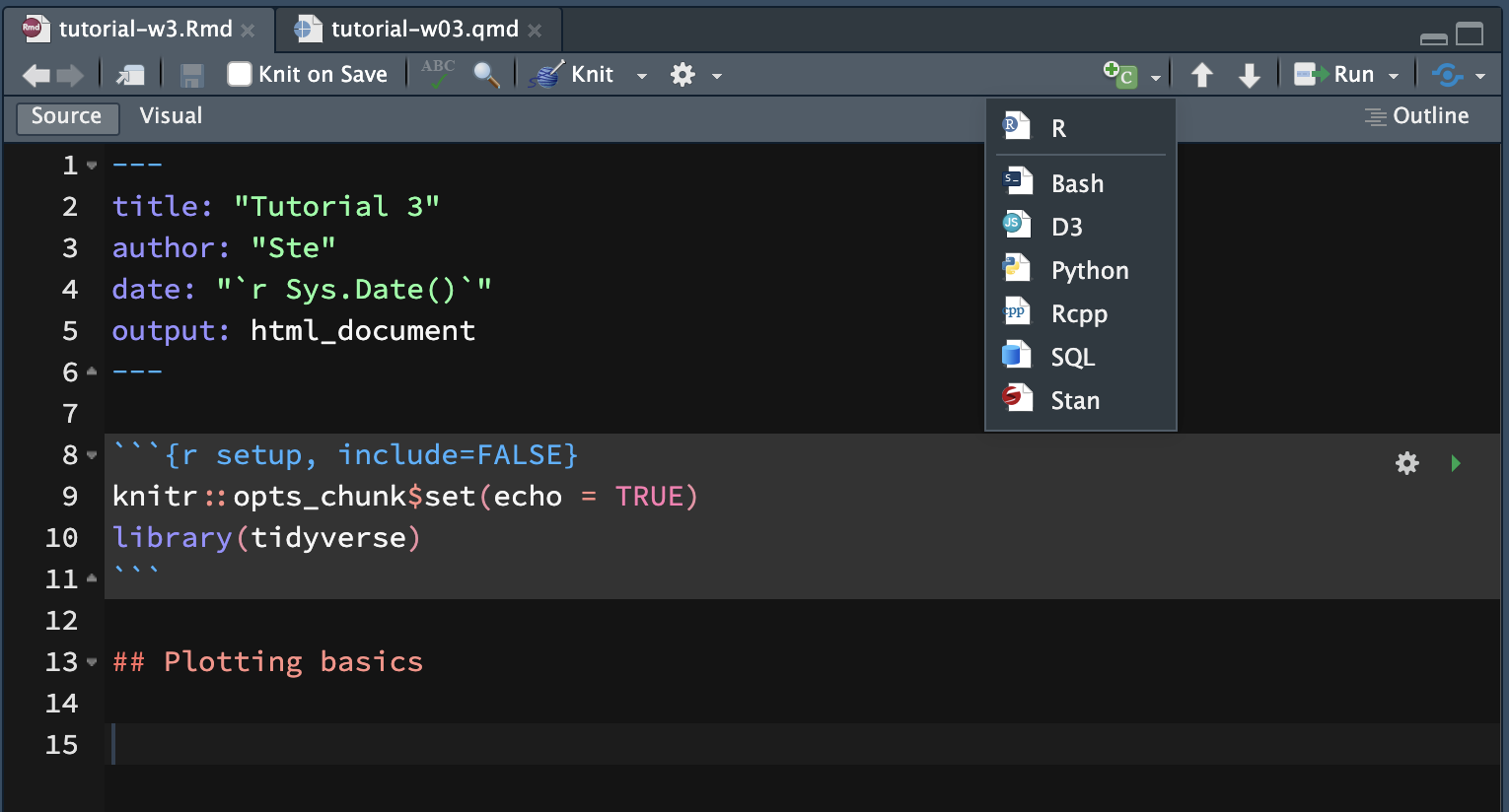
A new R code chunk will be inserted at the text cursor position.
Plotting basics
Plotting data in R is easy once you understand the basics.
Graphic systems
In R, you can create plots using different systems.
- Base R.
- lattice.
- ggplot2.
- more…
In this course you will learn how to use the ggplot2 system, but before we dive in, let’s have a look at the base R plotting system too.
Base R plotting function
Let’s create two vectors, x and y and plot them. For now, run these in the Console (not in the code chunk we just created).
x <- 1:10
y <- x^3

plot(x, y)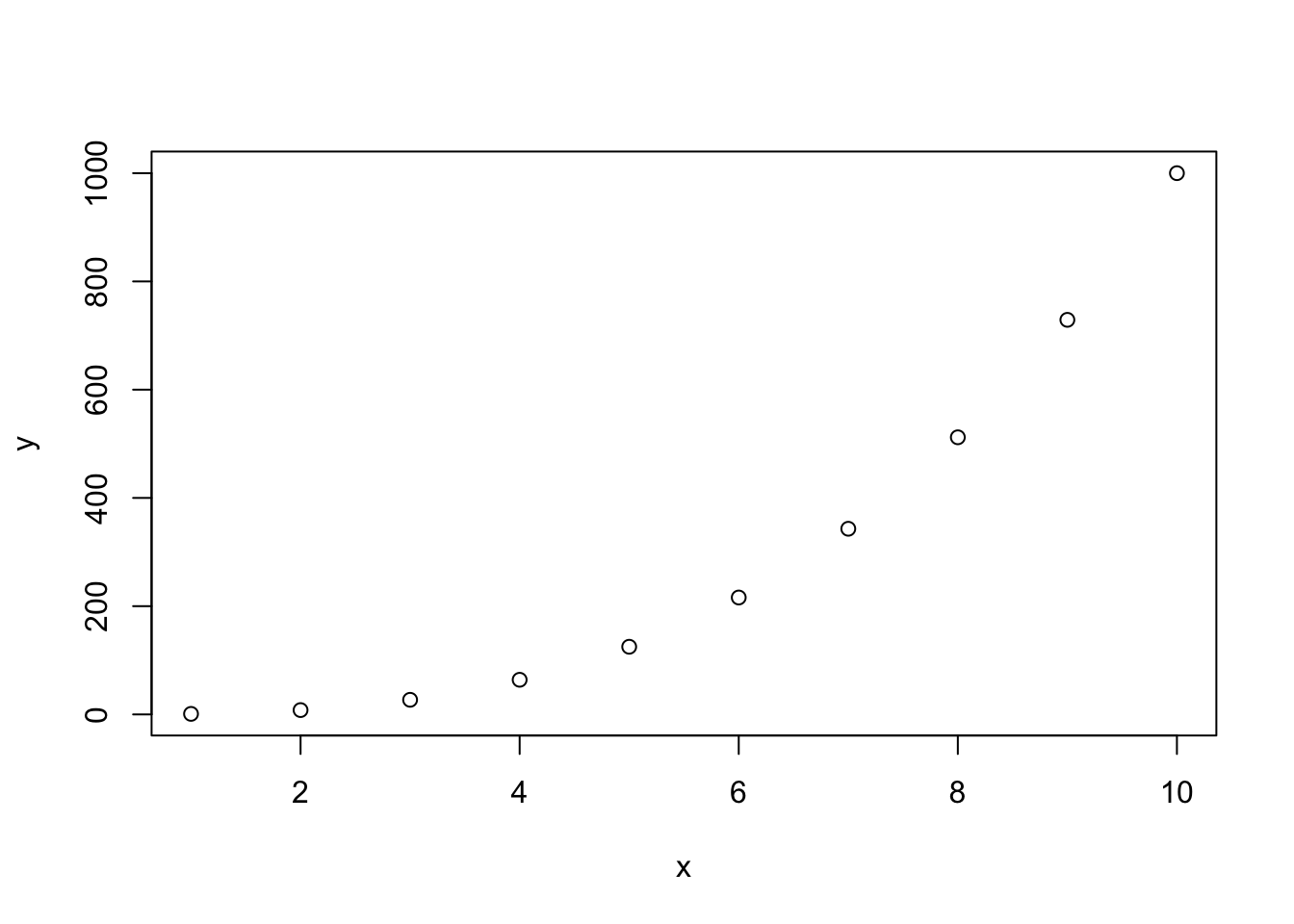
Easy!
Now let’s add a few more things.
plot(x, y, type = "l", col = "purple", lwd = 3, lty = "dashed")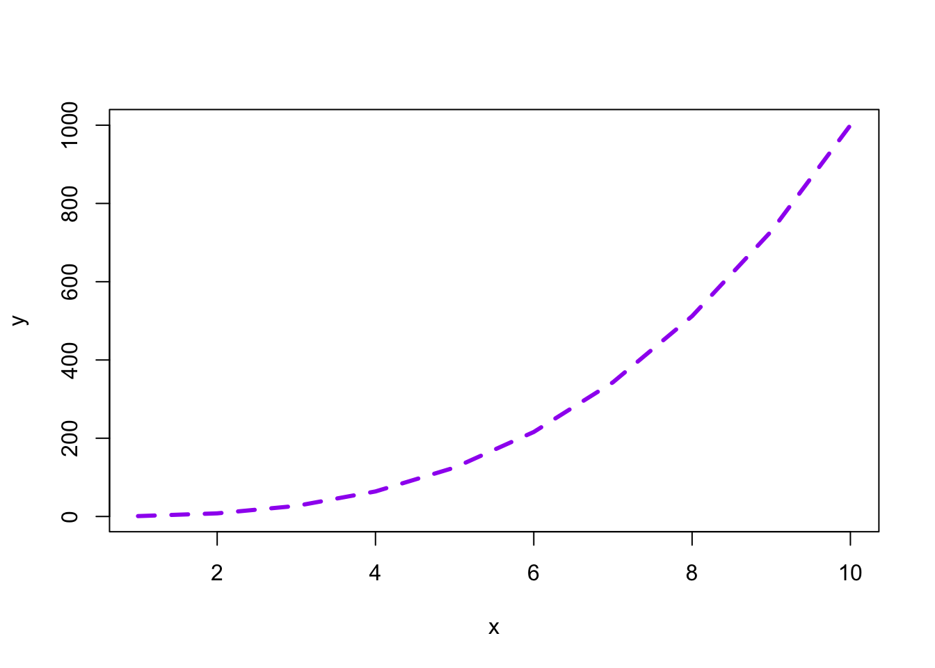
With plots as simple as this one, the base R plotting system is sufficient, but to create more complex plots (which is virtually always the case), base R gets incredibly complicated.
Instead we can use the tidyverse package ggplot2. ggplot2 works well with the other tidyverse packages and it follows the same principles, so it is convenient to use it for data visualisation instead of base R!
Your first ggplot2 plot
The tidyverse package ggplot2 provides users with a consistent set of functions to create captivating graphics.
Remember: To be able to use the functions in a package, you first need to attach the package. We have already attached the library(tidyverse) packages, among which there is ggplot2, so you don’t need to do anything else.
The polite data
We will use the polite data to learn the basics of plotting using ggplot.
The data comes from the paper by Winter and Grawunder, 2020. The phonetic profile of Korean formal and informal speech registers. DOI: 10.1016/j.wocn.2012.08.006
To download the file with the data right-click on the following link and download the file: polite.csv. (Note that tutorial files are also linked in the Syllabus). Remember to save the file in data/ in the course project folder.
With Rmd files, we can use relative paths to read data. For relative paths to work relative to the project working directory, you need to install the here package (remember how to install packages?) and add the following line in the setup chunk, just after the first line of code.
knitr::opts_knit$set(root.dir = here::here())(Note that it’s knitr::opts_knit rather than knitr::opts_chunk).
Now rerun the setup code chunk to set the new option.
This will set the working directory for the Rmd file to the project working directory.
Make sure that this line is always in the setup block, or R might get confused about where the working directory is and not be able to find the data.
Finally, create a new code chunk, add the following line of code and then run the code chunk to read the data.
polite <- read_csv("data/polite.csv")In this tutorial we will use the following columns:
f0mn: mean f0 (fundamental frequency).H1H2: difference between H2 and H1 (second and first harmonic).gender: speaker’s gender.musicstudent: whether the speaker is a music student (yes) or not (no).
A basic plot
These are the minimum constituents of a ggplot2 plot.
The
data: you have to specify the data frame with the data you want to plot.The
mapping: the mapping tells ggplot how to map data columns to parts of the plot like the axes or groupings within the data. These parts are called aesthetics, oraesfor short.
You can specify the data and mapping with the data and mapping arguments of the ggplot() function.
Note that the mapping argument is always specified with aes().
In the following bare plot, we are just mapping the mean f0 (f0) to the x-axis and the H2-H1 difference to the y-axis, from the polite data frame.
Create a new code chunk, copy the following code and run it. From this point on I will assume you’ll create a new code chunk and run the code yourself, without explicit instructions.
ggplot(
  data = polite,
  mapping = aes(x = f0mn, y = H1H2)
)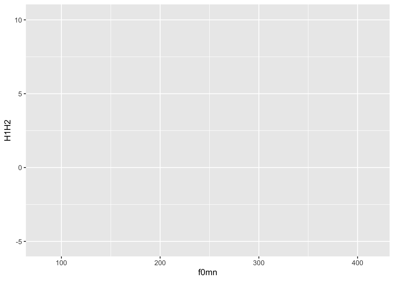
Not much to see here: just two axes!
Let’s add geometries
Nice, but we are missing the most important part: showing the data!
Data is represented with geometries, or geoms for short. geoms are added to the base ggplot with functions whose names all start with geom_.
For this plot, you want to use geom_point(). This geom simply adds point to the plot based on the data in the polite data frame.
To add geoms to a plot, you write a + at the end of the ggplot() command and include the geom on the next line. For example:
ggplot(
  data = polite,
  mapping = aes(x = f0mn, y = H1H2)
) +
  geom_point()
Warning: Removed 12 rows containing missing values (`geom_point()`).
This type of plot, with two continuous axes and data represented by points, is called a scatter plot.
Note that using the + is a quirk of ggplot(). The idea behind it is that you start from a bare plot and you add (+) layers of data on top of it. This is because of the philosophy behind the package, called the Layered Grammar of Graphics.
Function arguments
Note that the data and mapping arguments don’t have to be named explicitly (with data = and mapping =) in the ggplot() function, since they are obligatory and they are specified in that order.
ggplot(
  polite,
  aes(x = f0mn, y = H1H2)
) +
  geom_point()
In fact, you can also leave out x = and y =.
ggplot(
  polite,
  aes(f0mn, H1H2)
) +
  geom_point()
Warning: Removed 12 rows containing missing values (`geom_point()`).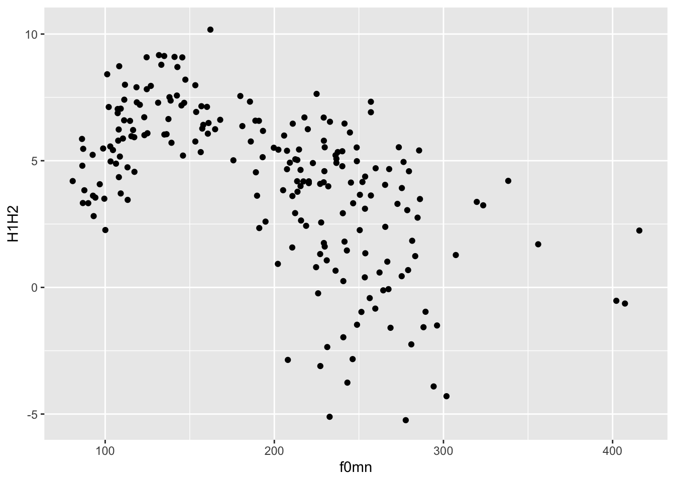
Try running ?ggplot in the Console to see the arguments of the function and the order they appear in.
Bar charts
Another common type of plot is the bar chart.
Bar charts are useful when you are counting things. In the following example, we will be counting the number of languages by their endangerment status.
Do you understand me?
There are thousands of languages in the world, but most of them are losing speakers, and some are already no longer spoken. The endangerment status of a language in the data is on a scale from not endangered (languages with large populations of speakers) through threatened, shifting and nearly extinct, to extinct (languages that have no living speakers left).
The glot_status data frame contains the endangerment status for 7,845 languages from Glottolog. To download the file with the data right-click on the following link and download the file: glot_status.rds. (Note that tutorial files are also linked in the Syllabus). Remember to save the file in data/ in the course project folder.
This time the file is not a .csv file but an .rds file. .rds files are files that can save any R object. They are commonly used to save data frames, like in this case.
To read an .rds file you need the readRDS() function.
glot_status <- readRDS("data/glot_status.rds")Here’s what the data frame looks like.
glot_statusFor us today, the most important columns are:
Name: the language name.status: the endangerment status of the language.Macroarea: the geographic macro-area the language is spoken in.
Create a bar chart
To create a bar chart, add geom_bar() to the plot.
You only need one axis, the x axis to be precise, because the y-axis will have the counts.
Also, note how we’re using %>% to pipe the glot_status data frame into the ggplot() function. This works because ggplot()’s first argument is the data, and piping is a different way of providing the first argument to a function.
glot_status %>%
  ggplot(aes(x = status)) +
  ...
Note how the counting is done automatically. R looks in the status column and counts how many times each value in the column occurs in the data frame.
Stacked bar charts
A special type of bar charts are the so-called stacked bar charts. These are bar charts where each bar contains a “stack” of shorter bars, each indicating the counts of some sub-groups.
To create a stacked bar chart, you just need to add a new aesthetic mapping: fill. The fill aesthetic lets you fill bars or areas with different colours depending on the values of a specified column.
Let’s make a plot on language endangerment by macro-area.
Complete the following code by specifying that fill should be based on status.
ggplot(
  data = glot_status,
  mapping = aes(x = Macroarea, ...)
) +
  geom_bar()
Faceting and panels
Sometimes we might want to separate the data into separate panels.
We can achieve that easily using faceting.
Polite again
Let’s reproduce one of the plots from above, but this time let’s use the colour aesthetic to colour the points by gender.
polite %>%
  ggplot(aes(f0mn, H1H2, colour = gender)) +
  geom_point()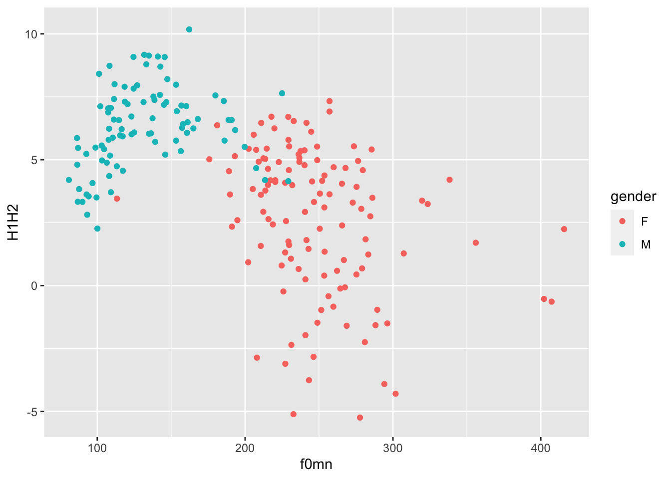
Does being a music student matter?
That looks great, but we want to know if being a music student has an effect on the relationship of f0mn and H1H2.
In the plot above, the aesthetics mappings are the following:
f0mnon the x-axis.H1H2on the y-axis.genderas colour.
How can we separate data further depending on whether the participant is a music student or not?
We can create panels using facet_grid(). This function takes lists of variables to specify panels in rows and/or columns.
The syntax is a bit strange. Check the documentation with ?facet_grid() (especially the examples) to see how it works and then complete the code below and run it to produce a plot with two column panels for musicstudent.
polite %>%
  ggplot(aes(f0mn, H1H2, colour = gender)) +
  geom_point() +
  facet_grid(...)
Render your Rmd file!
Now that you have done all of this hard work, why don’t you try and render the Rmd file you’ve been working on to an HTML file?
Go ahead, click on the “Knitr” button and if everything works fine you should see a rendered HTML file in a second!
Note that you will be asked to render your Rmd files for the assessments, so I recommend you try this out now.
The end
That’s all for this week!
Next week, you will learn how to create density and violin plots and how to customise legends, titles and labels!