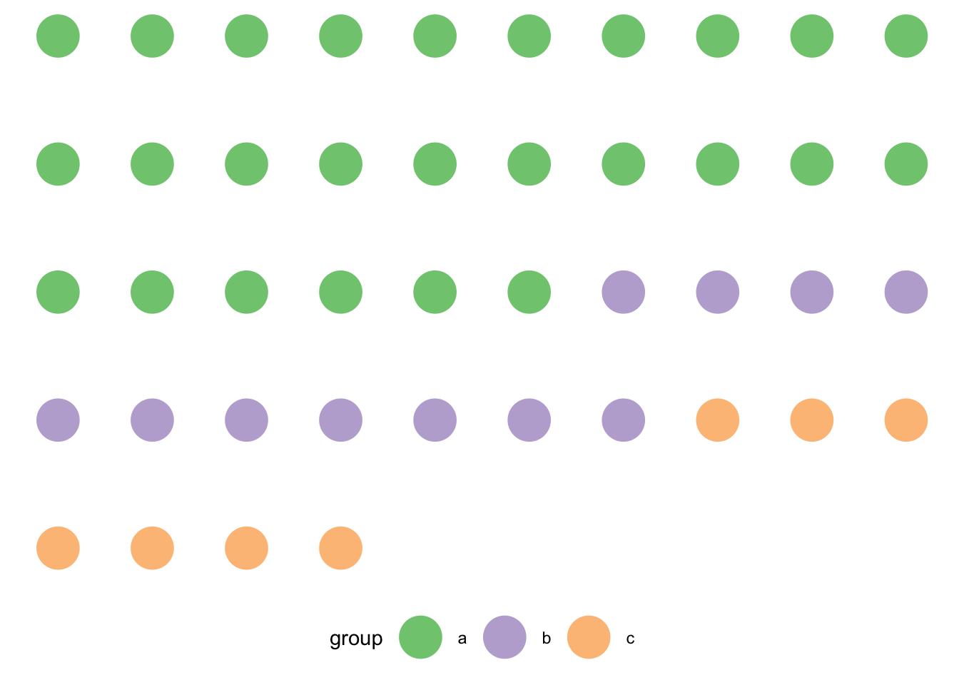
dots <- tibble(
  group = as.character(unlist(mapply(rep, c("a", "b", "c"), c(26, 11, 7)))),
  x = rep(1:10, length.out = length(group)),
  y = rep(1:(ceiling(length(group) / 10)), each = 10)[1:length(group)]
)R gist — Dot matrix charts with ggplot2
Gist
ggplot2
R
1 Set up
2 Create data
3 Plot dot matrix chart
dots %>%
  ggplot(aes(x, -y, colour = group)) +
  geom_point(size = 10) +
  scale_color_brewer(type = "qual") +
  theme_minimal() +
  theme(
    panel.grid = element_blank(),
    axis.title = element_blank(),
    axis.text = element_blank(),
    legend.position = "bottom"
  )
4 To do
- Order groups by descending count.
- Reduce spacing.
Citation
BibTeX citation:
@online{coretta2021,
  author = {Coretta, Stefano},
  title = {R Gist — {Dot} Matrix Charts with Ggplot2},
  date = {2021-11-21},
  url = {https://stefanocoretta.github.io/posts/2021-11-21-dot-matrix-charts/},
  langid = {en}
}
For attribution, please cite this work as:
Coretta, Stefano. 2021. R gist — Dot matrix charts with ggplot2. https://stefanocoretta.github.io/posts/2021-11-21-dot-matrix-charts/.