library(tidyverse)
theme_set(theme_minimal()) # I just like this theme :)Plotting prior distributions with ggplot2
Statistics
Regression models
brms
ggplot2
R
The choice of priors is a fundamental step of the Bayesian inference process. Vasishth et al. (2018) recommend plotting the chosen priors to see if they are reasonable.
In this post I will show how to easily plot prior distributions in ggplot2 (which is part of the tidyverse).
Let’s load the tidyverse first.
1 Plotting your priors
Let’s start with a simple normal prior with \(\mu\) = 0 and sd = 1.
The plot is initialised with an empty call to ggplot(). As aesthetics, you only need to specify the range of x values in aes(). Here, we use c(-4, 4), meaning that the x-axis of this plot will have these limits. For a normal distribution, it is useful to set the limits as the mean ± 4 times the standard deviation (this ensures all the distribution is shown).
The function ggplot2::stat_function() allows us to specify a distribution family with the fun argument. This arguments takes the density function (the R functions of the form dxxx) of the chosen distribution family, so for the normal (Gaussian) distribution we use dnorm(). The argument n specifies the number of points along which to calculate the distribution (here 101), while args takes a list with the parameters of the distribution (here the mean 0 and standard deviation 1).
ggplot(data = tibble(x = -4:4), aes(x)) +
  stat_function(fun = dnorm, n = 101, args = list(1)) +
  labs(title = "Normal (Gaussian) distribution")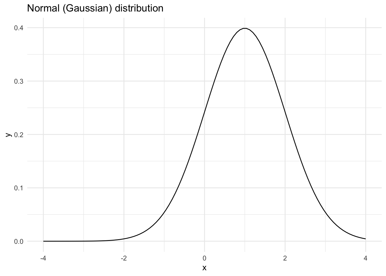
A beta prior will be bounded between 0 and 1, so we can specify that in aes(). The beta distribution has two arguments, shape1 and shape2 (here 2 and 5).
ggplot(data = tibble(x = 0:1), aes(x)) +
  stat_function(fun = dbeta, n = 101, args = list(2, 5)) +
  labs(title = "Beta distribution")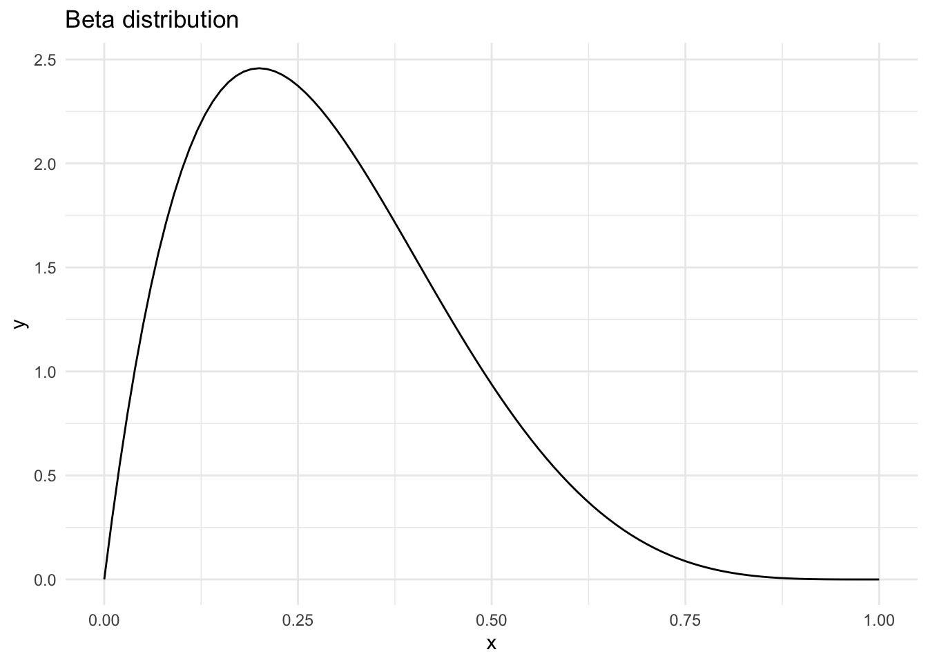
Another common distribution is the Cauchy.
ggplot(data = tibble(x = -10:10), aes(x)) +
  stat_function(fun = dcauchy, n = 201, args = list(-2, 1)) +
  labs(title = "Cauchy distribution")
The Poisson distribution can be plotted by changing the type of geom and using an n that creates only integers.
# the range 0:20 includes 21 integers, so n = 21
ggplot(data = tibble(x = 0:20), aes(x)) +
  stat_function(fun = dpois, n = 21, args = list(4), geom = "point") +
  labs(title = "Poisson distribution")
Of course any family with a corresponding dxxx function can be plotted (see ?Distributions and package-provided families).
2 References
Vasishth, Shravan, M. Beckman, B. Nicenboim, Fangfang Li & Eun Jong Kong. 2018. Bayesian data analysis in the phonetic sciences: A tutorial introduction. Journal of Phonetics 71. 147–161. https://doi.org/10.1016/j.wocn.2018.07.008.
Citation
BibTeX citation:
@online{coretta2019,
  author = {Coretta, Stefano},
  title = {Plotting Prior Distributions with Ggplot2},
  date = {2019-06-17},
  url = {https://stefanocoretta.github.io/posts/2019-06-17-priors-ggplot2/},
  langid = {en}
}
For attribution, please cite this work as:
Coretta, Stefano. 2019. Plotting prior distributions with ggplot2. https://stefanocoretta.github.io/posts/2019-06-17-priors-ggplot2/.