select(tongue_data, rec_date, fan_line, X, Y, word, vowel, c2)Plotting tongue contours with ggplot2
Phonetics
R
ggplot2
When plotting tongue contours data obtained from ultrasound tongue imaging in R using ggplot2, a common option to smooth over the individual contours and show the general pattern is to use geom_smooth(methood = "loess"). However, as I will show in this post, in certain cases this method leads to very disorted contours. Such distortion is more or less always present, although at a lower degree in less extreme cases.
To show the shortcomings of using geom_smooth() and present a viable alternative, we’ll be using ultrasound tongue imaging data from one speaker (me). This dataset includes tongue contours from within the closure of the conosonants /t, d/ preceeded by /a, o, u/. The dataset looks like this (some columns dropped):
rec_date is the date and time of recording. Each observed tongue contour has a unique rec_date (this will come in handy later). fan_line is the number of the line in the fan coordinate system used by Articulate Assistant Advanced (which I used to record the data). X and Y are the horizontal and vertical position of each point on the contour. The unit is millimeters. word, vowel and c2 are self-explanatory.
Let’s start by plotting the smoothed contours by vowel and consonant.
tongue_data %>%
  ggplot(aes(X, Y)) +
  geom_smooth(aes(colour = vowel), method = "loess") +
  coord_fixed() +
  facet_grid(c2 ~ vowel) +
  theme(legend.position = "none")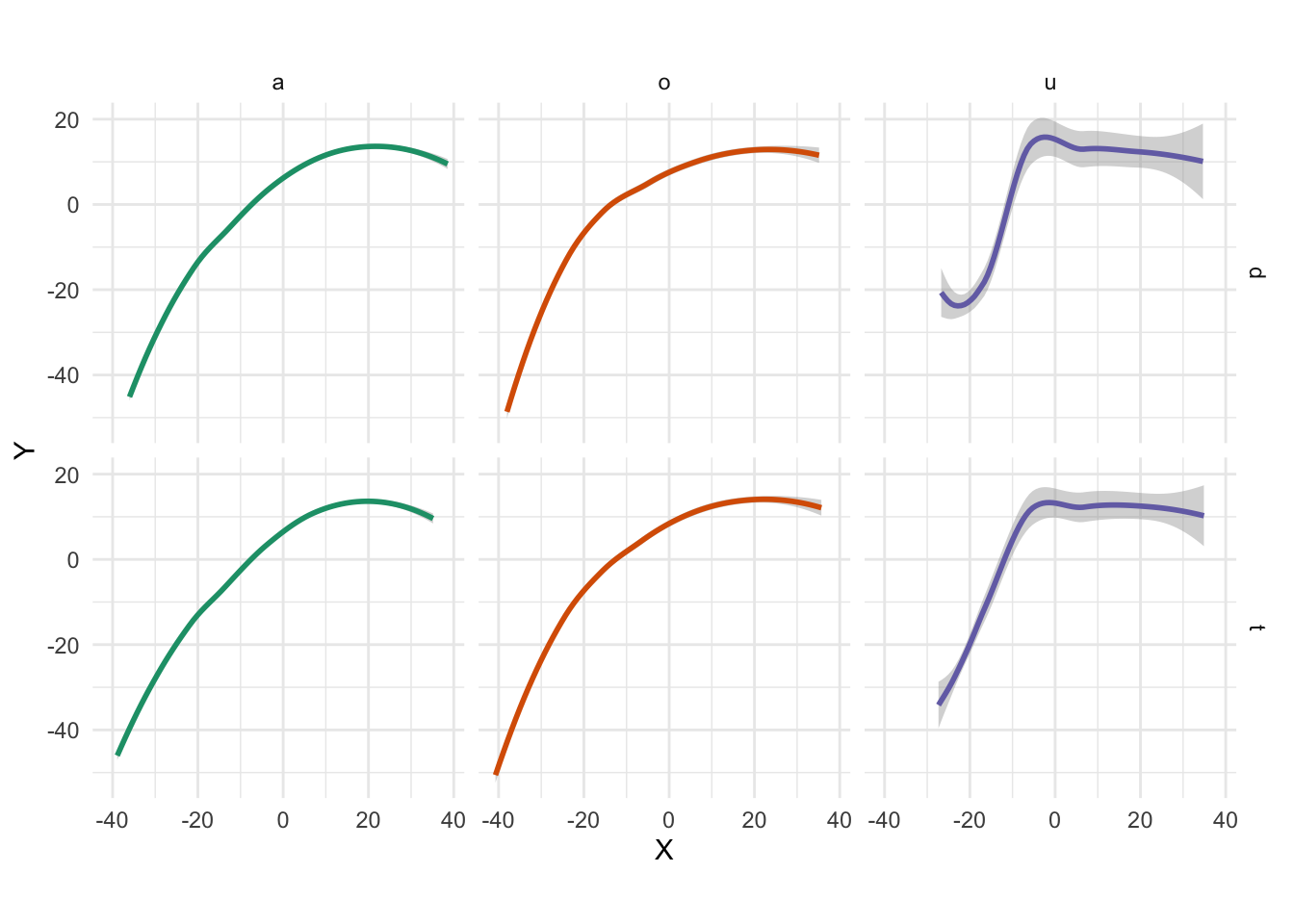
We can immediately notice that with /u/ there is something odd going on. That does not look like a tongue surface (maybe that of a chameleon! Definitely not one of a ‘hooman’.) The smooths for /a/ and /o/ seem quite standard.
To see what is going on, let’s plot now also the individual points as recorded in the data, whith a superimoposed smooth, for comparison.
tongue_data %>%
  ggplot(aes(X, Y)) +
  geom_point(alpha = 0.1) +
  geom_smooth(aes(colour = vowel), method = "loess") +
  coord_fixed() +
  facet_grid(c2 ~ vowel) +
  theme(legend.position = "none")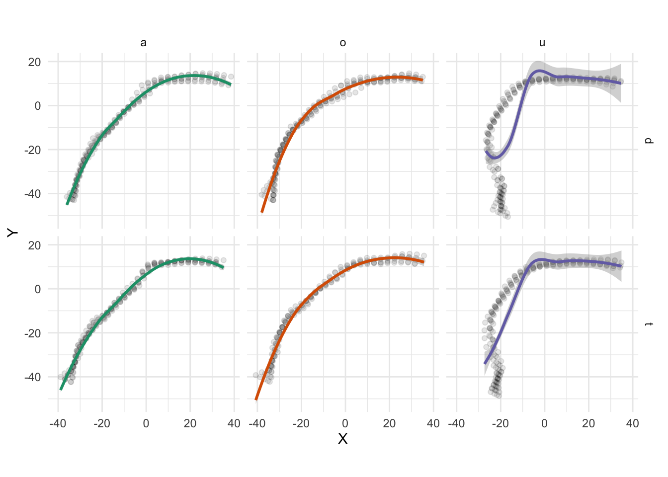
While the smooths with /a/ and /o/ more or less have a good fit when compared to the points, with /u/ the smooths are really off.
This happpens because the tongue root (in this particular case) developpes vertically rather than slanted. The smooth isagnostic about the fact that points lying on the same X value but with different Y values belong to different portion of the tongue contour. The result is that smoothing happens across tongue parts.
An alternative (if you don’t like points) is to use geom_path() to plot the individual tongue contours as lines. geom_path() connects points with a line, following the order in which they appear in the dataset. So, before using this geometry, we need to arrange the dataframe such that the points are in the right order (now they are in the wrong order).
To do so, we can use rec_date (which identifies the individual contours) and fan_line which indicates the orders of points (for each contour, there a maximum 42 points/fan lines; NAs have been excluded).
tongue_data <- tongue_data %>%
  arrange(rec_date, fan_line)

tongue_data
We can now use geom_path(). The argument group = rec_date ensures that individual lines are plotted (without it, the last point of one contour is connected with the first of the contour following in the dataset).
tongue_data %>%
  ggplot(aes(X, Y)) +
  geom_path(aes(group = rec_date, colour = vowel), alpha = 0.5) +
  coord_fixed() +
  facet_grid(c2 ~ vowel) +
  theme(legend.position = "none")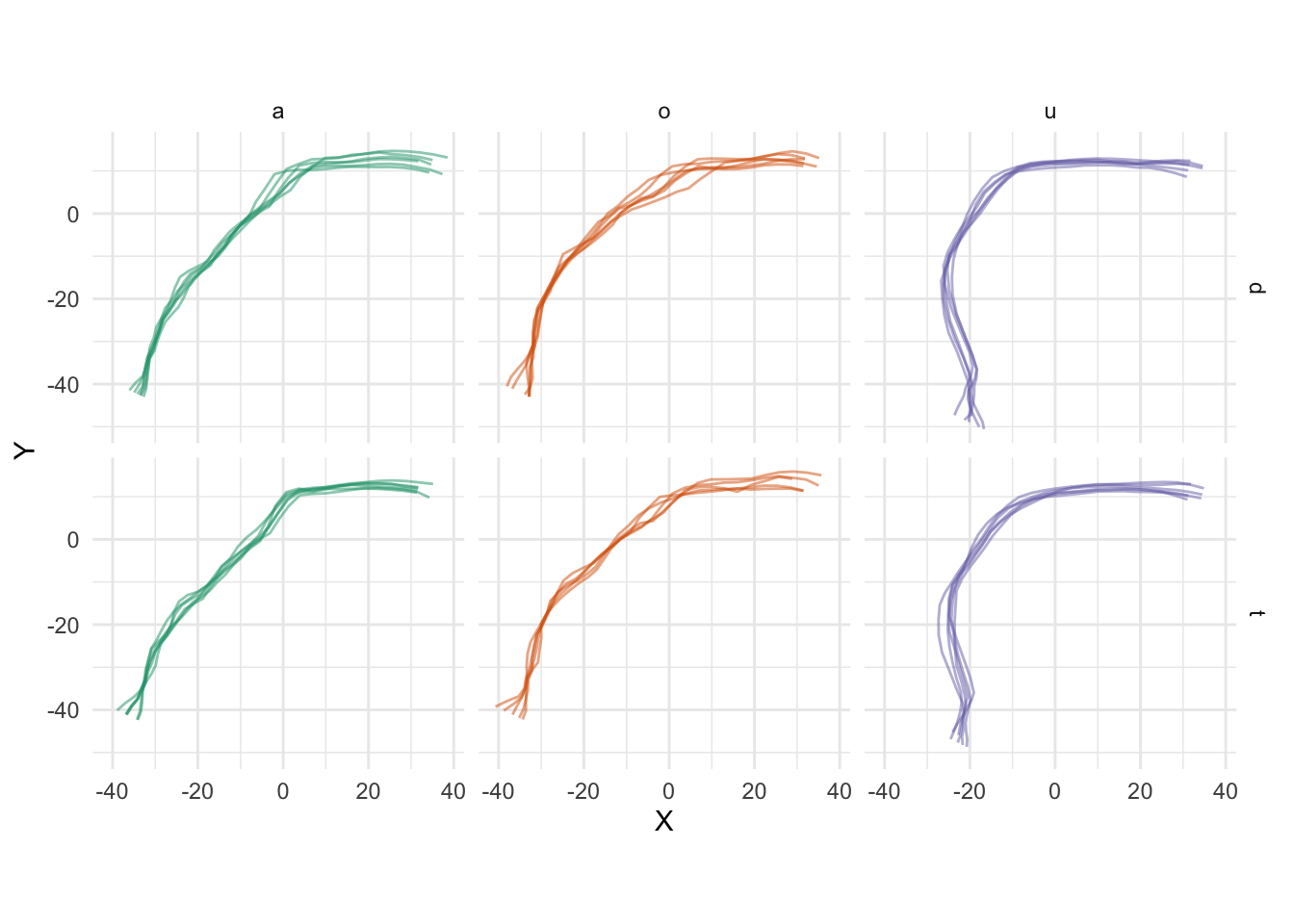
The tongue root in /u/ is now properly rendered.
But what fif you want to plot a single contour (possibly with confidence intervals) for each of the 6 panels in the previous figure, rather than all the contours?
An option is to plot an average contour (litterally, the aveages of X and Y). We can easily do that by grouping the data by fan_line and then summarise() it. Plotting can then be done with geom_path() and geom_polygon(). All together, the code looks like this.
xy_mean <- tongue_data %>%
  group_by(fan_line, vowel, c2) %>%
  summarise(
    X_mean = mean(X, na.rm = TRUE),
    Y_mean = mean(Y, na.rm = TRUE)
  )

xy_ci <- tongue_data %>%
  group_by(fan_line, vowel, c2) %>%
  summarise(
    X_CI_low = t.test(X)$conf.int[1],
    X_CI_up = t.test(X)$conf.int[2],
    Y_CI_low = t.test(Y)$conf.int[1],
    Y_CI_up = t.test(Y)$conf.int[2]
  )

ci_upper <- xy_ci %>%
  dplyr::select(-X_CI_low, -Y_CI_low) %>%
  dplyr::rename(
    CI_X = X_CI_up,
    CI_Y = Y_CI_up
  )

ci_lower <- xy_ci %>%
  dplyr::select(-X_CI_up, -Y_CI_up) %>%
  dplyr::arrange(dplyr::desc(fan_line)) %>%
  dplyr::rename(
    CI_X = X_CI_low,
    CI_Y = Y_CI_low
  )

ci <- rbind(ci_upper, ci_lower)

ggplot(xy_mean, aes(X_mean, Y_mean)) +
  geom_polygon(data = ci, aes(x = CI_X, y = CI_Y), alpha = 0.2) +
  geom_path(aes(X_mean, Y_mean, colour = vowel)) +
  facet_grid(c2 ~ vowel) +
  coord_fixed() +
  theme(legend.position = "none")
Citation
BibTeX citation:
@online{coretta2018,
  author = {Coretta, Stefano},
  title = {Plotting Tongue Contours with Ggplot2},
  date = {2018-08-23},
  url = {https://stefanocoretta.github.io/posts/2018-08-23-tongue-ggplot2/},
  langid = {en}
}
For attribution, please cite this work as:
Coretta, Stefano. 2018. Plotting tongue contours with ggplot2. https://stefanocoretta.github.io/posts/2018-08-23-tongue-ggplot2/.